Bold Bridesmaid Colors for 2026: Yellow, Pink, Blue, and Beyond
Bold bridesmaid palettes are the biggest ceremony upgrade of 2026, changing not just the vibe but the entire wedding album.

Think about the last wedding album you scrolled through. If every bridesmaid wore the same dusty sage or mauve, you probably moved through those photos quickly. Now picture a row of women in saturated marigold, cobalt, and hot pink, bouquets raised, chiffon catching outdoor light. You stopped. That's the whole argument for bold bridesmaid color in 2026, and it's not just aesthetic instinct; it's the logic of dopamine dressing finally arriving at the altar.
The dopamine dressing movement, which spilled from runways onto TikTok and Pinterest in 2022, is built on a straightforward premise: saturated, joyful color is a form of emotional self-expression, and wearing it changes how you feel. Loewe's Spring/Summer 2026 runway made primaries the main event rather than an accent. Valentino and Versace leaned into electric, saturated contrasts with similar confidence. That runway energy has now translated directly into the wedding industry, where bold, personality-driven color palettes are quickly replacing soft neutrals as the default bridesmaid directive. Brides choosing bright palettes cite three concrete, overlapping reasons: photo impact, personality, and mix-and-match flexibility. All three are real, and all three show up in the final album.
Why Color Is the Most Powerful Guest Experience Decision You'll Make
What a bridesmaid palette does to a wedding photograph is genuinely underestimated. Saturated dresses create visual anchors that give ceremony images depth, movement, and energy. A bright palette signals to every guest, and to every image in the album, that this wedding has a distinct point of view. The mood of the ceremony shifts too: when bridesmaids walk the aisle in bold, joyful color, the emotional temperature of the room changes in a way that neutral dressing simply cannot produce. That shift is visible in every photo taken from that moment forward.
The mix-and-match dimension adds another layer of editorial interest. Mismatched bright bridesmaid dresses are a huge trend right now, and the reason they work is the same reason a well-edited mood board works: different silhouettes in the same bold color family create cohesion through contrast rather than uniformity. A one-shoulder hot pink maxi beside a cowl-neck coral midi is not chaos; it's intentional variety, and it photographs with energy. Bold palettes feel more modern and personality-driven, they work beautifully for mix-and-match bridal parties, and they create a high-impact, editorial-style wedding look. Those three qualities are exactly what brides planning for 2026 are prioritizing.
The Color Recipes: Five Palettes, Five Venue Types
Dopamine dressing becomes genuinely practical when each bold color is matched to its natural home. Every hue has a venue type, a season, and a set of neutrals that keep the look balanced without muting it.
Marigold yellow with sky blue accents and ivory neutrals is the defining outdoor summer palette. Bright yellow is cheerful, eye-catching, and perfect for outdoor weddings, best suited to garden ceremonies, destination weddings, and rustic or boho-inspired themes. Pair it with white and ivory for a soft, romantic backdrop, bring in greenery and eucalyptus tones through the florals, and use soft blush as a balancing accent. The key technical detail: yellow looks best in motion. Flowing fabrics instantly elevate the look and keep it from feeling too bold, making lightweight chiffon or georgette the silhouette material of choice here.
Hot pink with champagne and white is the city wedding formula. Bold, fashion-forward, and ideal for modern or urban venues, hot pink hits differently in a rooftop event space than it does in a garden. Keep bridesmaid silhouettes varied — a maxi one-shoulder, a fitted midi, a structured strapless — and let champagne in the florals and table settings do the neutralizing work. The contrast keeps the look editorial rather than costume.
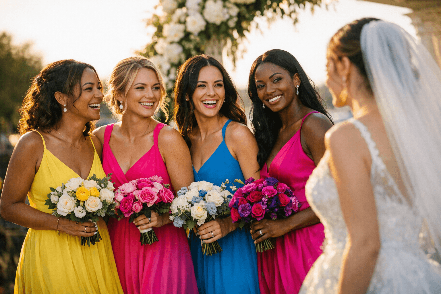
Cobalt blue with white bouquets and deep greenery is the safest bold option on this list. Universally flattering and genuinely works for any venue, it reads crisply outdoors at noon and equally well inside a candlelit ballroom. If you're introducing your wedding party to bold color for the first time, cobalt blue with clean white and botanical greens is the recipe to start with; it carries enormous visual impact without asking much of anyone's comfort zone.
Bright green with warm ivory and soft blush is the garden and rustic palette that earns its own chapter. Fresh, natural, and rooted in the same botanical references that make an outdoor ceremony feel considered rather than casual, this combination works especially well where the dress color can echo the landscape. Keep florals neutral — cream ranunculus, white garden roses, dried pampas — so the green has space to do its work.
Orange with terracotta and champagne is the tropical and fall answer. Bold and energetic, orange reads completely differently depending on season: at a coastal summer wedding it carries a sunset quality; at a November vineyard ceremony it anchors the entire warm palette. Pair it with terracotta in the accessories or florals and champagne in the linens for a color story that feels curated, not coincidental.
The One Rule That Keeps Every Bright Palette Flattering
There is a single rule that separates a bold bridesmaid palette that looks intentional from one that looks overwhelming: keep the saturation level consistent across every dress, and vary the silhouettes instead. When every bridesmaid is wearing the same color intensity, not necessarily the same shade but the same depth and vibrancy, the party reads as cohesive even in a mix-and-match scenario. The moment one dress is a muted version of the palette color and another is fully saturated, the group photograph falls apart and the editorial story collapses.
Silhouette variation is where individuality enters. A flowy A-line, a fitted midi, a bias-cut slip, and a structured strapless can all coexist within the same color family because the eye is drawn to the palette first and the silhouette second. It also resolves the universal bridesmaid complaint: nobody has to wear the same dress. The only shared commitment is to the same color intensity.
One practical tool that makes the saturation rule executable: order fabric swatches before committing to dresses from multiple retailers. Colors that look identical on a screen can read very differently in person, and a physical swatch under the actual light conditions of your venue tells you instantly whether two dresses are operating at the same saturation level.
If a single bold hue across the entire party still feels like too much of a commitment, pick one "anchor color" and use neutral florals or mismatched shades around it for a dynamic look. The anchor keeps the ceremony photographs from feeling fractured while giving individual bridesmaids room to interpret the palette in a way that genuinely suits them. That flexibility is what makes bold bridesmaid color feel modern rather than imposing, and what gives a wedding album a color story worth stopping for.
Know something we missed? Have a correction or additional information?
Submit a Tip