Strawberry red becomes the new neutral for capsule wardrobes
Strawberry red is acting like a capsule neutral, doing the job of black accessories while adding far more energy to a lean wardrobe.
Why strawberry red is suddenly the smart color
Strawberry red is moving like a neutral with attitude. It has the force of a statement color, but in a tight wardrobe it works like a repeatable building block, the kind of shade that can sit beside denim, camel, gray, navy, or black and still feel intentional. That is the whole trick: one saturated red family can do more than one job, from sharpening a simple outfit to replacing a standard black bag or shoe with something far less predictable.

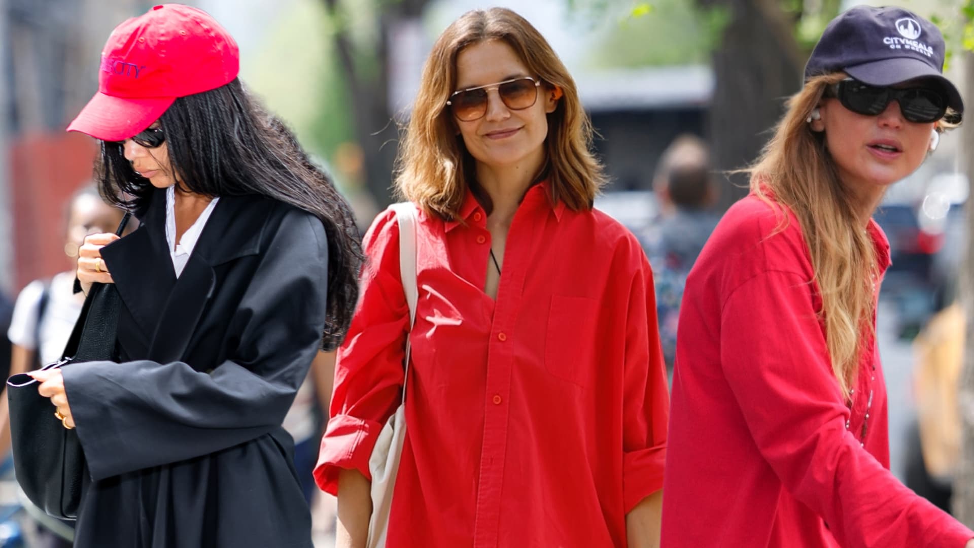
The reason it feels so useful right now is that the color is not being treated as a one-off splash. It is showing up on runways, outerwear, leather goods, and dresses, then sliding into celebrity street style on women like Jennifer Lawrence, Katie Holmes, and Zoë Kravitz. Once a color starts appearing in both fashion’s polished machinery and the off-duty clothes people actually copy, it stops reading as risky and starts reading as wardrobe logic.
Where to put strawberry red first
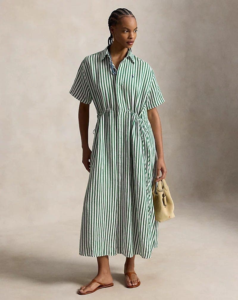
If the goal is a capsule wardrobe, the first move is not a head-to-toe look. It is a bag, a shoe, a knit, or a skirt. Those are the pieces that can carry color without making the rest of your closet work too hard, and strawberry red is especially strong when it is allowed to act as the single vivid anchor in an otherwise calm outfit.
A strawberry-red bag is the easiest entry point. It works like a black bag with a pulse, especially when you want an outfit to look finished without adding another neutral that disappears. A shoe in the same shade is sharper still, because it pulls a simple uniform into focus. A knit brings warmth and texture, while a skirt in strawberry red can be the one piece that makes a plain tee, white shirt, or navy sweater feel newly styled instead of merely worn.
The capsule colors it multiplies best
Strawberry red is most convincing when it is paired with the boring colors already earning their keep in a capsule wardrobe. Black makes it look graphic. Cream softens it. Gray cools it down. Navy gives it a preppy edge. Chocolate brown makes it feel richer and more expensive. Even denim becomes more interesting next to it, because the red keeps the outfit from collapsing into basic.
That is why this color works best as a multiplier, not as an isolated trend moment. If your wardrobe already leans on white tees, charcoal tailoring, straight-leg jeans, trench coats, and simple knits, strawberry red plugs into that system immediately. It gives those pieces more range without forcing you to rebuild the closet around a seasonally specific palette.
Pantone has already backed the direction of travel
Pantone’s New York Fashion Week Spring/Summer 2026 Fashion Color Trend Report, released on September 11, 2025, helps explain why red is pushing past trend territory into something broader. The report includes “Lava Falls,” a dramatic red, and frames the season around individual expression, fresh silhouettes, unconventional pairings, and a balance of maximalist and minimalist tones. That is basically capsule dressing with more swagger.
Leatrice Eiseman put the mood plainly, calling the season a “spirit of quirkiness and originality.” She also pointed out that younger consumers are comfortable mixing patterns and unusual combinations that were once treated as fashion “no-nos.” That matters here because strawberry red only becomes useful as a neutral if you are willing to let it clash a little. It does not need to match everything. It needs to make the mix feel more alive.
The runway evidence is not subtle
The spring 2026 runways were already pushing bold color into the main conversation. WWD reported strong color moments at Prada, Valentino, and Dior, which is the kind of high-fashion proof that turns an idea into a movement. Once those houses start treating saturated color as a serious option rather than a decorative punchline, the rest of the market follows fast.
Milan’s spring 2026 shows went even harder, with what WWD described as an “explosion of color” alongside sporty outerwear, lingerie-inspired details, and a broader mix of allure and utility. That combination is important. It means color is not being used to make clothes feel precious. It is being used to make them feel usable, modern, and slightly off-center in the best way.
Why retailers are watching the accessories first
Retailers are paying close attention to unexpected colors in accessories because that is usually where a trend proves it can live in real wardrobes. A bright shoe or bag can move through a closet faster than a full look, and if customers keep reaching for it, the color graduates from accent to staple. That is exactly how strawberry red is behaving now.
The accessory-first approach also keeps the color from becoming overwhelming. A vivid red coat can dominate a wardrobe. A red leather bag or glossy pump can quietly reset it. That is a much smarter place to start if you want the color to earn repeat wear instead of one dramatic photo.
How to wear it without losing the capsule feel
The cleanest way to wear strawberry red is to keep the silhouette simple and let the color do the work. Think straight trousers, a crisp shirt, a ribbed knit, a simple skirt, a sleek loafer, or a structured shoulder bag. The more streamlined the shape, the less you need to style around the color.
- Strawberry red with black creates instant contrast and feels sharper than expected.
- Strawberry red with cream or ivory looks polished and expensive, especially in soft knits or smooth leather.
- Strawberry red with denim keeps the outfit grounded and casual.
- Strawberry red with gray or navy feels controlled, which is exactly what makes the shade wearable in a lean wardrobe.
- Strawberry red with brown adds depth and makes the red feel less seasonal.
A few easy combinations make the point fast:
The larger shift underneath the color
This is bigger than one shade. The season is moving toward wardrobes that are built on mix-and-match tension rather than safe sameness. Pantone’s emphasis on fresh pairings and WWD’s runway reporting both point in the same direction: people want clothes that can do more than sit in neat categories. They want pieces that can switch roles, carry an outfit, and still feel easy to repeat.
That is why strawberry red works so well as a capsule accent neutral. It has enough saturation to replace the stale black add-ons everyone defaults to, but enough flexibility to keep returning in different forms. In a wardrobe that values versatility, it is not the loudest piece that wins. It is the one rich color that keeps making the rest of your clothes look more intentional.
This article was produced by Prism’s automated news system from verified source data, official records, and press releases, then run through automated quality and moderation checks before publishing. The system is built and supervised by the people who set the standards it runs under. Read our full AI policy.
Did this article answer your question?