Linen, Knits, and Muted Tones Define the Coastal Grandmother Palette
Linen breezes, soft neutrals, and one quiet accent color: the coastal grandmother palette is more considered than it looks.

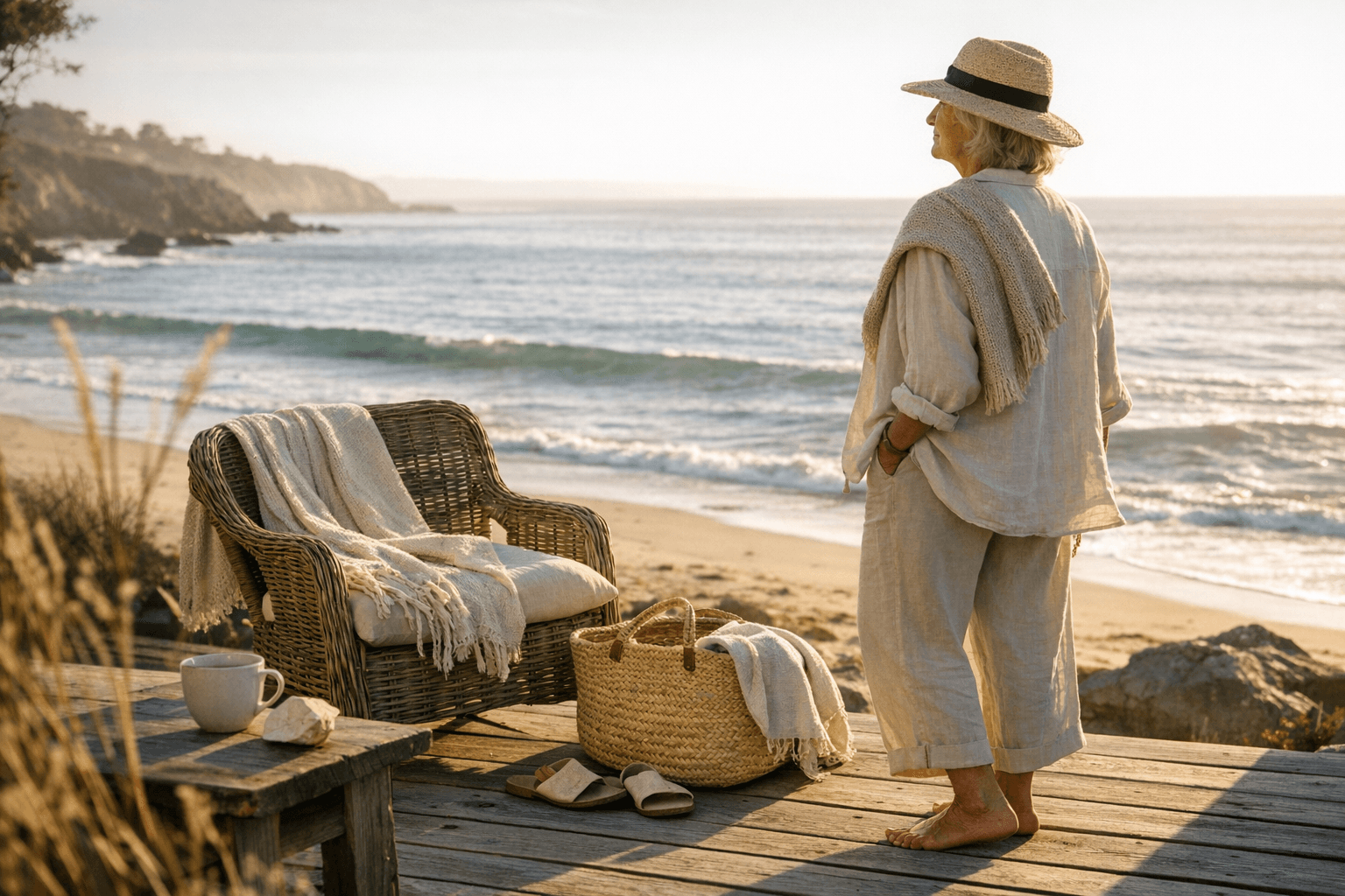
There's a specific quality of light in this aesthetic, the kind you get at 7am on a porch facing the water, everything washed out to its essential color. Off-white linen. A sand-colored tote. The suggestion of navy somewhere in the distance. Coastal grandmother style gets dismissed as "old money lite" or a TikTok shorthand, but the palette and material logic underneath it are genuinely rigorous. Get them right and everything you put on reads as intentional without trying. Get them wrong and you're just wearing beige.
The Palette: Five Colors, One Rule
The foundation is five tones: off-white, sand and beige (treat these as a single family rather than two separate choices), soft navy, and muted olive. That's your working palette. The rule is that you get one accent, and you commit to it. Sea-glass blue and terracotta are the two that work best within this world because both read as naturally occurring rather than decorative. Sea-glass has the obvious coastal reference, a color you'd find in a piece of tumbled glass on a gray-sand beach. Terracotta earns its place by warming the whole palette without disrupting the quietness of everything else.
The discipline here is the interesting part. A lot of muted-palette dressing fails because people add a second accent or drift into jewel tones thinking they're staying neutral. Within the coastal grandmother framework, that single accent isn't an afterthought. It's the pivot point. Everything else in an outfit defers to it. If you're wearing a terracotta linen shirt, your sand trousers and off-white knit are doing support work. If you introduce sea-glass in a ceramic bead bracelet or a cotton scarf, it should be the only color pulling focus.
The navy matters more than people acknowledge. Soft navy, not the hard contrast of classic prep, sits close enough to black to function as a grounding neutral but carries coastal context that charcoal or slate doesn't. A pair of wide-leg navy linen trousers reads differently than the same cut in black. The whole outfit breathes differently.
Material Hierarchy: What Goes First
The material logic is organized in a clear hierarchy, and working within it is what separates the people who've thought about this from the people who just bought some linen and hoped for the best.
Primary materials are European linen, specifically in garment categories that reward its structural looseness: dresses, trousers, and shirts. European linen has a different weight and finish than the mass-market linen sold at fast-fashion price points. It wrinkles the right way, meaning the creases look lived-in rather than neglected, and it gets softer with every wash rather than pilling or going limp. A linen dress in off-white or sand is the single most load-bearing piece in this aesthetic. It can anchor an outfit on its own or accept layering without resistance.
Secondary materials are lightweight knits, with cotton and cashmere at the top of the category. This is where the layering language of coastal grandmother really develops. A fine cotton knit in off-white worn under an open linen shirt, or a cashmere pullover in muted olive over wide linen trousers, creates the kind of tonal layering that looks effortless but requires some material consideration. Cashmere reads more luxurious and is the better choice when the outfit needs to work into an evening context. Cotton knits keep things relaxed and are more forgiving in actual coastal weather, where salt air and humidity make precious fabrics a liability.
Tertiary materials live in the accessories tier: textured pieces that add tactile depth without competing with the palette above. Think raffia, sea-grass weave, burnished leather in camel or cognac, natural horn, and ceramic. These aren't afterthoughts; they're what make the palette feel grounded in something real rather than artificially minimal. A raffia bag against a linen dress creates a material conversation that reads as considered. The same outfit with a smooth nylon tote loses the plot entirely.
Building the Wardrobe Layer by Layer
Start with the primary layer. If you're building from scratch, the investment case for one genuinely good linen piece in off-white or sand is strong: European linen from a quality source costs more upfront but functions across seasons and improves with age in a way that cheaper alternatives don't. A wide-leg linen trouser and an oversized linen shirt in the same tonal family can function as a set or be separated across multiple outfits.
The secondary layer is where most people under-invest. A single lightweight knit in each of two palette tones, say off-white and muted olive, gives you flexible layering options across the whole wardrobe. Cotton-cashmere blends hit a useful middle point between the two: warmer and softer than pure cotton, more relaxed and slightly more affordable than pure cashmere, and appropriate for the kind of unstudied elegance the aesthetic is actually going for.
The accent comes in last and needs to be deliberate. Choose sea-glass blue or terracotta based on your actual skin tone and which neutral base you're building from. Terracotta works harder against the off-whites and sands. Sea-glass reads better against navy and olive. Don't hedge and buy both hoping to rotate: pick one for a season and build around it. The accent might appear in a single accessory, a scarf, a piece of jewelry, a ceramic-handled bag, or as the color of one garment. Either approach works as long as it remains singular.
The Textures Do the Heavy Lifting
What prevents a muted palette from going flat is the textural range across the material hierarchy. Linen has visible grain. Fine knits have surface softness. Textured accessories have three-dimensional weave or patinated finish. The eye moves across these surfaces the way it moves across a well-composed photograph: there's always something to settle on, even when the color range is narrow.
This is the principle that separates coastal grandmother dressing from generic minimalism. A capsule wardrobe in beige with smooth fabrics throughout is an exercise in restraint that starts to feel austere. The same palette with linen, knit, raffia, and ceramic achieves quietness without flatness. The restraint is in the color. The life is in the texture.
That texture principle extends to how you wear things. Linen that's slightly rumpled at the sleeve, a knit with visible stitch structure, a bag with the slight irregularity of hand-weaving: these details communicate ease in a way that pressed and polished dressing within the same palette wouldn't. The coastal grandmother aesthetic is fundamentally about clothes that look like they've been living a good life alongside you, not clothes that have been preserved.
Know something we missed? Have a correction or additional information?
Submit a Tip

