Pucci’s summer 2026 campaign brings archive prints to the shore
Pucci is turning its archive into beachwear with real polish, mixing electric prints with calm seaside styling. The result makes coastal glamour feel fresh, not nostalgic.

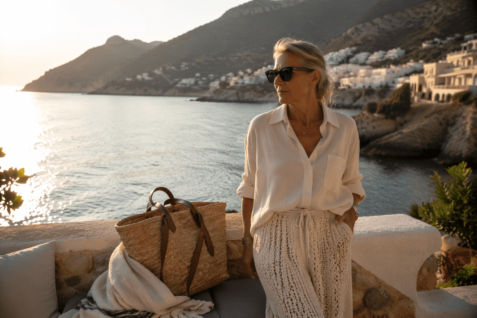
Pucci’s summer 2026 campaign takes the house’s most recognizable language, bold color and fluid print, and drops it right onto the shoreline. That is the appeal: a brand built on jet-set energy is now speaking to the woman who wants her beach look to feel edited, not obvious, with one foot in Riviera fantasy and the other in modern coastal polish.
Archive prints, softened by sea air
The collection, Pucci Summer, is the Maison’s Spring/Summer 2026 beachwear line, and it comes with a sharp point of view. Pucci says the season is “a state of mind” defined by colour, movement and freedom, and that framing matters because it positions beach dressing as something expressive rather than purely practical. The line brings together bikinis, women’s swimsuits, sarongs and accessories, all part of a 140-product offering that gives the brand enough range to move from poolside minimalism to full-print glamour without losing coherence.
The campaign’s styling makes that tension visible. Ocean blues, turquoise, violet, pastel pinks, orange, yellow and lavender create a saturated palette, but the silhouettes stay breezy and wearable. Knotted shirts, bikinis, sarongs, graphic wave leggings and a gold belt build a beach-ready mood that feels polished rather than costume-y, which is exactly why the look lands now. It gives coastal style a charge of color without asking it to abandon ease.
Why Pucci’s beach story still matters
Pucci’s identity has always been tied to the Mediterranean, and this campaign leans into that heritage without freezing it in place. Emilio Pucci founded the brand in 1947 and opened his first boutique in Capri in 1950, placing resort culture at the center of the house from the beginning. That history gives the collection weight, but what keeps it relevant is the way the brand translates that legacy for 2026, not as nostalgia, but as a living wardrobe for sunlit days and warm evenings by the water.

Camille Miceli, Pucci’s artistic director, describes the house’s new direction as “A New Journey,” and this campaign is a clear expression of that shift. Pucci says the collection is a contemporary vision by Miceli that carries the Maison’s archive directly to the water’s edge, which is exactly the right idea for a brand trying to bridge heritage and now. The archive is still there, but it has been stripped of museum stiffness and given movement, air and a little salt.
The coastal-grandmother signal, updated
If coastal-grandmother style has become a real fashion signal, Pucci’s answer is to make it brighter, sharper and less literal. This is not about the overly tidy version of seaside dressing or the nostalgia of a parked-truck beach house fantasy. It is about what happens when a classic resort house takes the codes of ease, sun-bleached light and nautical polish, then filters them through unmistakable print.
That is why the campaign feels culturally relevant. Fashion is still looking for ways to make ease look intentional, and Pucci’s mix of scarf-like sarongs, sculptural belts and graphic leggings does that with far more personality than a neutral-only beach uniform. The house is reminding the market that seaside dressing does not have to disappear into beige to feel sophisticated. It can be loud, elegant and still unmistakably relaxed.
How to wear the look without overdoing it
The strongest lesson here is restraint inside abundance. Pucci’s prints are busy by nature, so the smartest way to wear them is to let one piece carry the mood and keep everything else clean. A knotted printed shirt over a bikini works because it frames the pattern instead of fighting it, while a sarong adds movement without the commitment of a full matching set.

- A printed bikini with a pared-back cover-up for the clearest poolside statement.
- A sarong that moves easily from beach chair to lunch table.
- Graphic wave leggings for anyone who wants Pucci’s visual punch in a more fashion-forward silhouette.
- A gold belt or gold hardware to sharpen the whole look and keep it from drifting too casual.
A few pieces define the formula especially well:
That last detail is important. The gold belt functions like jewelry for the waist, giving the collection a point of polish that keeps the prints from reading as purely playful. It is the difference between beachwear and beach style.
The imagery seals the mood
The campaign’s setting does as much work as the clothes. Sunlit stone, blue sea and warm coastal skies create a backdrop that flatters the palette and reinforces the emotional pitch of the collection: escape, but edited. Tim Elkaim photographs Lulu Tenney, with styling by Emmanuelle Alt, and that combination gives the imagery a clean, high-fashion steadiness even as the clothes stay exuberant.
That balance is what makes the campaign feel newly relevant. It understands that the modern shopper wants impact, but not fuss. Pucci is offering color with discipline, print with airflow, and heritage with enough ease to feel like summer rather than a costume of it. In a market crowded with neutral beachwear, that is a much stronger signal: beach polish can still be vivid, and vivid can still be chic.
This article was produced by Prism’s automated news system from verified source data, official records, and press releases, then run through automated quality and moderation checks before publishing. The system is built and supervised by the people who set the standards it runs under. Read our full AI policy.
Did this article answer your question?