Julian Klausner drapes Dries Van Noten in quiet luxury dreamscape
Klausner’s Dries Van Noten turned pale layering, chiffon, and washed silk into masculine quiet luxury, even in a Paris heatwave.
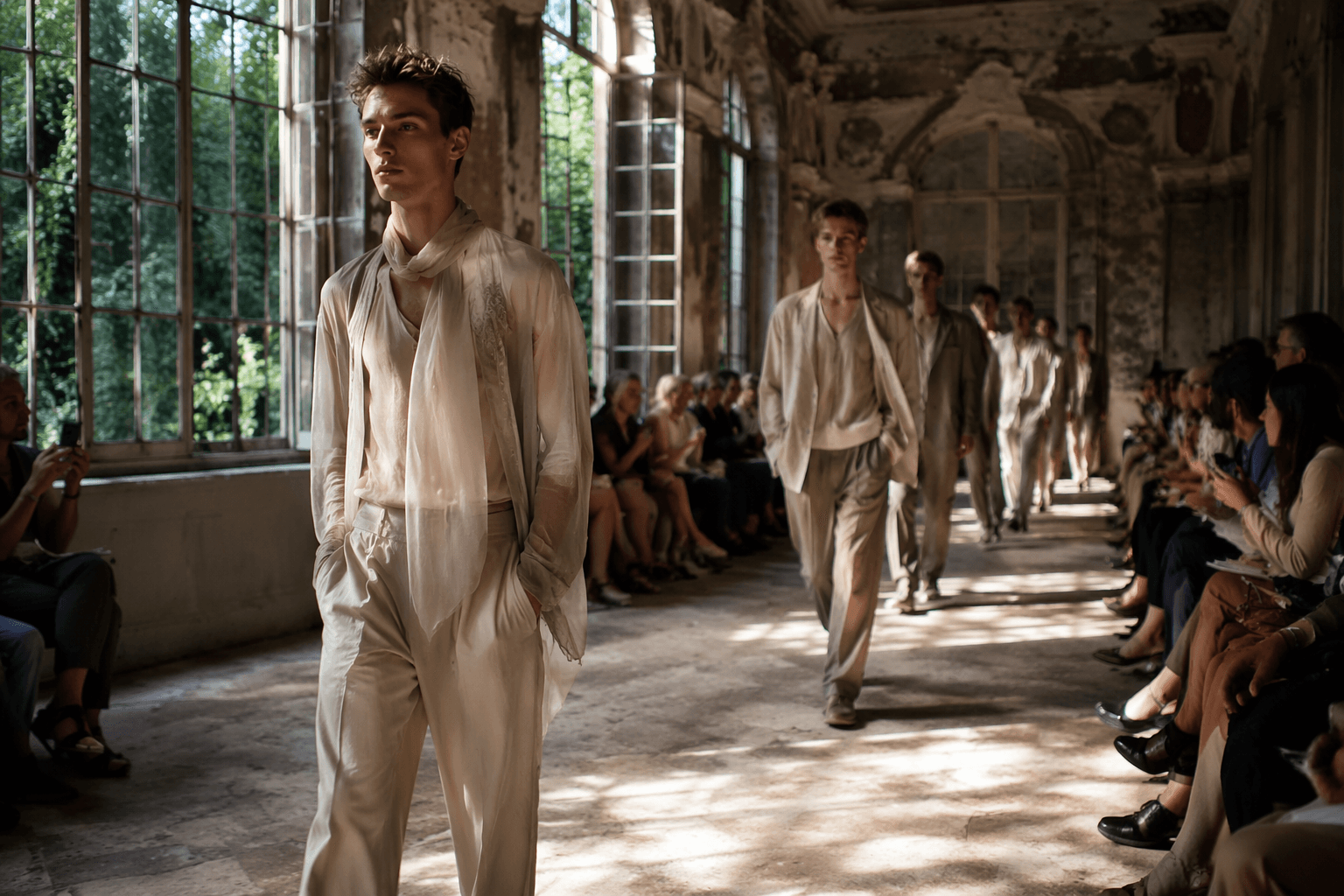
Dries Van Noten’s men’s Spring/Summer 2027 collection ran to 61 looks of peachy neutrals, powdery tones, and tonal layering that moved like a heat haze instead of a hard runway statement. Julian Klausner stripped the house down to its softest register and made that softness look expensive. In a season obsessed with swagger, this was a lesson in aristocratic ease: delicate, controlled, and masculine without ever turning stiff.
Softness, but make it look wealthy
The smartest thing about the collection is how little it tried to fight its own fragility. It was a dreamscape of pale color and airy construction, built from the thinnest, breeziest fabrics in the room, including washed silks, chiffon, watery nylons, and sheer knits. That mix gave the clothes a floating quality, but not a flimsy one. The finish stayed polished, the palette stayed disciplined, and the entire exercise felt adjacent to quiet luxury without falling into that category’s usual blandness.
This is where Dries gets interesting under Klausner. The label has always understood texture better than most houses, and here he pushed that instinct toward softness rather than ornament. Pale color did the heavy lifting, but it was the layering that gave the clothes their depth, letting one translucent note bleed into the next until the whole thing looked washed by light.
The collection was framed around sensuality. In the show notes, Klausner described it as "the idea of sensuality," "soft and intimate," and "loose, delicate, easy to remove, ready to fly away." That is exactly the register on the runway. Nothing felt armored. Nothing looked overworked. The clothes seemed designed to skim the body rather than command it, which is a much harder trick to pull off than tailoring that simply looks sharp.
What the heatwave did to the show
The setting made the clothes read even better. The presentation took place on June 25, 2026, during Paris Fashion Week, and the city was in the grip of a punishing heatwave that turned the show into a kind of visual relief. Front-row fans and a stark white set sharpened the collection’s whole idea: clothes that seem to exhale.
The severe Paris weather and the pared-back venue amplified the fabrics’ airiness and made the pale palette feel practical, not precious. A white fan in a blazing room is not a gimmick here, it is part of the styling language. The show’s coolness came from contrast, with the clothes offering a sense of shade against the outside temperature and the white set keeping everything crisp.
The natural reference points hovered without being over-illustrated, with a dreamlike atmosphere and a trace of Stéphane Mallarmé’s *L’Après-midi d’un faune*.
Klausner is not breaking Dries, he is tightening the codes
Klausner was appointed creative director of Dries Van Noten in December 2024, after founder Dries Van Noten retired from his namesake label in June 2024 following nearly four decades in fashion. The handoff has read as a continuity story from the start, and this collection makes sense inside that frame: not a reset, but a refinement.
The men’s Spring/Summer 2027 show is Klausner’s third menswear collection for the house and his second full menswear runway presentation after debuting menswear in June 2025. The clothes no longer read like an incoming designer testing the edges. They read like someone now comfortable enough to push the language of the brand into thinner, lighter, more intimate territory while still keeping Dries’ old strengths intact. The Belgian label’s long-running love of color, texture, and poetic layering is still there, just softened at the seams.
Dries Van Noten under Klausner is not selling vulgar luxury or nostalgia cosplay. It is showing how pale tones, tonal dressing, and nearly weightless fabrics can communicate composure without looking severe.

How to translate the look without losing the point
The runway logic is simple, even if the execution is not. The collection makes three things clear:
- Keep the palette narrow, with peach, cream, powder, and washed neutrals doing the work.
- Let fabrics move, choosing silk, chiffon, sheer knits, or similarly light cloth over anything too structured.
- Build depth through tonal layering so the look feels composed, not costume-y.
This article was produced by Prism’s automated news system from verified source data, official records, and press releases, then run through automated quality and moderation checks before publishing. The system is built and supervised by the people who set the standards it runs under. Read our full AI policy.
Did this article answer your question?