Queen Elizabeth II's pocketed bouclé portrait redefined old-money elegance
Hands in her pockets, Queen Elizabeth II made bouclé feel subversive. The image turned royal restraint into the sharpest old-money flex.
The pocket pose that changed the mood
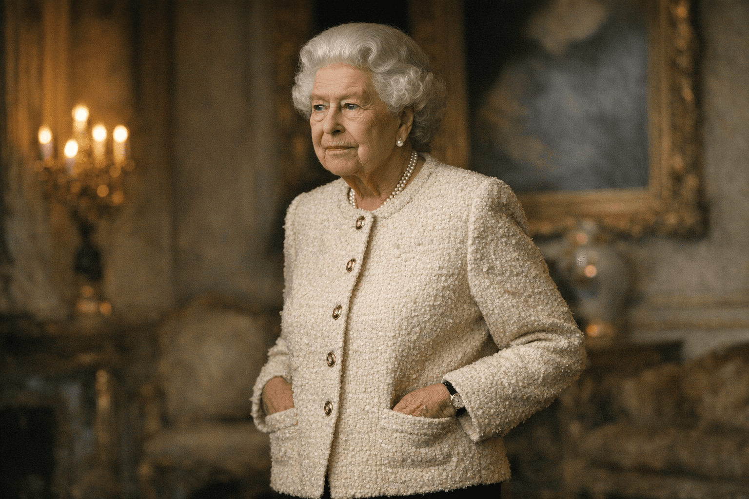
The sharpest thing about Queen Elizabeth II’s pocketed bouclé portrait is how little it seems to be trying. At Windsor Castle in March 2019, Chris Jackson caught her in a pose the palace had long avoided: shoulders easy, hands in her pockets, expression calm enough to feel almost off-duty. That looseness is exactly why the picture still lands. It takes the most formal image in the world and lets in a little air.
For old-money fashion, that is the whole lesson. Status does not always announce itself with tension. Sometimes it looks like a woman in impeccable tailoring, wearing heritage fabric, standing still enough to make confidence look inherited.
Why it reads as old-money, not casual
This portrait works because every soft detail is anchored by structure. The bouclé gives the image texture and depth, the kind of surface that catches light without screaming for it. Her pose softens the frame, but the insignia keeps it anchored in authority: she was wearing her Canadian insignia as Sovereign of the Order of Canada and the Order of Military Merit in the official Canadian portrait.
That balance is what separates old-money polish from plain casual dressing. The clothes do not beg for attention. The line of the jacket is clean, the fabric has weight, and the body language is relaxed without turning sloppy. It is the same code that makes a perfect navy blazer, a menswear-inspired trouser, or a cashmere coat feel expensive before the label is even considered.
Angela Kelly, the Queen’s longtime dresser and then Personal Advisor, Curator, Wardrobe and In-house Designer, wrote in her book *The Other Side of the Coin: The Queen, the Dresser and the Wardrobe* that the Queen wanted to be photographed more informally and wanted the freedom to pose with her hands in her pockets. Kelly said she asked the Queen to do exactly that for the image. That detail matters because it flips the old assumption that restraint always means rigidity. Here, restraint is the point, but it is paired with permission.
The fear around the pose was the reason it worked
The pocket pose was not an obvious palace move. Kelly wrote that the Queen Mother and senior advisers had previously warned against it as inappropriate for public view. That hesitation is part of what makes the final image feel so modern. The portrait is not rebellious, but it is quietly disruptive, the way the best style always is when it slips one rule just enough to make the rest look sharper.
HELLO! described the moment as a “royal first” for the late Queen, and that phrase feels right because the portrait has the energy of someone who finally understood that formality does not have to mean stiffness. The result is not casual in the everyday sense. It is controlled ease, which is a much more expensive-looking thing.
Why the portrait traveled beyond royal-watch circles
The image became Canada’s official portrait of Queen Elizabeth II when the Canadian government released it on October 16, 2020. Canada said it would be displayed in government buildings, schools, embassies, and high commissions, which explains why the portrait had to work as more than a nice photograph. It had to function as a symbol, one that could carry across public institutions without losing its authority.
That wider use is part of why the image resonated outside royal circles. Canada.ca identifies it as the last official Canadian portrait of Queen Elizabeth II, taken at Windsor Castle in March 2019, and the Legislative Assembly of Ontario also notes that the portrait was taken there in March 2019. The context matters because it places the image in the long machinery of state portraiture, where clothing, posture, and insignia all do the talking before the face does.
How to read the old-money code in the picture
If you want the style lesson stripped down, it comes down to three things: texture, posture, and restraint. Bouclé brings in the heritage signal. The pocket pose brings in ease. The insignia keeps the whole thing from tipping into softness. Nothing is over-accessorized, nothing is over-explained, and that is exactly why it feels authoritative.
That is also why the image still feels current in a wardrobe landscape obsessed with “quiet luxury” but often missing the point. Quiet luxury is not just beige clothes and low logos. It is the confidence to let cloth, cut, and presence carry the look. In this portrait, the Queen does not need to perform grandeur. The tailoring does that for her.
The modernity here is subtle but real. She looks less like a ceremonial figure frozen in protocol and more like someone who understands how a body can change the temperature of a formal image. That is why the photograph reads with the same clarity as a great runway exit: not because it is loud, but because it is absolutely sure of itself.
How the look translates now
The easiest way to borrow this energy is to stop treating polish like decoration and start treating it like discipline. Old-money dressing is strongest when the clothes feel settled on the body, not styled into submission. A bouclé jacket, a tailored coat, a structured skirt, or a strong shoulder all get better when the rest of the look leaves room to breathe.
- Choose fabrics with visible texture, not just smooth shine. Bouclé, tweed, and brushed wool do the visual heavy lifting.
- Keep the silhouette calm. A clean shoulder, a straight line, and a hem that does not fuss tell a more expensive story than anything overworked.
- Let posture do part of the styling. A relaxed stance can make formal clothes feel current without making them look careless.
- Use one signifier of heritage or institution, then stop. In the Queen’s case, the Canadian insignia did that job with precision.
The reason this portrait endures is that it understands a hard truth about status: authority is often strongest when it looks unforced. Queen Elizabeth II’s pocketed bouclé image did not dilute the monarchy. It modernized its surface without stripping away its weight, and that is why the frame still feels like a master class in old-money ease.
This article was produced by Prism’s automated news system from verified source data, official records, and press releases, then run through automated quality and moderation checks before publishing. The system is built and supervised by the people who set the standards it runs under. Read our full AI policy.
Did this article answer your question?