Toile de Jouy Returns, From French Royal Heritage to Summer Style
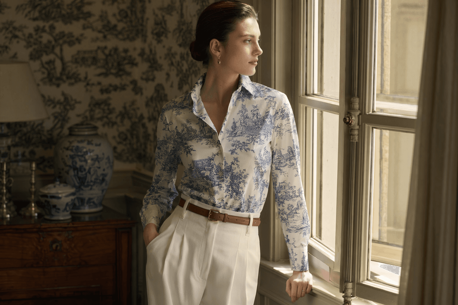
Toile de Jouy looks expensive when it is treated like architecture, not whimsy. One printed piece, clean tailoring, and neutral accessories keep it in old-money territory.

The print that survives because it knows how to behave
Toile de Jouy is back, but the smartest way to wear it is not as a costume piece. The print feels richest when it is handled with discipline: one panel of fabric, a sharp silhouette, and a palette that stays close to white, navy, cream, or black so the pattern reads as heritage, not novelty. That is where the French-aristocratic romance and the Dior pedigree matter. They give the print status; restraint gives it style.
Why Toile de Jouy still reads expensive
The story starts in Jouy-en-Josas near Versailles, where Christophe-Philippe Oberkampf founded the factory in 1760. Britannica traces Toile de Jouy to cotton or linen printed with landscapes and figures, and by 1770 the factory had moved from woodblocks to copperplates, which gave the prints more precision and detail. The Metropolitan Museum of Art notes that Louis XVI granted the factory the title Manufacture Royale in 1783, Napoleon I awarded it the Legion of Honor in 1806, and the operation employed about 1,000 workers in the late 18th century.
The labor behind that polish is part of the appeal. Women made up one-third to one-half of the workforce at different times, and female printers earned half the pay of male printers. So yes, Toile de Jouy is elegant, but it is also industrial, technical, and built on real hands. That is why it still has authority. It was never just a sweet pastoral print floating in from nowhere.
One of the factory’s best-known works, “Les Travaux de la Manufacture,” depicts the textile-making process itself, which is exactly the sort of self-aware craftsmanship that keeps the pattern from feeling flimsy. The Metropolitan Museum of Art also notes that pictorial printed cottons are commonly referred to as toile de jouy, which says everything about how fully the motif has become shorthand for French refinement and leisure.
Why it is back on the style radar
The timing makes sense. WWD reported that buyers at Paris Fashion Week were moving away from quiet luxury and toward something more romantic and expressive, and that shift gives Toile de Jouy a real opening. This is a print that lives between old money and personality: decorative, but not loud; historical, but not dusty; pretty, but still structured enough to work with tailoring.
That balance is what makes it feel current now. The best way to wear it is to let the print be the statement and keep everything else quiet. Toile de Jouy already carries Versailles, Oberkampf, royal favor, imperial recognition, and a whole archive of French visual memory. It does not need extra drama from the rest of the outfit.
How Dior keeps it from looking like wallpaper
Dior has done the most to keep Toile de Jouy alive in modern wardrobes. The house describes it as a beloved timeless signature that is constantly reinvented in Dior Maison, and Maria Grazia Chiuri has reworked it across women’s fashion and home pieces, including Limoges porcelain and cushions made with French and Italian ateliers. That matters because Dior is not treating the pattern like a one-season novelty. It is treating it like a house code.
The clearest fashion example is Dior’s Toile de Jouy Sauvage silk top for Fall 2024, cut in white and navy blue silk twill with hand-rolled edges, a Christian Dior signature, and a jacquard band. Dior positions it as a new way to wear a silk square scarf, which is exactly the right instinct. Toile de Jouy works best when it is folded, wrapped, or shaped into something precise. The print looks luxe when the execution is exact.
The homeware follows the same logic. Dior’s Toile de Jouy tableware includes an oval platter in white and blue, along with other pieces framed as part of the house’s French savoir-faire and Dior spirit. That crossover between wardrobe and table is not random. It reinforces what the print has always been: a marker of cultivated taste, whether it is worn, served on, or draped across a sofa.
The rules for wearing it without tipping into costume
Toile de Jouy is at its best when it acts like a single statement and nothing else. If the print is already carrying the story, the rest of the look should step back and let it speak.
- Wear one printed piece at a time. A silk top, skirt, dress, or scarf is enough. Stack multiple motifs and the look veers from polished to theme-party fast.
- Keep the palette neutral. White, navy, cream, sand, black, and soft tan let the pattern read as expensive and controlled. The Dior example works because white and navy blue feel crisp, not sugary.
- Choose tailoring over sweetness. A sharper shoulder, a clean hem, or a structured waist keeps the print in old-money territory. Toile de Jouy looks better against discipline than against excess fabric and frills.
- Use accessories that disappear into the outfit. Neutral leather, polished hardware, and simple shapes let the fabric stay center stage. The point is not to decorate the print, but to frame it.
- Let the silhouette do one job only. If the print is romantic, the shape should be clean. If the cut is relaxed and resort-ready, keep the lines long and uncluttered so it feels intentional rather than costume-like.
That formula works for city lunch, a coastal weekend, or a warm-weather event. A Toile de Jouy top with tailored trousers feels sharper than a full print explosion; a printed skirt with a plain fitted knit reads richer than anything overworked. The motif does not need help. It needs editing.
Why this heritage print still lands now
Toile de Jouy keeps coming back because it gives you history without heaviness. It comes from Jouy-en-Josas near Versailles, from Oberkampf’s factory, from royal favor under Louis XVI and imperial recognition under Napoleon I, and it still feels fresh when cut into a modern silhouette. That mix is rare. Most statement prints either scream trend or collapse into nostalgia. Toile de Jouy survives because it can be made to look disciplined.
That is the whole trick with old-money style right now. The cheapest way to look rich is not a logo and not maximalist print overload. It is restraint, clean lines, and the confidence to let one beautifully made pattern carry the room.
This article was produced by Prism’s automated news system from verified source data, official records, and press releases, then run through automated quality and moderation checks before publishing. The system is built and supervised by the people who set the standards it runs under. Read our full AI policy.
Did this article answer your question?