The Army Painter explains layering for clearer miniature shading
Layering is the brush-control move that turns flat miniatures into readable volume. The Army Painter's refresher shows when it beats faster shortcuts and how to keep blends clean.
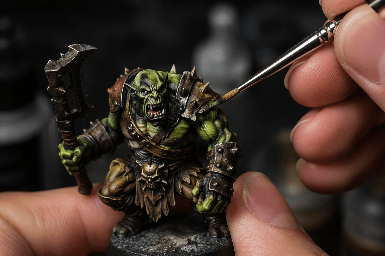
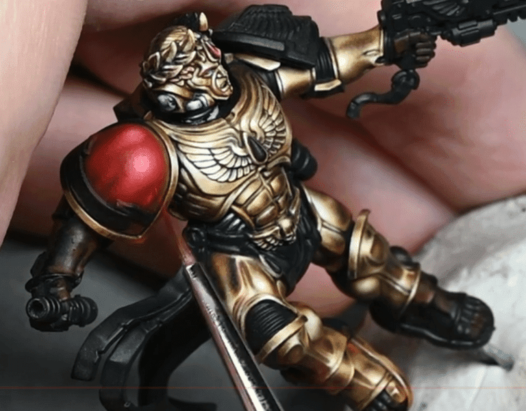
A shoulder pad reads as a shoulder pad instead of a flat patch of color when each highlight covers a slightly smaller area than the last. In a July 2, 2026 entry, The Army Painter defines layering not as “putting more paint on,” but as a controlled way to shape light and volume by building highlights and shadows in successive passes. That is why the finish looks like depth instead of a single blunt coat.
What layering is actually doing
Layering leaves some of the previous stage visible, so the eye can read a transition from dark to midtone to light across armor plates, cloth folds, faces, and raised trim. The effect is subtle at the brush, but obvious at arm’s length, which is exactly where most tabletop miniatures live.
Layering sits in the middle of the hobby ladder, more deliberate than a quick basecoat, but still practical for troops, characters, and display pieces. That makes it useful whether you are trying to clean up a rank of infantry or push a single hero model toward a competition finish.
When layering is the right tool
Layering earns its place when you want control more than speed. If a model needs a crisp cheekbone, a readable cloak fold, or a helmet ridge that catches the light in the right place, layering gives you a way to place that highlight exactly where you want it. Speed-first shortcuts can leave a model finished faster, but they often flatten the sculpt or let the paint do too much of the work on its own.
It is especially strong on pieces that have clear volumes and obvious focal points. Armor, tabards, capes, and faces all reward the technique because each pass can tighten the transition and increase contrast without losing the shape underneath. It is also a better fit when you are judging the model from tabletop distance and still want the silhouette and the forms to read cleanly.
Tabletop-standard versus display-level use
Warhammer Community defines Battle Ready as an accessible tabletop standard, while Parade Ready is the next step up, and that higher standard explicitly uses Layer paints to add richness to miniatures.
A Battle Ready model can rely on enough contrast to look good in play, while Parade Ready asks for more refinement in the transitions and color placement. Layering and glazing are commonly used alongside washes, drybrushing, and edge highlighting as part of a broader painting system.
Citadel Layer paints have been part of that system for over a decade, and a June 2, 2014 Warhammer Community video showed Duncan using them to highlight and build up colors on miniatures. Layer paints remain the workhorse for painters who want to add controlled brightness without jumping straight from basecoat to final edge.
Why layering and glazing go together
Layering is about building opacity and shape in stages. Glazing uses thinned paint and a transparent layer to create soft shading, subtle transitions, knock back sharp highlights, and tint areas with other colors. That makes glazing the cleaner, softer tool, while layering is the more structural one.
The two techniques solve different problems, and the strongest blends usually use both. Golden Demon winners use layering and glazing to achieve advanced blends and fix mistakes. Andy Wardle put it plainly: “When I got the hang of blending, using layering and some glazing to fix mistakes, I felt like I could achieve whatever I wanted with the right amount of time.”
Use layering when you need to place form, recover clarity, or push contrast in a controlled way. Reach for glazing when the transition is already there and you want to soften, tint, or calm an edge that reads too hard.
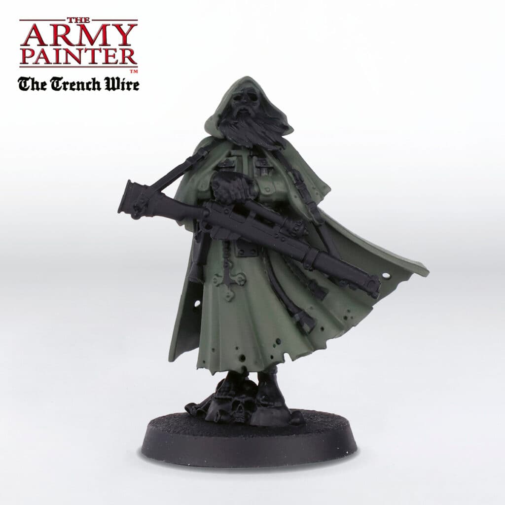
The mistakes that make layered blends look chalky or patchy
Most weak layering comes from ignoring the technique’s core spacing. If every layer spreads just as far as the base color, the surface stops reading as volume and starts reading as a series of flat repaints. That is when blends go patchy, because the eye sees separate zones instead of a gradual shift.
Paint consistency matters just as much. A layer that is too thick can turn chalky and obscure the smoother transitions underneath, especially on light colors and raised edges where you want the brightest areas to stay clean. The fix is simple in concept, if not always in execution: keep the earlier shapes visible, work the highlight inward, and let each step sharpen the form instead of flooding it.
There is also a judgment call in how far to push the layering before switching to glazing. If the model needs more richness but the transition is already in place, glazing can tie the stages together and hide a rough seam. That is why advanced painters treat the two methods as companions rather than rivals, using each one where it solves a different part of the problem.
A technique that still matters at every level
Richard Gray has said White Dwarf and Golden Demon features were a major catalyst for his own journey.
This article was produced by Prism’s automated news system from verified source data, official records, and press releases, then run through automated quality and moderation checks before publishing. The system is built and supervised by the people who set the standards it runs under. Read our full AI policy.
Did this article answer your question?