Warhammer Community Skaven art gallery spotlights the faction’s grimy menace
Skaven art still does the heavy lifting for painters, and this gallery is a clear roadmap for grime, glow, and clan identity on modern kits.
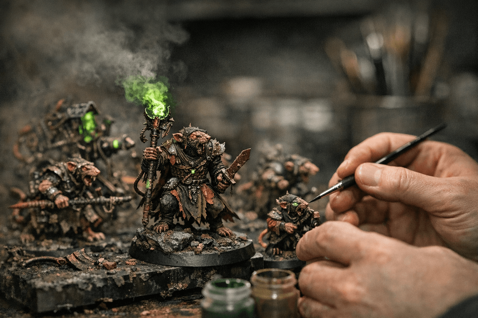
The look that makes Skaven instantly readable
Warhammer Community’s Skaven art gallery lands as more than a nostalgia trip. It is a sharp reminder that Skaven are one of Warhammer Age of Sigmar’s most recognisable factions because their visual language is so extreme: rotten fur, rusted metal, warpstone glow, and a frantic sense of movement that makes every image feel unstable. The gallery gathers art across the history of the Horned Rat’s children, and that makes it a useful reference for anyone trying to decide how far to push a Skaven army toward filthy realism or stylised studio brightness.
That matters because Skaven are easiest to paint well when every surface works together. If the fur is dull and dirty, the armour needs to feel corroded. If the warpstone glows hard and bright, the rest of the model has to stay grimy enough to make the contrast hit. The art gallery is valuable precisely because it reinforces that balance, showing how Games Workshop wants the faction to read at a glance: dangerous, degraded, and barely held together.
Classic menace versus modern contrast
The strongest takeaway from the gallery is how much Skaven art has always depended on contrast, even when the style changes. Older images lean harder into murk and filth, with heavy shadows, warped silhouettes, and a more decomposed sense of texture. Those cues translate well if you want an old-school army that feels like it crawled out of Blight City and never saw clean water again.
The newer studio direction is often cleaner and more aggressive in composition. Warpstone reads brighter, armour edges catch harder light, and the faction identity is pushed through bolder colour separation. That approach is especially useful on today’s models, where finer sculpted details can disappear if everything is drowned in brown and black. The trick is not choosing between “grimy” and “bright,” but deciding which one carries the main read and which one supports it.
- Use fur as a mass texture, not a single colour field.
- Let rust and chipped metal define weaponry and armour.
- Reserve the brightest green for warpstone, eyes, or magical effects.
- Keep cloth and leather muted so the models do not turn into visual noise.
- Push clan identity through selective accent colours rather than repainting every surface.
For painters, the most usable cues from the gallery are simple:
What to steal from the art when painting modern Skaven
The best part of a gallery like this is that it acts like a reference library for practical decisions. You can pull palette ideas directly from the images without copying them outright. Fur can range from ash-grey to filthy tan, but it works best when the highlights are sharp enough to separate individual rats in a unit. Rust should look layered, not flat, with warm browns under orange oxidation so the weapons feel old enough to be dangerous.
Warpstone glow is where modern Skaven painting can really sing. The art often treats that energy as the faction’s visual heartbeat, and that gives painters permission to go brighter than they might on other Chaos armies. A strong glow effect on blades, lamps, and tokens instantly says Skaven, especially when it sits against broken metal and dirt. If you want a more classic look, mute the glow and let the models feel contaminated rather than radioactive; if you want the newer studio style, turn the saturation up and let the green dominate small, controlled areas.
Clan identity also matters more than many painters first think. The art history of the faction shows that Skaven are not just one mass of rats, but a network of competing schemes. That means colour accents, banners, tattoos, and wargear details can do a lot of work. A unit can stay uniformly dirty while still feeling like Clan Eshin, Clan Skryre, or another corner of the underempire just by changing a few high-impact details.
Why this gallery matters right now
This is not a rules reveal, but it still lands as a current hobby story because Skaven are being pushed hard across Games Workshop’s current Age of Sigmar coverage. The official faction page describes them as a Chaos-warped race that has schemed and plotted for centuries, and recent coverage has leaned into the fact that they are now in the ascendent. That rise is tied to the Great Horned Rat joining the pantheon of Chaos gods, with the Vermindoom described as a major lore shift reshaping the Mortal Realms.
That broader push gives the art gallery extra weight. It is not just looking backward at old images, it is reinforcing the way the faction should feel in the present day: frenetic, diseased, and more central to the setting than ever. Games Workshop has also tied the faction into fresh product support through Battletome: Skaven, which includes background lore, rules, and miniatures galleries, plus Spearhead: City of Ash, where the Skaven share the stage in a new boxed set alongside the Cities of Sigmar force.
For painters, that means the official visual direction is not drifting. It is tightening. The art, the battletome, the new miniatures, and the city-fighting imagery around City of Ash all point in the same direction: Skaven should look like they have erupted into the Mortal Realms with filth, speed, and a sense that every blade and banner has survived too many bad decisions.
The gallery as a roadmap for your army
If you are choosing a direction for a Skaven collection, this gallery gives you a clean decision tree. Go old-school if you want oppressive shadows, muddy textures, and a more horror-driven look. Go modern if you want the army to pop on the table with high-contrast edges, bright warpstone effects, and cleaner faction reads across large units. Both approaches work, but they solve different problems.
The key is consistency. A Skaven force looks strongest when the fur, rust, and glow all agree on the same tone of corruption. The art feature shows that the faction’s identity has never depended on neatness; it depends on motion, grime, and visual overload. Use the gallery as a reminder that even the most chaotic army still needs a clear silhouette and a few bold colour choices to read well.
The fact that Warhammer Community says the next art installment will focus on Nighthaunt also tells you this is part of an ongoing visual series, not a one-off detour. That makes the Skaven gallery a useful checkpoint in a broader stream of faction art, and for painters it is exactly the kind of reference drop that can shape a project before the first primer ever hits the model.
This article was produced by Prism’s automated news system from verified source data, official records, and press releases, then run through automated quality and moderation checks before publishing. The system is built and supervised by the people who set the standards it runs under. Read our full AI policy.
Did this article answer your question?


