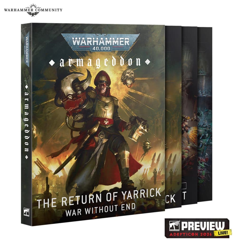
Eavy Metal reveals how Warhammer 40k Armageddon box art came together
Armageddon’s box art is a painting brief in disguise, with softer Ork skin, narrative Marine poses, and 728 transfers shaping the new edition’s identity.
Games Workshop’s Armageddon launch set is doing more than opening a new edition of Warhammer 40,000. The ’Eavy Metal team has turned it into a statement piece, using the box art to sell the models’ personality, the setting’s exhaustion, and the scale of the war before a single unit hits the tabletop. Tom and Connor’s round-table breakdown shows how that look was built from the ground up, and it gives painters a clear roadmap for copying the same visual language on their own starter-set miniatures.
The official Armageddon brief
Armageddon was unveiled as the launch set for the new edition of Warhammer 40,000 at AdeptiCon 2026 in March, then shown in full in an unboxing on 1 May 2026, before pre-orders opened on 6 June 2026. Games Workshop called it the biggest Warhammer 40,000 launch set yet, and the contents back that up: 61 brand new miniatures split between Space Marines and Orks, plus the Core Rulebook, Operation: Imperator, Chapter Approved 2026-27, the Dominatus campaign deck, datacards, and a transfer sheet. That means the box art had to do a lot of work at once, presenting the new edition, the factions, and the campaign story in one glance.
The story framing matters because it shapes the miniatures’ visual identity. The Ork horde has swelled after Ghazghkull Thraka’s return to Armageddon, while the Space Marines are pushing Operation Imperator to stop the world from collapsing under pressure. In practice, that gives the painters a strong contrast to work with: one side should feel savage, crowded, and brutish, while the other needs to look disciplined, battered, and still proud enough to carry a campaign on their shoulders.
How the Orks were painted
Tom’s biggest Ork takeaway is the skin. He explains that this generation leans a little more naturalistic, with skin that is slightly lighter, less saturated, and built with more variation so the models read as living creatures instead of flat green shapes. The key is not abandoning the classic Ork look. The team deliberately kept the new range compatible with existing painted collections, so a mixed mob of darker Orks, lighter Orks, and older schemes still feels coherent on the shelf and on the table.
That is the practical lesson to steal for your own box: push the face and limbs to feel fleshy, not monochrome. Tom points to blending tonal shifts through the elbows, ears, nose, and lips, with darker lips and visible transitions that create those instant visual hooks you get from real skin. If you are painting the new Armageddon Orks, that means reserving the most saturated greens for selective accents and using softer blends elsewhere so the models keep their bite without becoming cartoonishly uniform.
Tom also singles out the Big Boss as the kind of model the whole project benefits from. He likes the mean pose, the musculature, and the balance between fun details and broad flat panels, because those surfaces make room for chequer patterns and freehand glyphs. That is a very box-art-friendly design choice, and it translates directly to hobby desks: on the biggest Ork character in the set, use the open cloth and armour plates to add one or two bold identity marks rather than crowding every inch with effects.
How the Space Marines were staged
Connor’s favourite part of the set is the new Intercessors, and his reasons are exactly the reasons they work so well in the Armageddon presentation. He calls out the grenade thrower, the combat blade fighter, and the auspex operator as examples of how the kit feels less like anonymous rank-and-file and more like a Tactical Squad with individual heroes. That kind of pose variety is one of the strongest visual cues in the whole launch box, because it makes the force look like it is operating under fire rather than standing in a sterile parade line.

The boxed set’s Space Marines support that same idea through their armour treatment. The Intercessors wear helmets and plating drawn from different marks of power armour, a patch-job look that reflects long attritional warfare, and the Captain, Librarian, Chaplain with Jump Pack, and Ancient all add their own narrative weight. The Ancient’s banner, in particular, is built for freehand or transfer work, which is exactly the sort of surface you want if you are trying to make a starter-set force look like it belongs in a campaign, not just in a demo cabinet.
Transfers, Chapter identity, and campaign markings
Armageddon’s transfer sheet is one of the most useful pieces in the whole box for copying the studio look. It includes 728 high-quality waterslide transfers, with Chapter symbols for the Ultramarines, Blood Angels, Salamanders, Crimson Fists, and White Scars, plus Ork glyphs and other markings. That gives you the fastest route to making the launch set feel official, because the box art is not just about neat paintwork, it is about clear faction identity at a glance.
Operation Imperator sharpens that identity even further. The lore book focuses on the Blood Angels, Salamanders, Crimson Fists, Ultramarines, Black Templars, and White Scars, while also covering the Goffs, Evil Sunz, Deathskulls, Bad Moons, Snakebites, and Blood Axes on the Ork side. Warhammer Community also notes that the Blood Angels have a long history of defending Armageddon, which helps explain why the campaign feels like a gathering of old grudges rather than a random cross-section of Chapters.
What to copy on your own launch-set minis
The Armageddon box art works because it commits to a few clear choices and repeats them across the whole range. If you want the same effect on your own starter set, keep the focus on three things:
- Use a slightly more subdued Ork green, with visible tonal variation and shaded facial features.
- Treat Space Marine armour as field-repaired wargear, not pristine parade plate, and mix marks where the sculpts invite it.
- Reserve the cleanest, boldest details for transfer-ready surfaces like banners, shoulder pads, glyph plates, and flat armour panels.
- Give each model a job in the scene, even if you are only painting one box, so the force reads like a squad with a purpose.
That is the real achievement of the Armageddon box art: it turns a launch set into a story about identity. The Orks look alive, the Marines look committed, and the whole presentation feels like a war zone you can build in plastic and paint into a campaign.
This article was produced by Prism’s automated news system from verified source data, official records, and press releases, then run through automated quality and moderation checks before publishing. The system is built and supervised by the people who set the standards it runs under. Read our full AI policy.
Know something we missed? Have a correction or additional information?
Submit a Tip