Tacori refreshes branding to spotlight heritage, craftsmanship and Crescent motif
Tacori’s new identity pushes beyond bridal shots, using color, type and imagery to frame its Crescent motif, California craft and Romania-to-California family story.
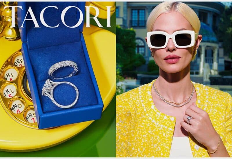
Tacori is recasting itself with a sharper visual language that puts its Crescent motif, family history and California workshop at the center of the frame. The refresh updates the brand’s color palette, imagery and messaging, and it was developed with Studio Jae Jun Kim to give Tacori a clearer point of view and a more complete expression of who the company is.
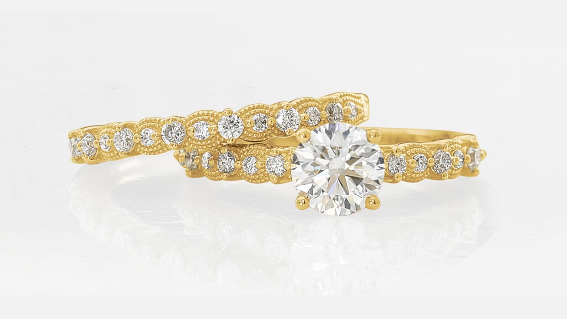
The new system starts with the logo, which was shaped by Tacori’s signature Crescent design. The jeweler describes that Crescent as sculptural, with subtle thick-to-thin movement that echoes the hand-engraving and metalwork found across its jewelry. A fresh font joins the update, helping move the brand away from generic bridal polish and toward something more characterful, with narrative and wit built into the presentation.
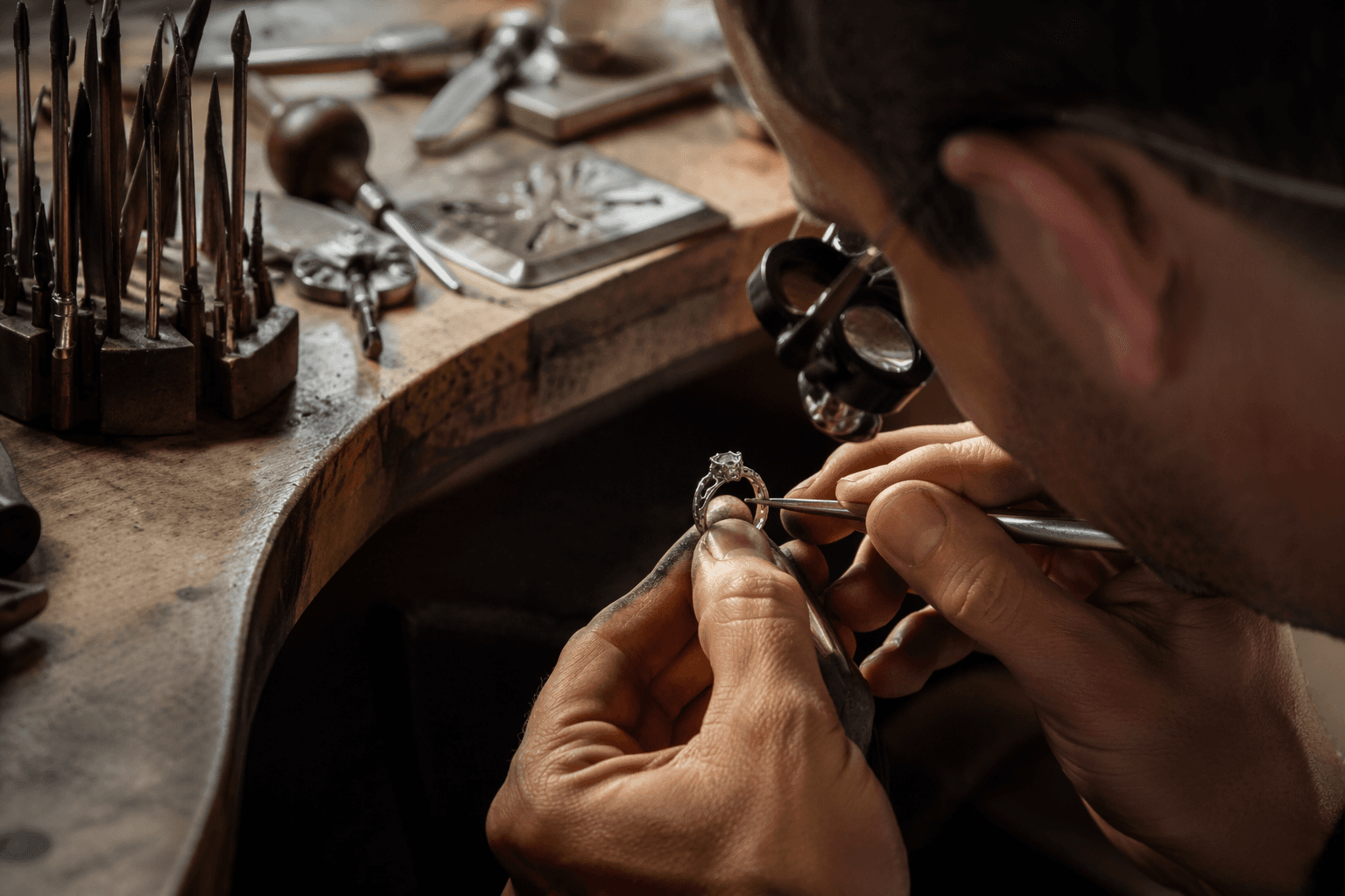
That matters for a house like Tacori, which has long sold more than a product line. The company is rooted in the story of founders Gilda Balian and Haig Tacorian, whose family history begins in Romania before the business moved to California. Tacori says every piece is handcrafted by artisans in California, a detail that gives the brand’s luxury positioning a more tangible claim than mood-board language alone.
The Crescent itself carries the weight of the rebrand. Tacori says the design was introduced in 1998 and has become one of its most recognizable visual signatures. In an industry where many jewelers rely on interchangeable romance tropes, Tacori is leaning on a shape that already belongs to it, then building the rest of the identity around that form rather than treating it as a decorative afterthought.
The timing also tracks with a wider effort to elevate how Tacori is presented to shoppers. In February 2025, the company announced a luxury shop-in-shop fine jewelry experience in 15 Tacori authorized retailers, while recent celebrity styling and fashion collaborations have kept the name visible beyond the wedding case. The latest refresh suggests Tacori wants that visibility to read as a coherent brand story, not just scattered moments of exposure. For a family-owned jeweler competing in a crowded luxury field, clearer imagery and a stronger point of view can matter as much as the stones themselves.
This article was produced by Prism’s automated news system from verified source data, official records, and press releases, then run through automated quality and moderation checks before publishing. The system is built and supervised by the people who set the standards it runs under. Read our full AI policy.
Did this article answer your question?