Monica Rich Kosann refreshes monogram with Art Deco-inspired personalization tools
Monica Rich Kosann turned her Art Deco monogram into a digital personalization tool, pairing it with marigold packaging and a more heirloom-minded brand refresh.
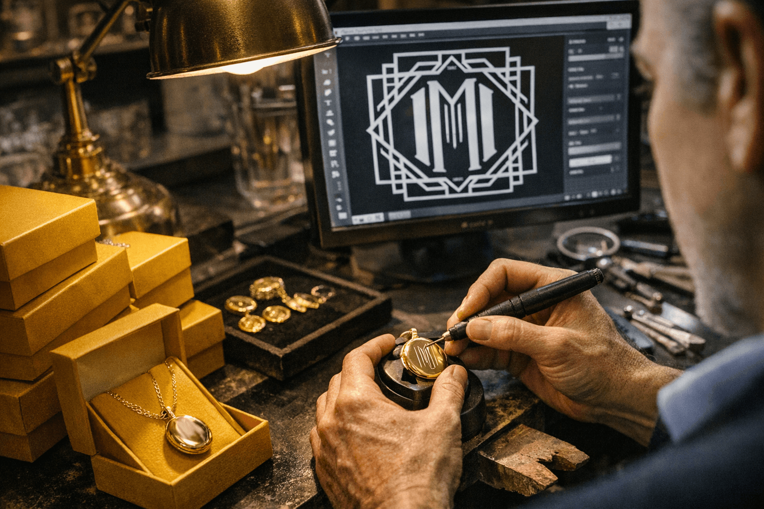
Monica Rich Kosann has made a business out of turning memory into jewelry, and her latest refresh pushes that idea into the digital age. The brand has redrawn its long-running monogram with an Art Deco-inspired look and added an online tool that lets shoppers create initials in the same style, a move that makes the house signature feel less like a logo and more like a piece of personal ornament.
The update arrives alongside a broader brand reset that includes a new color, marigold, and a company-wide visual shift centered on the monogram. Kosann has described the effort as a way to thank customers while giving them a more elevated, meaningful experience, which fits neatly with the brand’s “Your Story, Not Ours” ethos. In jewelry, that distinction matters: personalization only feels luxurious when the design language is strong enough to stand on its own, and the Deco geometry gives the monogram the crispness of a true motif rather than a novelty flourish.
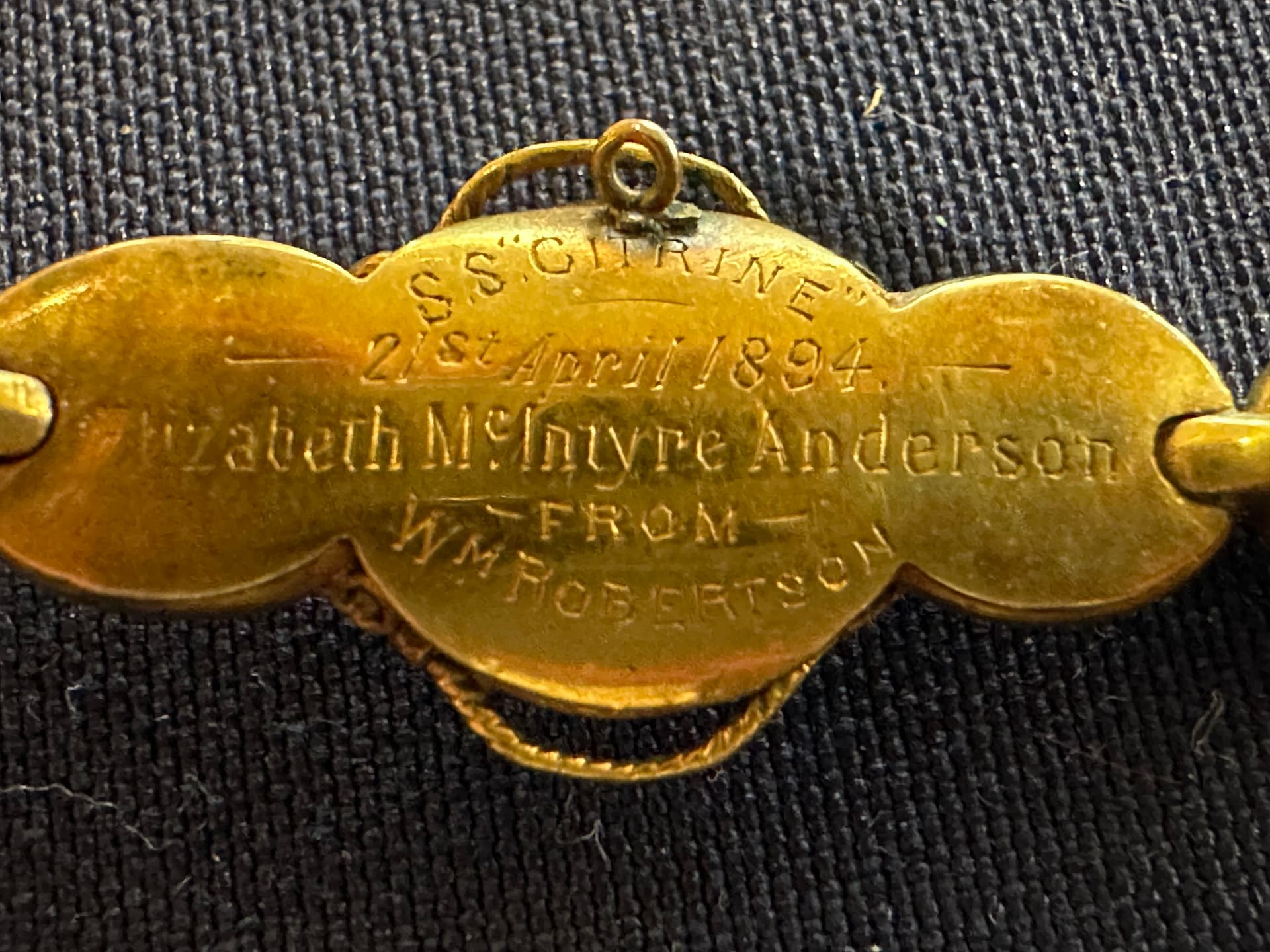
The timing is telling. Monica Rich Kosann celebrated its 20th year in business in 2024, and the refresh underscores how far the line has traveled from its origins in photography more than 25 years ago. Kosann began by telling clients’ stories through portraiture, then started placing those images into vintage lockets and other heirloom objects. That narrative impulse became the backbone of a jewelry line that has since expanded from lockets into charms, bracelets, rings, necklaces and earrings.
The brand has always been strongest when it treats jewelry as a vessel for intimacy. Kosann has repeatedly described lockets as a place for mantras, secrets, inspirations, memories and photos, and that idea now extends beyond the jewelry itself to the monogram customers will see on packaging and can adapt for themselves online. The result is a small but smart shift: a brand mark becomes a client-facing design tool, and identity becomes part of the purchase rather than an afterthought.
That emphasis on craft and meaning has also helped define Monica Rich Kosann as a Certified B Corporation, with quality, craftsmanship and environmental and social standards folded into the brand story. The new monogram feature, described by the company as a first-of-its-kind digital tool in its own rebrand messaging, feels less like a marketing add-on than a modern heirloom gesture. It gives the brand’s ACE recognition a polished proof point, but the real story is simpler: personalization now looks more considered, and more collectible, than ever.
This article was produced by Prism’s automated news system from verified source data, official records, and press releases, then run through automated quality and moderation checks before publishing. The system is built and supervised by the people who set the standards it runs under. Read our full AI policy.
Did this article answer your question?