Tacori unveils warmer brand identity with jewel-toned, human touch
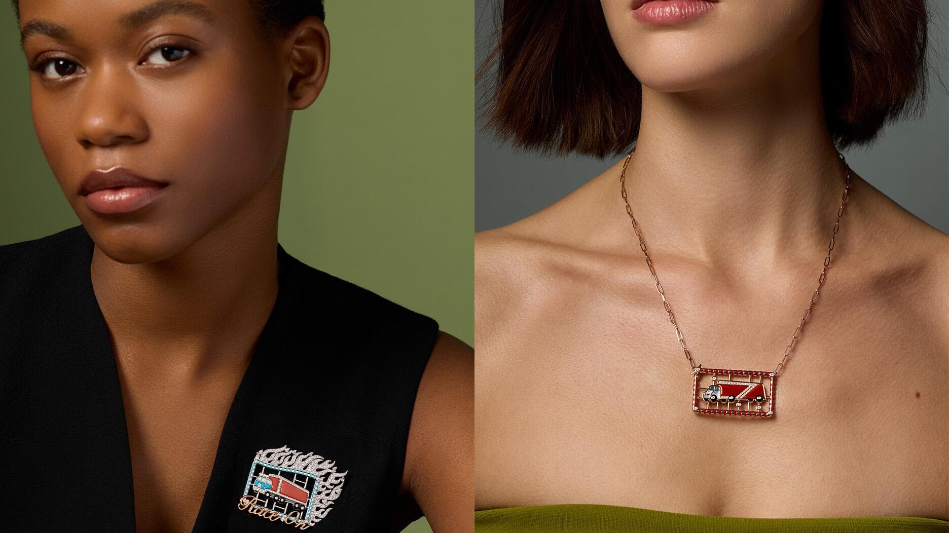
Tacori introduced a warmer brand identity at Couture 2026, pairing jewel tones and softer type with its signature Crescent to make bridal feel more personal.

Tacori unveiled a new wordmark, a jewel-toned color palette and more human campaign imagery at Couture 2026 inside Wynn Las Vegas, recasting its bridal and fine jewelry language around emotion rather than polish alone. The refresh was built to give the family-owned house a more ownable identity and a sharper point of view without severing it from the Crescent motif that has defined the brand for decades.
The visual reset is deliberate. Bec Bowman, Tacori’s creative head, said the new colors were chosen to feel rich, expressive and full of life, and the brand framed the direction as “luxury with more personality, emotion, and individuality.” That is a telling shift for a jewelry house that has long relied on the precision of its handwork and the quiet code of modern-vintage design. The new campaign lookbook, titled “Life’s Beautiful Details,” pushes that message further, centering joy, originality and passion rather than the more formal cues that have traditionally dominated bridal marketing.
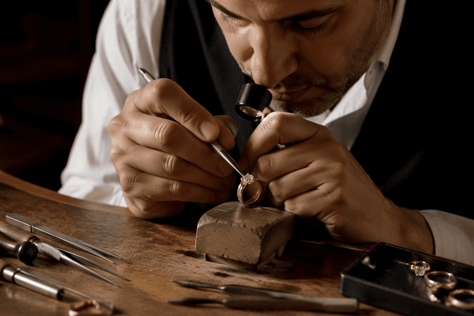
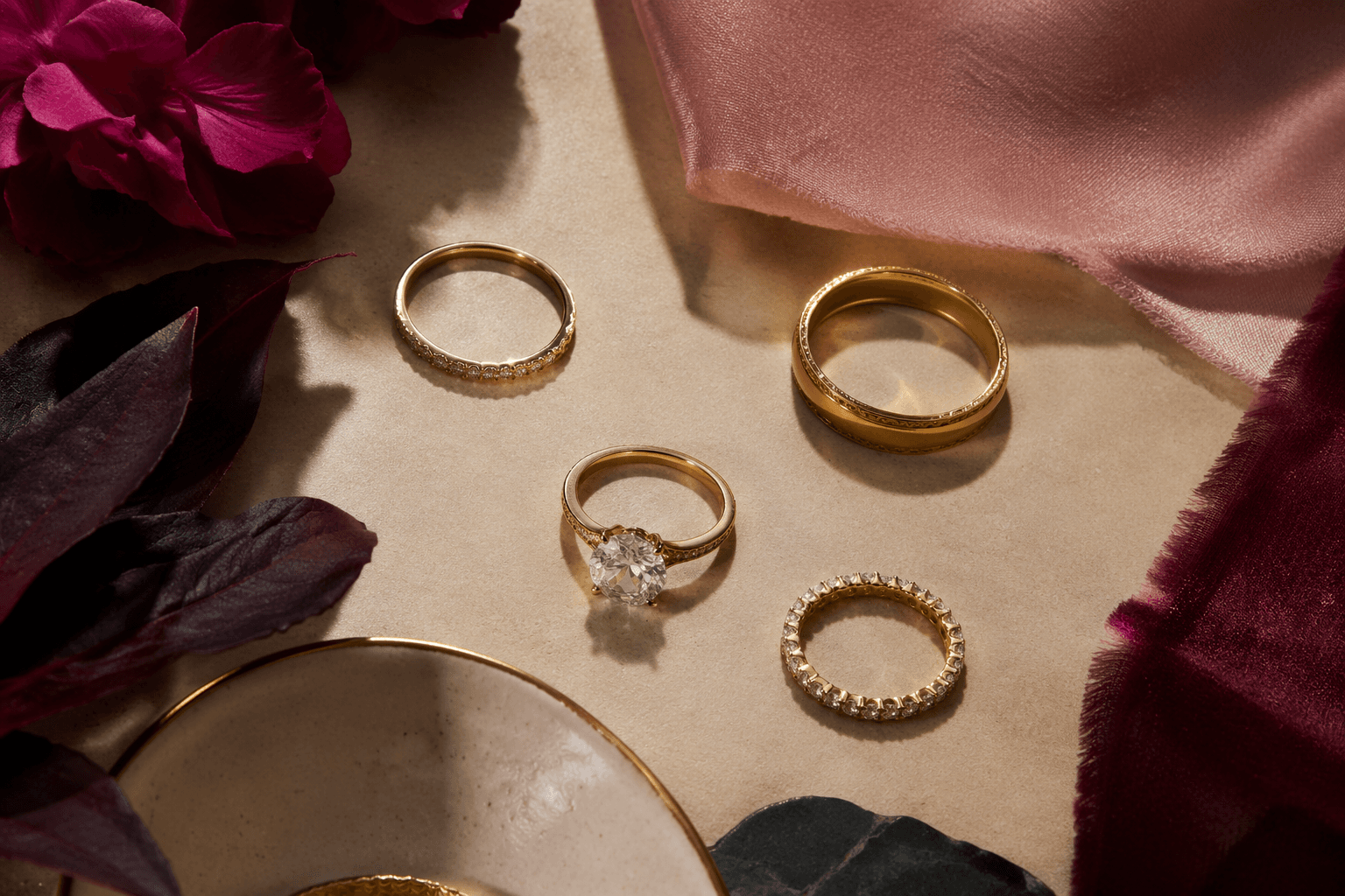
Tacori’s strongest asset remains the Crescent, the sculptural design language it dates to 1998, when founder Haig Tacorian commissioned artisan Garo Kourounian to create a ring with a concealed heart shape. In 2023, the brand marked the Crescent’s 25th anniversary and described it as the signature detail woven through its collections in etched metal, pavé diamonds, negative space and hidden forms visible only to the wearer. That motif is not just decorative. Tacori says master artisans spend a minimum of four years in an in-house apprenticeship before they can produce a basic variation of it, a reminder that the house’s most recognizable visual cue is also one of its most technically demanding.
That craftsmanship message matters because Tacori is trying to look less generic at a moment when personalization sells. The brand says most of its jewelry is customizable and crafted on demand, and that its pieces are handcrafted in California by specialized artisans who may spend days on a single ring or necklace. Paul Tacorian and Nadine Tacorian have said the evolution reflects the artistry, originality and connection at the core of the company, which suggests the new palette and typography are doing more than refreshing packaging. They are helping Tacori sell the same promise in a more contemporary register: a made-to-order jewel that feels intimate, not institutional.
For a category still led by engagement rings and heirloom buying, that is a meaningful pivot. Tacori is leaning into warmer color, softer typography and more expressive imagery because bridal shoppers now expect a brand to mirror how they want to present themselves, not just how they want to be married. The Crescent still anchors the story, but the framing has changed: less formal luxury, more personality that can be seen at a glance.
This article was produced by Prism’s automated news system from verified source data, official records, and press releases, then run through automated quality and moderation checks before publishing. The system is built and supervised by the people who set the standards it runs under. Read our full AI policy.
Know something we missed? Have a correction or additional information?
Submit a Tip