Color Theory Essentials for Miniature Painting: Practical Palette Planning
This primer translates core color theory into hands-on techniques for painters working on 28-54mm miniatures, focusing on palette design, contrast control, and application methods that work at small scale. Learn how to choose dominant, accent, and neutral colors, use light and saturation to sell details, and apply studio methods like wet palettes, thinning, glazes, and dry-brushing for reliable results.

Color works differently at miniature scale. What looks balanced on a canvas can read muddy on a 28-54mm miniature unless you plan value, saturation, and lighting from the start. This article lays out the fundamentals of the color wheel and gives concrete, practical steps to design palettes, manage contrast, and use common studio techniques to make paint choices translate into strong, readable models.
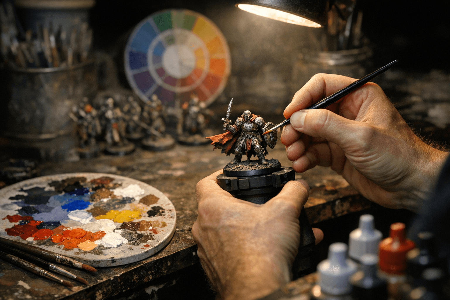
Start with the wheel. Primaries produce secondaries and tertiaries; understanding those relationships makes it easier to pick harmonious schemes. Build a palette around a clear dominant color, one or two accent colors, and a neutral base to tie the model together. Use complementary pairs to create visual pop, and analogous combinations when you want subtle, cohesive surfaces. Keep saturation and value in mind: a bright, saturated accent on a low-saturation neutral will read with more contrast than two equally bright colors.
Value and light are the main tools for perceived contrast. On a miniature, contrast comes from value differences more reliably than hue differences. Plan mixes so that rims, edges, and focal areas have higher value separation from surrounding surfaces. Account for display lighting when finalizing mixes: warm gallery lights will shift blue tones toward gray, while cool LED lighting can make reds appear darker. Test your palette under the lamp you use for painting and under the light you expect for display.
Practical studio techniques make color decisions repeatable. Use a wet palette to keep mixes stable and to blend thin layers without skinning. Thin paints for smoother layering; aim for controlled transparency rather than heavy coverage on the first pass. Apply glazes to nudge hue and saturation without obscuring details, and use washes to settle shadows and unify panel lines. Dry-brushing remains a fast method for texture highlights, but combine it with layering and edge-highlighting to avoid flattening form.

Color psychology helps communicate mood. Cooler, desaturated palettes feel somber or tactical, while warm, saturated palettes feel energetic or heroic. Test a vignette of the model in small swatches to verify the emotional effect before committing to full coverage.
Finally, treat palette design as iterative. Mix swatches, photograph them under your display light, and refine values and saturation until the miniature reads at arm’s length. These practical steps convert color theory from abstract charts into reliable workflows that make small-scale painting clearer, faster, and more expressive.
Know something we missed? Have a correction or additional information?
Submit a Tip

