Ontario Reign unveil new logo, jerseys in full brand refresh
Ontario Reign turned a logo reveal into a reset, unveiling a new crest, jerseys and color palette that tie the Kings’ top affiliate to Ontario and the Inland Empire.

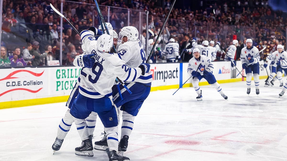
The Ontario Reign did more than clean up a logo. They rolled out a full brand evolution on June 13, then put the new jerseys on pre-order the same day, signaling a fresh push for the Kings’ top affiliate ahead of a 2026-27 season that already feels like a turning point.
Nearly every visual piece changed. The club introduced a redesigned primary logo, new wordmarks, a new brand font and a refreshed color palette centered on enhanced Inland Blue and Empire Gold. The new look is designed to sit on ice, on merchandise and on game-night presentation as a single identity, not a patchwork of updates.

The crest keeps the Reign’s connection to the Kings family front and center, but it also reaches deeper into local identity. Crown and royal-inspired elements remain part of the design, while the top of the logo features an O as a nod to Ontario itself. The club said the five pistons built into the mark represent power, precision, pressure, unity and relentless forward movement. Beneath it, the ground treatment draws from Ontario Motor Speedway and the region’s history of speed and motion, giving the logo a Southern California feel that is more specific than a generic minor-league refresh.
Vice president Dan Lynch said the goal was to build a distinct identity that honors the team’s history, celebrates its ties to the Inland Empire community and maintains a strong connection to the Kings organization. He also pointed to an extensive collaborative process with fans and stakeholders, a reminder that this was meant to be more than a design exercise. In a market where the Reign have to compete for attention against the Kings, the Ducks and the broader Southern California sports scene, that kind of specificity matters.
Kings president Luc Robitaille called the new look a strong fit with the organization’s historic brand as it moves toward its 60th anniversary season in the fall. The Reign also launched a video tied to the rollout, opened merchandise sales around the new identity and said single-game tickets for 2026-27 will arrive later in the summer. That sequence makes the rebrand feel like a commercial reset as much as a visual one: new look, new inventory, new sales cycle, same ambition to own a bigger piece of the market.
This article was produced by Prism’s automated news system from verified source data, official records, and press releases, then run through automated quality and moderation checks before publishing. The system is built and supervised by the people who set the standards it runs under. Read our full AI policy.
Know something we missed? Have a correction or additional information?
Submit a Tip