Custom Floral Bridal Gown Inspires a Fully Cohesive Wedding Aesthetic
One custom floral gown became the blueprint for an entire wedding's visual world — here's exactly how to pull that off without the look tipping into costume.

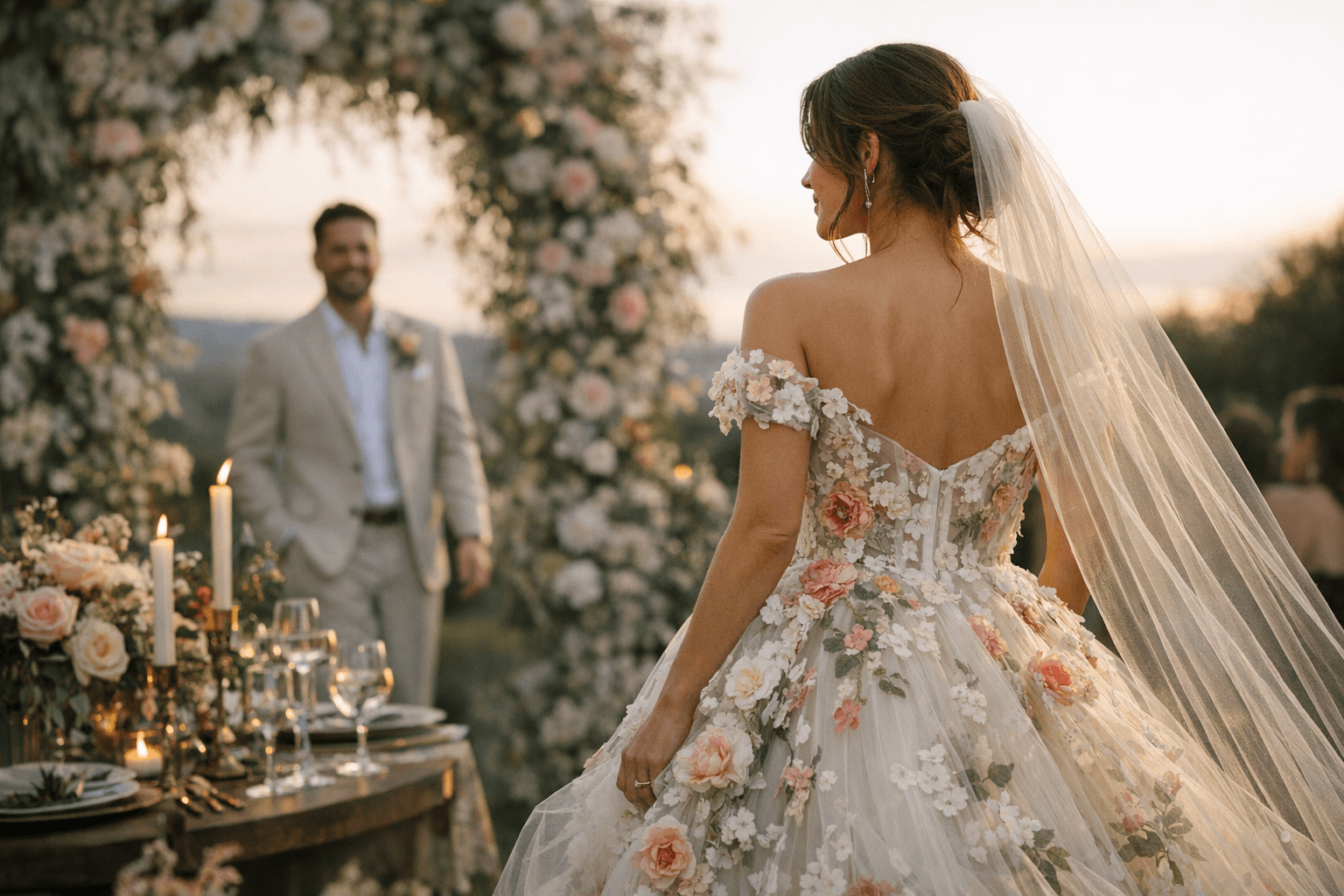
The best wedding aesthetics don't start with a mood board. They start with the dress. That's the takeaway from a real-wedding feature on Green Wedding Shoes, in which a bride's custom floral gown didn't just steal the show at the ceremony: it designed the entire event. Every element, from the floral installations to the table linens, the stationery suite, the cake, and the signage, was reverse-engineered from the print on that gown. The result wasn't matchy-matchy. It was cohesive in the way a well-edited wardrobe is cohesive: intentional, layered, and unmistakably considered.
If you're wearing a patterned or printed gown, this approach is the most powerful visual storytelling move available to you. Here's how to make it work.
The Pull-from-the-Print Rules
Before anything else, three non-negotiable principles govern the whole system.
- Choose 2-3 dominant hues from the print, and commit. A floral print typically contains five or more colors, but not all of them deserve equal weight in your day's palette. Identify the two or three that carry the most visual energy in the fabric and build everything outward from those. The remaining shades in the print become accents, not anchors.
- Repeat one motif in at least three distinct places. This is what separates a cohesive aesthetic from a scattered one. One bloom or leaf shape, pulled from the gown's print and reappearing in the florals, the stationery, and the cake, is enough to thread the entire day together without it reading as a theme park.
- Hold the rest neutral. Ivory linens, warm white candles, natural wood tones: these are the breathing room. Every bold element needs negative space to land properly. Neutrals aren't a cop-out; they're structural.
Starting with the Color Palette
The gown in the Green Wedding Shoes feature functioned as a moving color swatch. Rather than selecting a wedding palette from a trend report and then hunting for a dress to match, this couple inverted the process entirely. The dress came first, and the palette followed. That means every subsequent vendor conversation, from the florist to the stationer to the rental house, started with a single reference point: the fabric itself. Bring a swatch to every meeting. If the color matching can't happen in person, a well-lit photograph of the actual gown on a neutral background is the next best tool.
Florals and Ceremony Installations
The gown's floral print translated directly into the ceremony's living installations. This is where the "repeat one motif" rule becomes transformative: when a specific bloom from the print appears again in a ceremony arch or a cascading arrangement, the bride's entrance reads as an extension of the environment she's walking into, not a separate element dropped into it. The florals used across the ceremony in this feature weren't a coincidental complement; they were a deliberate echo, chosen because the gown said so first.
Stationery
Paper goods are the first visual communication your guests receive before the day begins, which makes them critical carriers of the print's DNA. In the Green Wedding Shoes feature, the stationery suite was shaped by the same motifs and color story driving the gown, creating visual continuity from the save-the-date through the ceremony program. The most effective approach: lift two colors from your dominant hues for the ink and paper stock, and use one illustrative element from the print as a recurring graphic device. That single repeated detail, whether a garden rose, a trailing vine, or a specific leaf shape, ties every paper element back to the dress.
Tablescape
The table design in this wedding didn't attempt to recreate the gown's full palette at every place setting. Instead, it leaned on selective application: specific blooms from the print appeared in the centerpieces, one or two accent colors showed up in the napkins or taper candles, and the rest of the table stayed grounded in neutral linen and natural materials. This is the difference between a tablescape that feels designed and one that feels decorated. Restraint is not absence of personality. It's the thing that makes personality legible.
Wedding Party Attire
The wedding party's styling was informed by, not copied from, the gown. The most elegant approach when your dress leads with pattern: dress the party in one of the gown's dominant solid hues, or in a tonal neutral that lets the florals do the speaking. The goal is for the wedding party to read as part of the same visual family as the bride, not as a competing pattern story. Groomsmen's accessories, pocket squares or ties, offer a low-risk opportunity to echo a single color from the print without committing to anything too literal.
Cake and Signage
Even the cake and signage choices in this feature referenced the gown's visual language. The cake incorporated the motif at the point of finishing detail, which is precisely where it should live: as an accent, not the main canvas. Signage, meanwhile, used the palette's typography and illustrative elements to keep the visual throughline running into every corner of the venue. When guests move from ceremony to cocktail hour to reception and the same color story greets them at every moment, that's not accident. That's architecture.
A custom floral gown is rare. The design thinking it enables doesn't have to be. Any printed or boldly colored dress, off-the-rack or bespoke, contains everything you need to build a complete visual world. You just have to be willing to let the fabric lead.
This article was produced by Prism’s automated news system from verified source data, official records, and press releases, then run through automated quality and moderation checks before publishing. The system is built and supervised by the people who set the standards it runs under. Read our full AI policy.
Did this article answer your question?