5 ways to wear pastels now without looking saccharine
Pastels work when they’re sharpened, not sweetened. The fix is all in the styling: clean tailoring, tonal layers, metallics, jewelry and brown grounding.

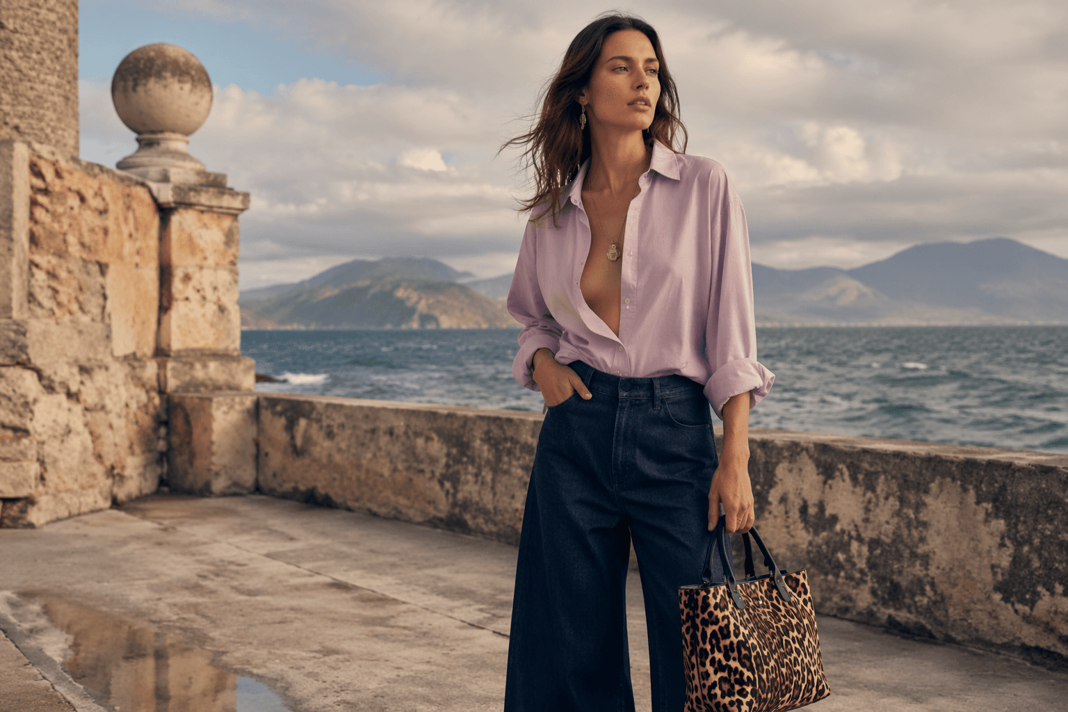
Start with a sharper silhouette
Caroline Leaper’s five-way formula works because it refuses the default pastel trap: anything floaty, frilly or overly polished. Butter yellow and Whispering Angel pink feel strongest when they’re cut into clean lines, not dissolved into swish and ruffle. That tracks with the bigger color mood too: Pantone says consumers are looking for grounding in changing times, and its Spring/Summer 2026 London palette pushes refinement and reinvention instead of nostalgia for its own sake.
The easiest way to make a soft shade feel current is to give it structure. Think a pale lilac shirt under a crisp blazer, a pastel trouser with a boxy shoulder, or a pale yellow knit worn with trousers that actually hold a crease. W Magazine’s spring pastel edit got this exactly right at Alaïa, Chloé, Prada, Bally, The Row and Marni, where pastels were sharpened with tailoring and neutrals instead of being left to drift into sweetness.
Go tonal, but make it textured
Tonal dressing is where pastels stop looking dainty and start looking expensive. A head-to-toe wash of one color, especially something like Pale Banana, smoky lilac or a washed pink, reads far more assured than a random pastel thrown over black denim. The point is not sameness. It is control, with tiny shifts in fabric and finish doing the heavy lifting.
That is why the best versions are never flat. A satin shirt against matte wool, a ribbed knit beside a fluid skirt, or a crisp cotton layer under something brushed and soft keeps the look alive. WGSN’s S/S 25/26 analysis helps explain why this feels right now: enhanced neutrals made up 36.5 percent of the collection colour category, and that softer palette has pushed pastels away from candy coating and toward wearable, adult dressing.
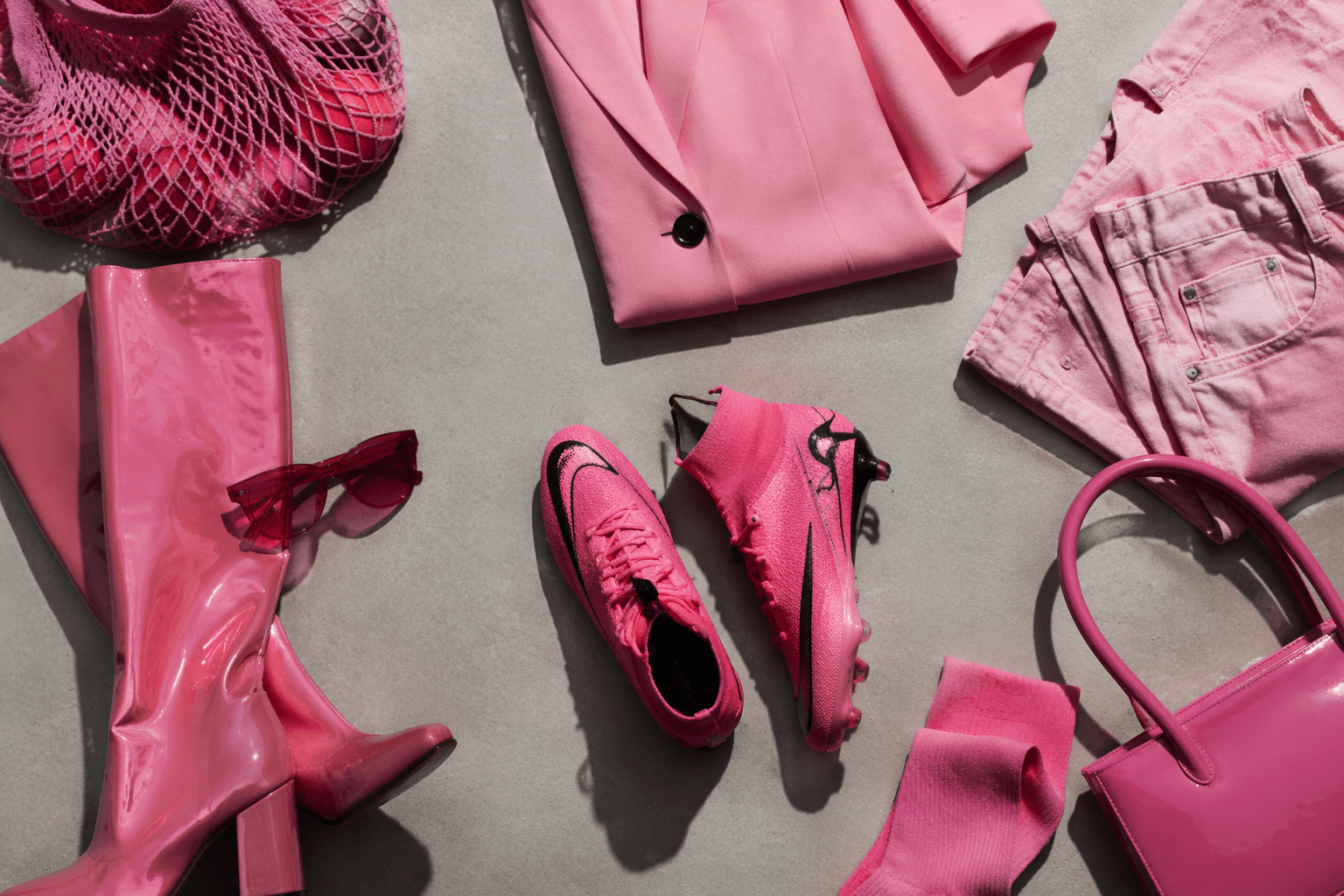
Add metallics like punctuation, not decoration
Pastels need friction, and metallics are one of the cleanest ways to create it. A silver chain, a polished buckle, a mirror-finish bag or a hard little heel keeps a pale outfit from drifting into nursery territory. The trick is restraint. One sharp metallic detail is usually enough to make a powdery color feel edited instead of precious.

This is where the season’s jewelry mood comes in. Who What Wear’s spring 2026 jewelry roundup frames jewelry as the quickest way to elevate a spring wardrobe, and that is exactly how it should work with pastels: as a cool flash, not a sugar glaze. A pale dress with sculptural earrings, a lilac blouse with a silver cuff, or a minty suit with a hard, clean necklace all land with more edge than a pile of delicate, overly sentimental extras.
Use jewelry to toughen the sweetness
If the color is soft, let the jewelry do the attitude work. Bigger earrings, a thicker chain, a ring with a little shine, or a watch with a proper metal bracelet all stop pastels from collapsing into too-cute territory. This is not about piling on sparkle; it is about giving a soft palette some architecture.
The best jewelry with pastels has a slightly architectural feel. Think clean geometry, polished surfaces and pieces that read intentional from across the room. That kind of finishing touch works especially well with the season’s smokier pinks and lilacs, because it keeps the outfit adult, not frosted. It also fits the broader shift toward polished dressing that is showing up across spring 2026 styling, where accessories are doing more than decorating. They are setting the tone.
Ground everything with brown or another dark anchor
This is the move that saves the whole look. Brown is the antidote to pastel preciousness because it brings warmth without forcing contrast into full black-and-white mode. A butter yellow cardigan over chocolate trousers, a pale pink shirt with espresso loafers, or a lilac dress under a camel coat all feel steadier and more lived-in than the same pieces styled with sugary accessories.
WGSN’s neutral-heavy runway read makes this especially relevant, and W Magazine’s black-anchored styling at The Row, Bally and the rest of the spring pastel set proves the point from the opposite direction: soft colors need a grounded partner. Brown is a little less severe than black and often more flattering next to pale shades, which is why it keeps showing up in the smartest pastel outfits. It cuts the sweetness just enough, and that is the whole game.
This article was produced by Prism’s automated news system from verified source data, official records, and press releases, then run through automated quality and moderation checks before publishing. The system is built and supervised by the people who set the standards it runs under. Read our full AI policy.
Did this article answer your question?