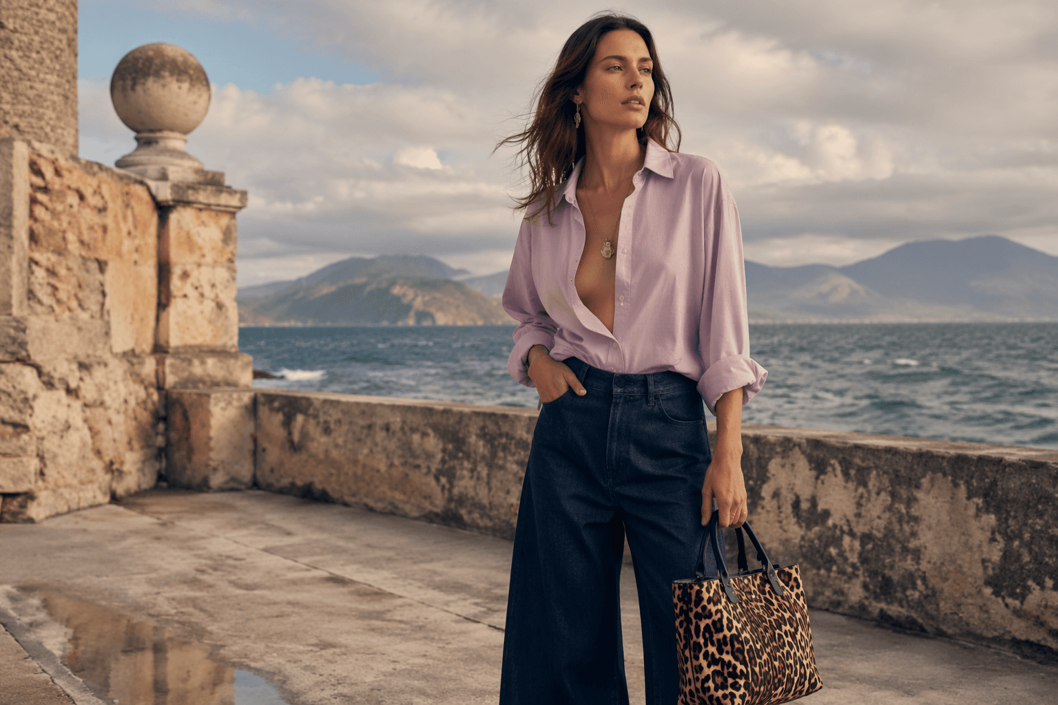
Tod's redefines Italian ease with soft tailoring and lightweight luxury
Tod’s is betting on soft tailoring, Pashmy fabric, and sun-washed neutrals to sell the quiet power of everyday luxury. The result feels less flashy, more expensive.
Tod’s did not come to Milan to shout. At Villa Necchi Campiglio, Matteo Tamburini turned menswear into a quieter flex: soft tailoring, featherweight layers, and the kind of polished basics that look like they were chosen by men who already know exactly what they want. The message is clear: this is Italian luxury for daily life, not for peacocking.
The new Italian wardrobe
The show was called “The Italian Wardrobe,” and that title does a lot of the work before a single look lands. Tod’s framed the collection as a tale of the most authentic Italian lifestyle, which in practice meant relaxed shapes, lived-in lightness, and clothes that look expensive because they are considered, not because they are loud. Tamburini leaned into classic forms and let fabric do the talking, which is usually where the smartest luxury houses are heading right now.
That matters commercially because affluent men are buying into wardrobe building, not one-off statements. A polished bomber, a soft blazer, a shirt that drapes instead of clings, a sneaker that reads clean instead of clever, these are the pieces that slide into real life. Tod’s understands that the strongest luxury signal in 2026 is not a logo flash; it is ease with precision.
Pashmy is the point, not the pitch
At the center of the collection is Pashmy, Tod’s ultra-soft, lightweight material, and the brand kept returning to it because that is where the collection’s value lives. Pashmy appeared in the Brera Bomber, the Castello jacket and blazer with patch pockets, and the enveloping Solferino Shirt. Those are not show-off garments. They are the sort of pieces that quietly upgrade a man’s whole rotation because they feel good, move well, and sit between tailoring and leisure without forcing a choice.
Tamburini said the focus was even more on fabrics because the shapes were classic, and that is exactly why the clothes work. When the silhouette is familiar, the hand of the material becomes the luxury. Pashmy gives Tod’s the lightness that makes a wardrobe feel current without looking trend-chased, which is a very strong place to be when the customer wants investment pieces that still breathe in summer.
Why the palette reads expensive
The color story was doing real work here. Beige, cocoa, terracotta, ocher, stone gray, dusty blue, washed azure, Riviera blue, and pearl grey built a sun-washed range that felt like stone, sky, sand, and shadow. Nothing was screaming for attention, but everything had enough warmth and variation to keep the eye moving.
This is the palette of a man who wants his clothes to look like they belong in a well-traveled apartment in Milan, a weekend house on the coast, and a city office without changing character. Earthy neutrals give the tailoring weight; the blues and greys keep it from sinking into beige sameness. It is discreet, yes, but not dull. That distinction is the whole game.
The Ghirri reference gives the clothes texture
Tamburini anchored the collection in Luigi Ghirri’s 1984 project “Viaggio in Italia,” and that reference is smarter than a nostalgic postcard exercise. Ghirri’s work was about surfaces, light, gestures, and lived moments, which is exactly how this Tod’s lineup felt: observed rather than staged, intimate rather than theatrical. It gives the clothes a visual grammar that fits the brand’s current direction, where Italian ease is presented as something specific, modern, and rooted in daily behavior.

That is also why the show at Villa Necchi Campiglio felt right for the second straight season of this mood. Tod’s has been building a consistent runway language around relaxed summer dressing and Italian lifestyle imagery, and this venue turns that idea into architecture. The house is not chasing fantasy; it is selling a place, a pace, and a way of dressing that already has a social life.
The shoes are not side notes
Tod’s also used the collection to push product with real commercial intent. The Red Dot sneaker was introduced as a new icon, described by the brand as a modern expression of luxury marked by softness and lightness. That is a very Tod’s move: not a performance sneaker, not an aggressive fashion shoe, but a sleek daily piece that aims to become part of the brand’s long-term language.
The Gommino loafer got a new leather accessory inspired by the interlocking closure of the Greca belt, which keeps the house’s signature shoe in the conversation without overhauling what already works. In luxury menswear, that kind of incremental update is often more powerful than a hard reset. Men who buy Tod’s usually want continuity with a twist, not reinvention for its own sake.
Tamburini’s point of view is consistent, and that is the appeal
Tamburini, born on November 8, 1982, in Pesaro, became Tod’s creative director in 2023 after stints at Rochas, Schiaparelli, Emilio Pucci, and Bottega Veneta. That resume explains the balance he brings to the brand: enough fashion fluency to keep the collection from feeling sleepy, enough discipline to avoid turning Tod’s into a logo machine. He has also said, “I don’t design for specific markets,” and that attitude shows in the clothes, which aim for feelings rather than demographic boxes.
That global-minded approach matters for Tod’s because the brand’s luxury code is rooted in Made in Italy craftsmanship, timelessness, and elegance without ostentation. Those values travel. The customer in Milan, Riyadh, New York, or Tokyo is not necessarily buying the same fantasy, but he is buying the same attitude: quiet confidence, excellent materials, and clothes that do not expire after one season of attention.
Why this version of menswear keeps winning
Tod’s Spring-Summer 2027 men’s collection lands in a season when the best menswear looks less like a costume and more like an edited life. This is why understated utility keeps gaining ground. Soft tailoring feels cooler than armor-like suiting, lightweight luxury feels smarter than heavy statement dressing, and polished basics offer more mileage than flash pieces that exhaust themselves after a couple of wears.
Tod’s is making the case that real affluence now looks like discernment. Not louder shoes. Not bigger branding. Better fabric, better proportion, better color, better ease. In that register, “The Italian Wardrobe” feels less like a theme and more like a business model for how luxury menswear is actually being bought.
This article was produced by Prism’s automated news system from verified source data, official records, and press releases, then run through automated quality and moderation checks before publishing. The system is built and supervised by the people who set the standards it runs under. Read our full AI policy.
Did this article answer your question?