Watches and Wonders 2026, textured dials, green stones, vintage cues guide luxury design
Textured dials and green stones turned Geneva into a style forecast: the season’s best watches now borrow the language of jewelry, archives, and the Space Age.
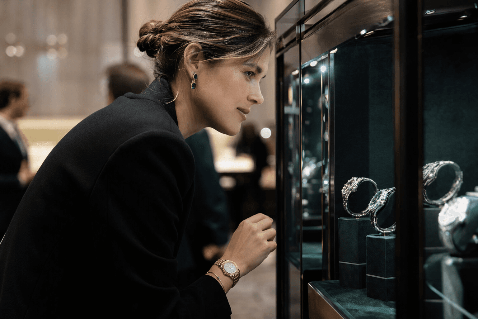
The clearest message from Watches and Wonders 2026 is that luxury watches are dressing like objects you notice from across a room. The fair’s most persuasive pieces were not simply technical feats, but compact compositions of texture, color, and historical memory, the kind that make a watch feel less like a tool and more like the sharpest accessory on your wrist.
The new luxury mood in Geneva
This was a fair built on subtlety rather than spectacle, even as the numbers were enormous. The Geneva edition ran from April 14 to 20, with public days from April 18 to 20, and Richemont said it was expected to draw nearly 60,000 visitors, 1,700 journalists, more than 6,000 retailers, and about 50,000 overnight stays. Organizers listed 65 exhibiting brands in one press release and 66 on the event site, while Audemars Piguet returned after its 2021 withdrawal, a reminder that the industry’s biggest names still treat this fair as the place to reset the conversation.
What changed on the floor was the tone. The strongest watches were often in the 40-something-millimeter range, but the real shift came in the details: decoration moved beyond the dial and onto bracelets and clasps, green stones replaced safer neutrals, and skeletonized movements made transparency feel polished rather than technical. For anyone reading the fair as a style signal, the takeaway is simple: watch design is influencing the broader luxury wardrobe in the same way fabric finish or heel shape does in fashion, by changing how polished, precious, or directional an outfit feels.
Texture is the new quiet flex
The most wearable trend was texture. Dials that looked brushed, grained, or layered gave watches a depth that reads almost like fine tailoring, the difference between flat jersey and a wool with real hand. That matters because texture is one of the easiest ways to make an outfit feel considered without adding bulk, and these watches suggest the same logic is moving into jewelry, hardware, and accessories.
Decoration spilling from dial to bracelet and clasp is the detail to watch closely. It signals that the industry is no longer treating the face of the watch as the only place to perform artistry. That idea is likely to travel well into rings, bangles, handbag closures, and even belt hardware, where small-scale surface treatment can do the work of a louder statement piece.
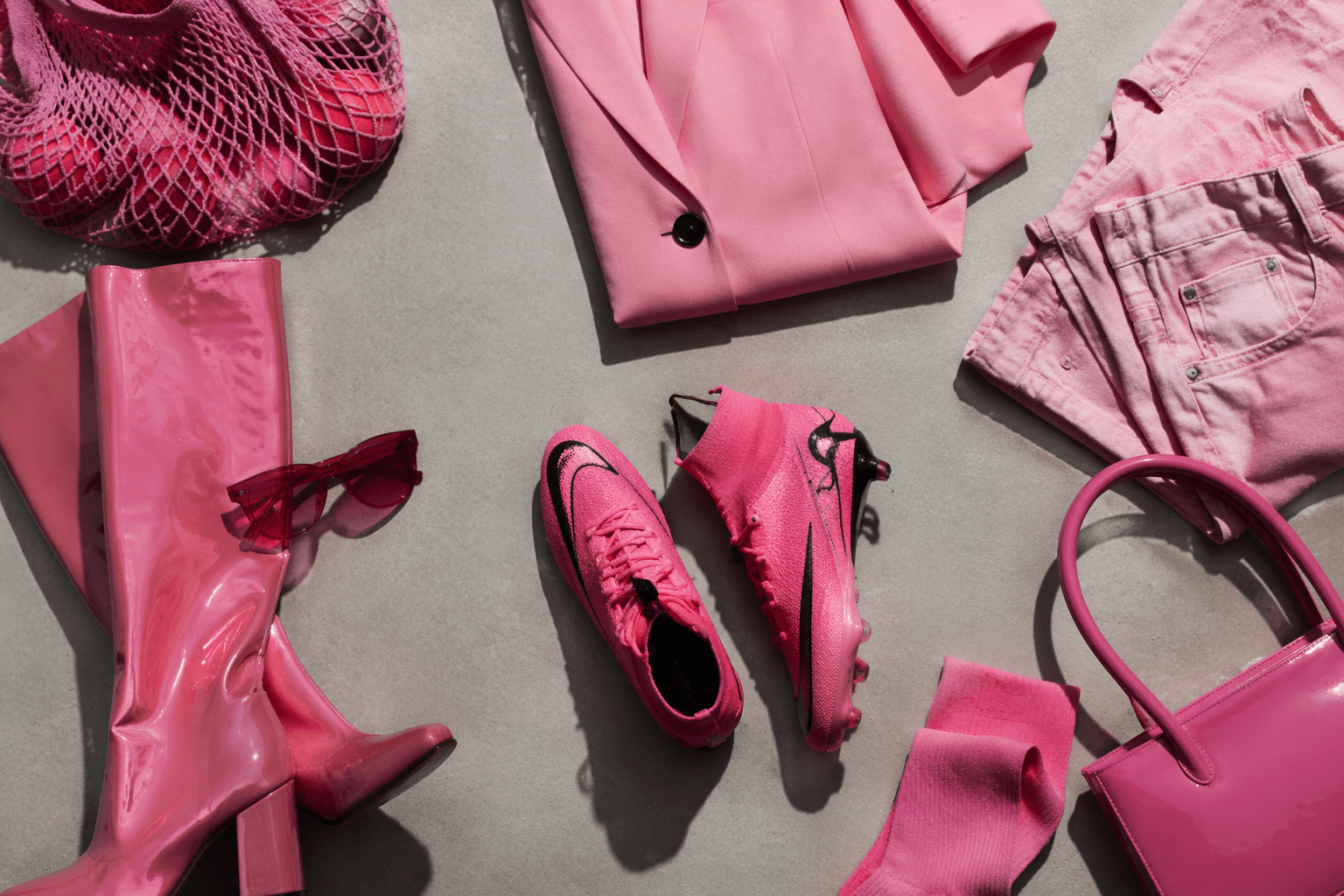
Green stones are the color story with staying power
Green was everywhere, but not in a generic spring way. WWD singled out malachite, bloodstone, natural aventurine, enamel, and ceramic, often paired with yellow gold, which gave the watches a saturated, mineral-rich look rather than a pastel one. That combination feels especially durable because it balances color with material seriousness: yellow gold warms the palette, while the stones themselves carry the visual weight.
This is the trend most likely to move beyond watches and into everyday jewelry. A malachite dial, an aventurine face, or a bloodstone accent has the same effect as a great emerald earring or a lacquered clutch: it makes an outfit feel intentional in one move. If you want the longest-lasting signal from the fair, this is it. Green stones in yellow gold read expensive without trying too hard, and that is exactly why they are likely to stay.
Vintage cues are becoming less nostalgic and more editorial
The archive references were not costume-y. Brands looked back at their own histories, but the result was not a return to the past so much as a sharpening of profile: familiar case shapes, old-world complications, and proportions that feel grounded after years of overstatement. That approach is especially useful now, because it lets a watch carry emotional weight without looking fussy.
This is where the crossover into everyday style gets interesting. Vintage cues are already shaping what feels current in jewelry and accessories, from chunky chain links to rounded, softly domed silhouettes. Watches and Wonders made the case that nostalgia works best when it is edited, not literal. A restrained nod to an archive model can make a watch feel like a wardrobe staple rather than a collector’s trophy.
The Space Age is back, but only some of it will last
The fair’s more futuristic watches leaned into moon missions, aerospace references, and sculptural forms that felt lifted from midcentury optimism. Bremont’s integration of its Supernova watch on the chassis of Astrolab’s FLIP rover headed to the moon gave that fantasy a real-world anchor, and it was one of the clearest examples of how brands are using space not as a gimmick, but as a narrative of precision and endurance.
Still, not every cosmic gesture is built for daily life. Space-age shapes can be thrilling in a display case, especially when they push case architecture or lume treatment into unfamiliar territory, but they are also the most likely to read as fair-season experimentation. The lasting version of this trend is more subtle: a rounded case with an unusual lug, a dial with depth that recalls a porthole, or a polished detail that feels lifted from 1960s futurism without tipping into costume.
Skeletonized movements keep winning because they show their work
Skeletonized watches remained one of the fair’s loudest signals, and for good reason. They turn mechanical complexity into visual pleasure, letting gears, bridges, and cutouts become part of the design language rather than hidden engineering. W magazine described skeletonized timepieces as a pervasive trend across almost every booth, and that tracks with the industry’s current appetite for watches that reveal more of themselves.
For style purposes, skeletonization is the watch equivalent of a garment with clean internal structure showing through, like visible corsetry or a sheer panel used with restraint. It gives depth and a sense of craft, but it can also skew hard-edged if the execution is too aggressive. The versions most likely to endure are the ones that keep legibility and proportion intact. The ones that feel purely decorative will have a shorter runway.
What belongs in your wardrobe, and what belongs in the fair
If you are translating Watches and Wonders 2026 into a shopping lens, separate the long-game signals from the flashier ones.
- Worth the investment: textured dials, green stones in yellow gold, restrained archive references, and skeletonized pieces that keep the watch readable. These cues have enough material depth and styling range to work with both tailoring and more casual clothes.
- Best as experimentation: the most overt Space Age shapes, the most theatrical cutouts, and any piece that leans entirely on novelty. These can be fun and visually smart, but they are less likely to hold up once the fair mood fades.
For 2026, the larger story is not that watches have become louder. It is that they have become better dressed. The brands that stood out at Geneva understood that the next luxury language is tactile, slightly nostalgic, and rich with detail, which is exactly how a watch becomes part of the way you wear everything else.
This article was produced by Prism’s automated news system from verified source data, official records, and press releases, then run through automated quality and moderation checks before publishing. The system is built and supervised by the people who set the standards it runs under. Read our full AI policy.
Did this article answer your question?