Chartreuse Emerges as Summer 2026's Freshest Color Trend
Chartreuse is the anti-pastel reset summer 2026 needs. Its yellow-green snap feels fresher than the soft shades already everywhere.
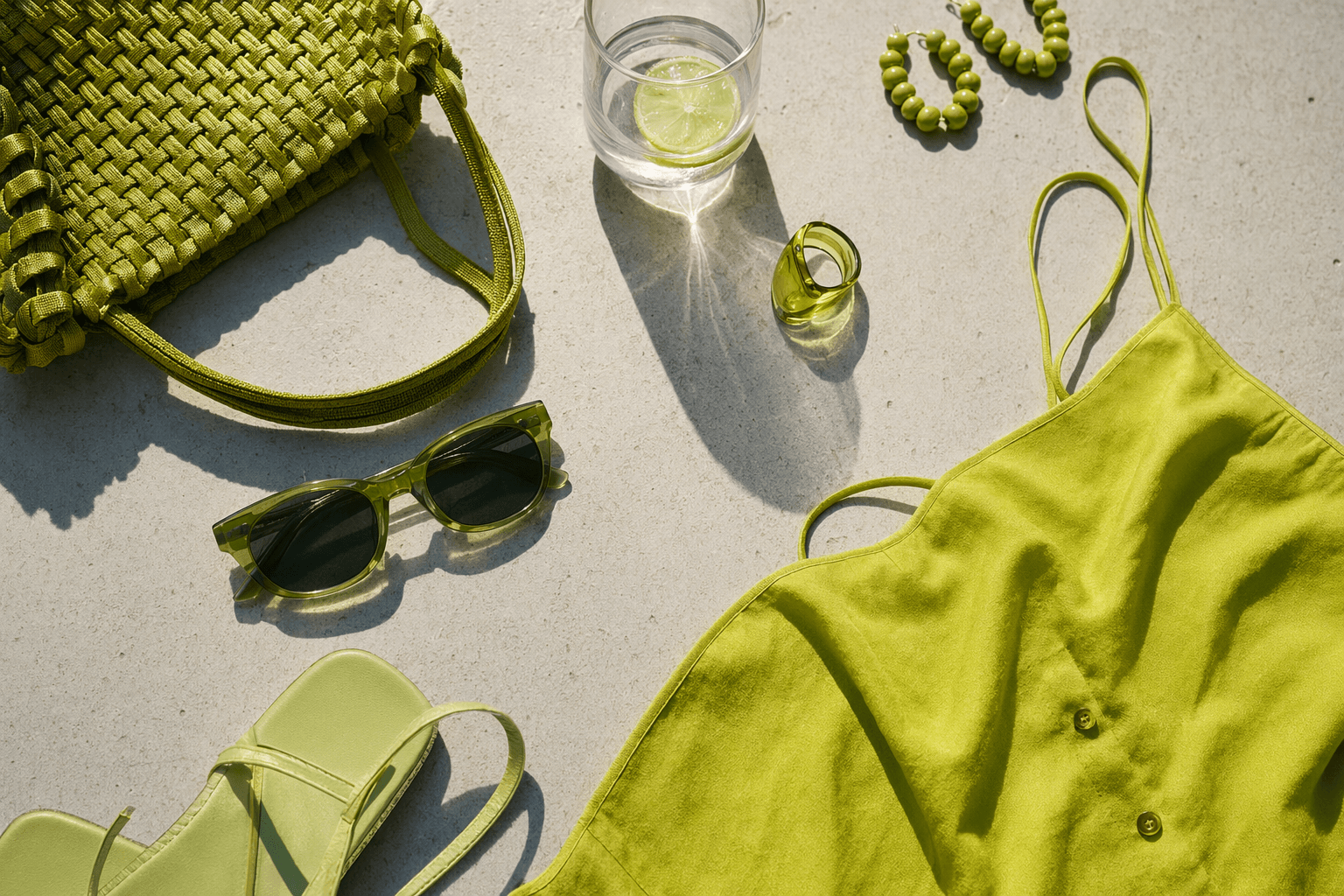
Why chartreuse matters now
Chartreuse is the color that cuts straight through summer’s pastel fog. Merriam-Webster defines it as a variable color averaging a brilliant yellow green, and that brightness is exactly why it feels sharper than the mint, butter yellow, and blush tones that have softened wardrobes for seasons. If those shades read pretty and expected, chartreuse feels like a deliberate jolt.
It also has real history behind it, which is part of the charm. Merriam-Webster says the color name entered English in 1884, while Britannica traces Chartreuse liqueur to Carthusian monks near Grenoble and says the formula dates from the 16th century. That gives the trend a pleasing contradiction: it looks new on a slip dress, but it carries a name with centuries of backstory.
The runway setup
Fashion has already been preparing the ground for stronger color. WWD described Paris Fashion Week Spring/Summer 2026 as a reset centered on design, craftsmanship and creativity, a signal that the market is ready to move beyond safe neutrals and tired pretty shades. Pantone’s Spring 2026 fashion color report pushed the conversation further, focusing not just on individual colors but on how they would be paired, which is where chartreuse becomes especially useful.
That pairing mindset is the reason the shade feels wearable rather than theatrical. Chartreuse works best when it is anchored by tailoring, denim, black satin, burgundy leather, or a crisp neutral that keeps the eye from sliding into overload. Merriam-Webster even separates chartreuse into chartreuse green, a dark greenish yellow, and chartreuse tint, a pale yellow green, so the color has enough range to shift from bold to soft without losing its identity.
How to wear chartreuse now
Work look
The easiest office entry point is one chartreuse piece with disciplined lines. A silk blouse under a navy blazer, a fine knit tucked into wide-leg trousers, or a slim chartreuse belt breaking up a suit can all make the color feel polished instead of loud. Because Pantone’s forecast emphasized pairing, chartreuse at work is strongest when it plays the supporting role, not when it takes over the whole outfit.
Fabric matters here. Matte crepe, tailored wool, and clean cotton keep the shade from drifting into party territory, while glossy satin can skew evening too quickly for a weekday. Keep the rest of the palette sharp and calm, and let one chartreuse detail do the work.
Weekend look
Off duty, chartreuse becomes even easier. A boxy T-shirt, a roomy cardigan, or a lightweight sweater in the shade can wake up denim, canvas, and other familiar weekend basics without demanding a total style rewrite. This is where the color feels most modern, because it interrupts the routine rather than replacing it.
If you want the lowest-risk version, start with accessories. A chartreuse tote against worn-in jeans, a sandal with a pale yellow-green strap, or a compact shoulder bag can deliver the effect without overwhelming the outfit. The trick is to keep the rest of the look simple so the color reads as fresh, not frantic.
Evening look
Chartreuse is making a convincing after-dark argument too. WWD reported that Chase Infiniti wore a chartreuse satin dress with burgundy accessories at a GQ Met Gala after-party in May 2026, and that combination shows exactly how to make the color feel rich rather than candy-bright. Satin gives chartreuse depth, while burgundy pulls it into a darker, more luxurious register.
For evening, the best formula is one strong surface and one grounding accent. A slip dress, column silhouette, or sculpted top in chartreuse can be finished with black heels, burgundy sandals, or a compact clutch, depending on how much drama you want. If the fabric is already high-shine, keep jewelry spare so the color and cut remain the focus.
How to choose the right version
Not every chartreuse has to hit at full volume. The brighter version feels the most fashion-forward, but chartreuse green brings a deeper, moodier note, while chartreuse tint offers a softer entry point if you are not ready for full yellow-green intensity. That flexibility is what makes the trend practical, because it lets you choose the version that suits your wardrobe instead of forcing a costume-like approach.
The smartest way to wear chartreuse is to let it solve a style problem. It can act as a crisp accent in tailoring, a freshener with denim, or a sleek evening color in satin, which means it moves through real life instead of waiting for a special occasion. That is the mark of a trend worth paying attention to: it changes the mood of an outfit without making you start from scratch.
The takeaway
Chartreuse is not just another bright color passing through the season. It is a reset color with a real name, a long history, and enough range to move from the office to the weekend to dinner without losing its edge. In a summer crowded with soft shades, that hard little flash of yellow-green feels like the freshest thing in the room.
This article was produced by Prism’s automated news system from verified source data, official records, and press releases, then run through automated quality and moderation checks before publishing. The system is built and supervised by the people who set the standards it runs under. Read our full AI policy.
Did this article answer your question?


