Grape purple and tomato red emerge as summer’s bold new pairing
Grape purple and tomato red are summer’s sharpest color clash, and the trick is wearing them as a balanced duo, not a costume.

Grape purple and tomato red have become the season’s most convincing color story because they feel daring without slipping into novelty. Harper’s Bazaar pushed the idea into the conversation with its June 24, 2026 piece, “Red Purple Color Trend 2026,” a nine-look guide built for the city, the beach, and everything in between.
Why this pairing feels right now
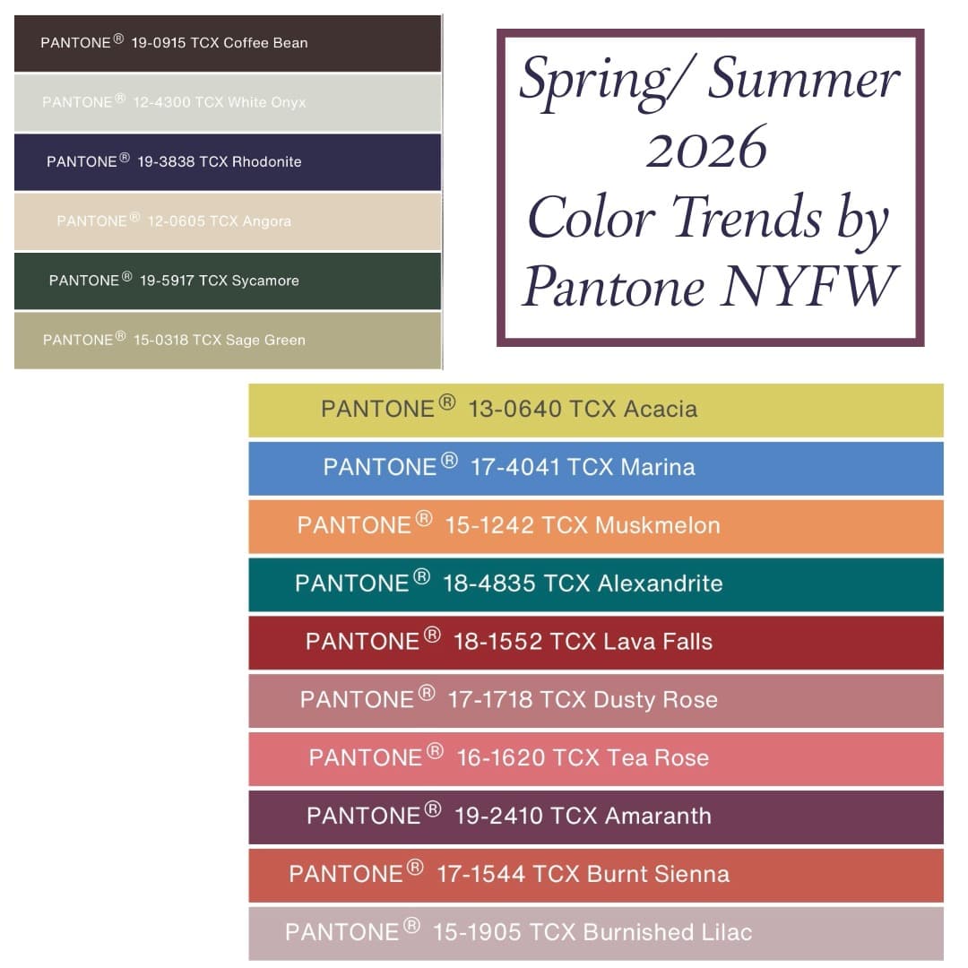
The appeal starts with scale: both shades are saturated, so neither one looks timid beside the other. Pantone’s Spring/Summer 2026 Fashion Color Trend Report, released for New York Fashion Week, described the season as one of individual expression and unconventional pairings, which is exactly why this combo reads as modern instead of mismatched.
Pantone’s standout palette included Lava Falls, a vivid red, and Amaranth, a cosmopolitan purple. Put those two ideas together and you get a wardrobe formula that feels current in the way the best summer dressing does, with enough intensity to register in daylight and enough polish to work at night.
The color logic that makes it wearable
This pairing works because it behaves like contrast dressing with guardrails. Tomato red brings heat and motion, while grape purple adds depth, making the whole look feel richer than a simple red-and-neutrals formula. That balance keeps the colors from fighting, especially when one hue does most of the talking and the other stays in a supporting role.
The easiest way to keep it from looking costume-y is to choose one dominant shade and let the second appear in a clean block, trim, or accessory. A red dress with a purple shoe, a purple skirt with a tomato top, or a single print that pulls both tones together all feel sharper than mixing five different saturations at once.
The city formula: one strong piece, one clean counterpoint
For city dressing, think tailored edges and deliberate restraint. A tomato-red blouse tucked into grape-purple trousers, or a purple slip skirt anchored by a red knit, gives the pairing enough structure to feel expensive rather than experimental.
This is where the Harper’s Bazaar framing matters, because the story’s “city” angle suggests real wardrobe utility, not just photo-op styling. Keep the silhouette crisp, add a leather belt or compact bag, and let the colors do the work while the shape stays familiar.
The beach formula: bright, but softened by texture
At the beach, the pairing looks best when texture breaks up the saturation. A gauzy purple cover-up over a red swimsuit, or a tomato-red bikini under a loose grape-purple shirt, keeps the colors airy instead of heavy. Linen, mesh, crochet, and terry all make the contrast feel more relaxed.
The trick is to avoid matching everything too perfectly. A sun-faded purple with a punchier red feels more effortless than two identical brights, especially in natural light, where the eye already reads color more intensely.
The after-dark formula: let the shades go glossy
At night, this pairing becomes more glamorous when the fabrics carry shine. Satin, crepe, patent, and silk all sharpen the contrast between grape purple and tomato red, making the look feel intentional enough for dinner, cocktails, or a gallery opening.
This is also where runway proof helps. Coveteur noted that tomato red turned up on Spring/Summer 2026 and Fall/Winter 2026 runways at Valentino, Carolina Herrera, and Balenciaga, which tells you the shade is already moving through the fashion system as more than a passing accent. The lesson for evening is simple: one polished piece in each color is enough.
What flatters which skin tones
The reason the combo is gaining traction is that it gives different complexions something useful to work with. Tomato red lights up warmer undertones, while grape purple brings a cooler, jewel-box intensity that can flatter deeper skin and add contrast on fairer skin. Together, they create the kind of visual tension that photographers love and stylists use to make skin look alive.
Harper’s Bazaar Australia’s purple coverage makes the point in a slightly different way, describing purple as an indulgent but wearable shade. That shift matters because the color no longer feels like a hard statement reserved for the boldest dresser; it reads more like a neutral for people who prefer their neutrals with personality.
The runway evidence behind the trend
This is not a social-media-only idea. Pantone’s SS26 report tied the season to broader creative independence, and Coveteur’s March 25, 2026 trend roundup made the case that 2026 is about color, unexpected variations, and surprising pairings. That same coverage pointed to tomato red as a runway constant across multiple collections, which is why the shade suddenly feels everywhere without ever becoming boring.
The designer spread is what gives the trend staying power. Valentino, Carolina Herrera, and Balenciaga all helped push tomato red into the season’s visual vocabulary, while Chanel, Gucci, and Hermès gave purple a Resort 2026 platform. When both halves of a pairing are already on major runways, the styling move stops looking like a stunt and starts looking like direction.
The celebrity proof that pushed it out of fashion week
Celebrity wear matters here because it turns runway theory into something legible on a person. Coveteur pointed to the 2026 Oscars red carpet, along with looks worn by Teyana Taylor and Alexander Skarsgård, as evidence that tomato red had already crossed into the mainstream spotlight. That kind of visibility makes the color feel less editorial and more lived-in.
Purple has had the same momentum. Harper’s Bazaar Australia cited Dua Lipa and Kendall Jenner as recent wearers of the shade, which helps explain why grape purple now feels less like a statement and more like a repeatable styling choice. Once a color shows up on both celebrity dressing and resort runways, it starts behaving like a wardrobe category instead of a one-off moment.
How to buy into it without overthinking it
The smartest shopping logic is to build the look around pieces you would already wear in other outfits. Start with a red shirt, a purple skirt, or a bag in one of the two colors, then add the second tone in a smaller dose so the pairing stays clean. That approach works at any budget because the strength of the trend is in proportion, not price.
For the most polished result, keep the rest of the outfit quiet: metallics, cream, black, or soft tan all let the colors stay centered. In a season defined by Pantone’s Lava Falls and Amaranth, and reinforced by Bazaar’s nine-look guide, grape purple and tomato red work best when they look chosen, not forced.
This article was produced by Prism’s automated news system from verified source data, official records, and press releases, then run through automated quality and moderation checks before publishing. The system is built and supervised by the people who set the standards it runs under. Read our full AI policy.
Did this article answer your question?


