Pantone predicts 2026 color dressing will embrace bold contrasts
Quiet luxury's neutral hangover is over: 2026 color dressing is about sharp contrast, and Pantone is handing out 16 shades to prove it.
The neutral reset is over
The quiet-luxury hangover is finally cracking, and color is coming back with a point of view. Pantone’s Fashion Color Trend Report for New York Fashion Week Spring/Summer 2026, released September 11, 2025, frames the season as a “dramatic bulwark against AI and creeping homogenization,” which is fashion’s way of saying the safe beige era has officially run out of steam.
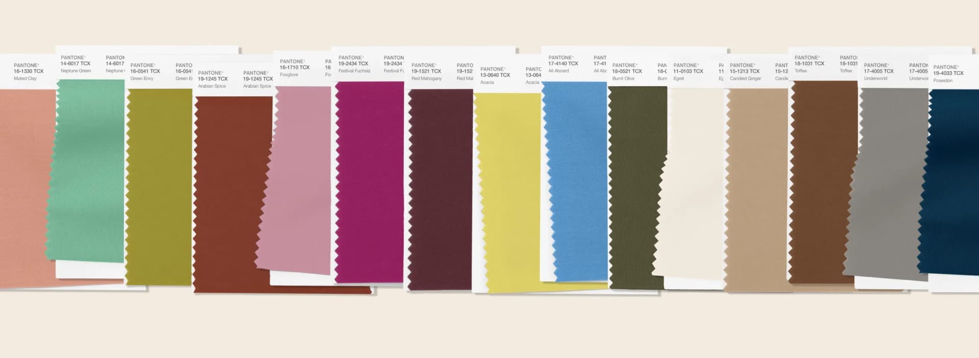
That matters because this is not just a pretty palette slide. Pantone says the report includes the top ten standout colors plus six seasonless shades, and the whole point is individual expression, not obedient matching. Leatrice Eiseman calls Spring/Summer 2026 a continuation of the “drumbeat for honesty, authenticity” and the urge to put “our own unique stamp” on what we wear, which is exactly why color now feels less like an accent and more like the outfit’s main idea.
Why the new palette feels sharper than last year’s
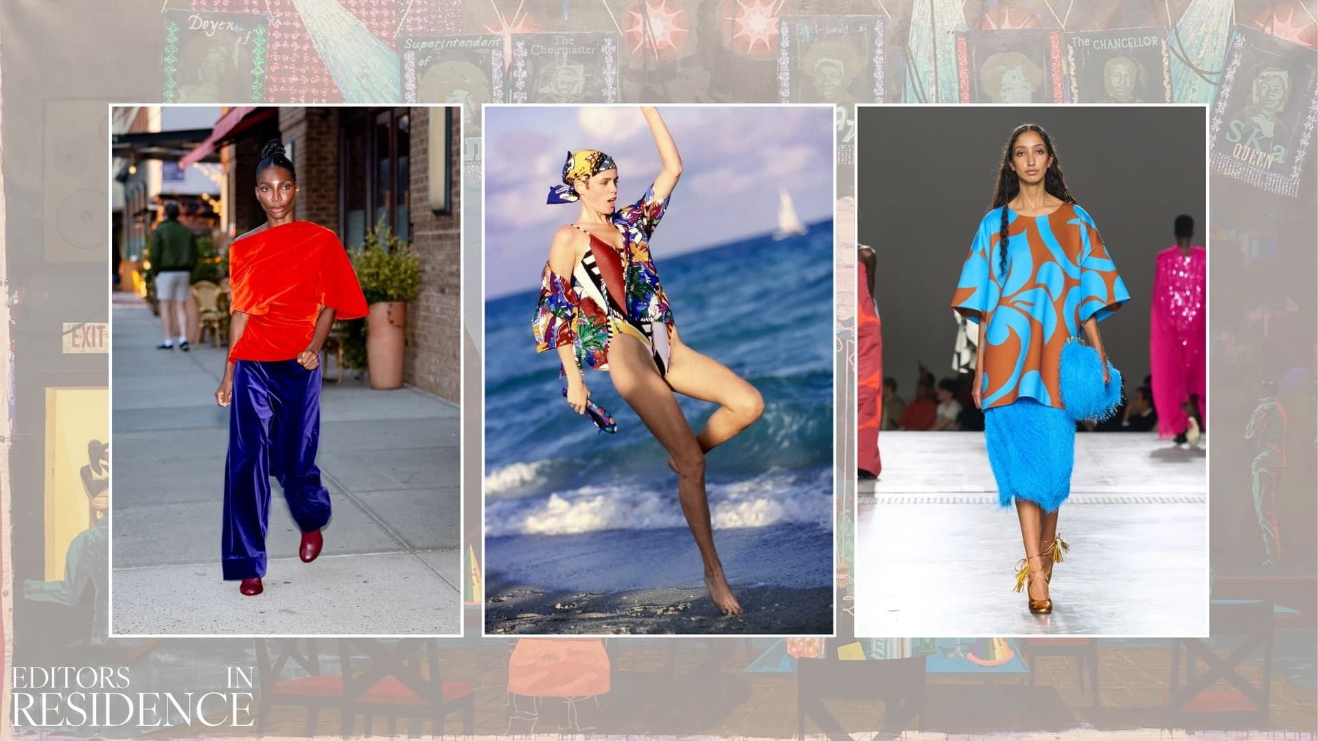
Pantone’s standout shades tell you everything about the mood shift. Acacia, Marina, Muskmelon, Alexandrite, Lava Falls, Dusty Rose, Tea Rose, Amaranth, White Onyx and Sage Green do not read as a soft-focus rainbow; they read as a wardrobe with opinions. Some are warm and edible, some are cool and mineral, and the mix of vivid colors with foundational tones is what makes the whole thing feel wearable instead of costume-y.
WWD’s coverage of the same report picks up the same energy, with Eiseman describing the season’s mood as “a spirit of quirkiness and originality.” She also points out that younger consumers have no problem mixing stripes, dots and plaids, which used to be treated like a fashion crime scene but now looks like the most normal thing in the world. Add vintage to that mix, and the message is clear: old and new are being thrown together on purpose, and the best looks are the ones that feel slightly unexpected.
That is why Who What Wear’s 2026 color guidance lands so cleanly. The site frames the year as contrast-first, drawing inspiration from the runway, art, nature and interiors instead of safe, matching sets. In other words, the smartest outfits are borrowing the tension of a gallery wall, a flower bed, or a well-designed room, then turning that tension into clothes.
The three contrast formulas that actually work
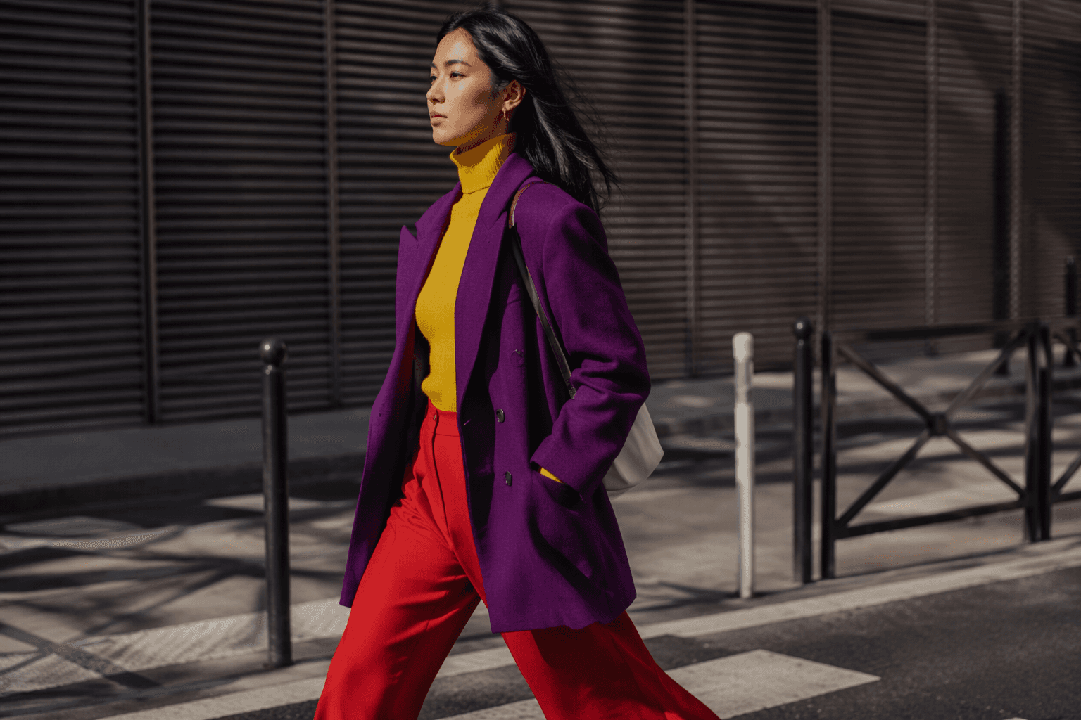
The first formula is the easiest one to wear and the hardest one to overdo: pair a soft shade with a hard one. The runway versions are already there in black and white terms of the palette, with Who What Wear pointing to ballet pink and red, while Coveteur flags tomato red, cobalt blue and deep eggplant as major shades across Spring/Summer 2026 and Fall/Winter 2026 shows. In real life, that means a blush knit with red trousers, a red tee under a pale pink jacket, or a cobalt sweater with a satin skirt that keeps the whole thing from going sweet.
The second formula is all about grounding one bright color with something that lets it breathe. Who What Wear’s cerulean and espresso pairing is the clearest example, because the dark, coffee-toned base gives the blue somewhere to land. Translate that to your closet and you get a Marina sweater with crisp White Onyx trousers, a Lava Falls blouse with deep wash denim, or an Alexandrite coat over a simple neutral dress. The trick is not to mute the color; it is to give it a clean runway next to something steadier.
The third formula is the one that turns a good outfit into a memorable one: mix color with pattern, texture, and a little vintage attitude. Eiseman’s point about stripes, dots and plaids is not trivia, it is the whole mood. Try butter yellow with sage green the way Who What Wear highlights it, then push it further with a striped shirt under a plaid jacket, or a Tea Rose knit with a vintage floral skirt that looks pulled from a different decade but still feels current.
How to make it feel normal, not styled to death
The easiest way to wear this trend is to stop thinking in terms of perfect sets. Instead of buying the exact matching top and skirt, build around one strong color, one contrast, and one calm anchor. If you want the most immediate payoff, start with the combinations already proving themselves on the runway: pink with red, cerulean with espresso, butter yellow with sage green, or tomato red with cobalt blue.
What makes this shift feel bigger than a seasonal color story is the commercial signal underneath it. Pantone’s 16-shade mix is built for personal expression, and the industry is clearly rewarding outfits that look chosen, not automated. After a few seasons of polished restraint, 2026 is giving people permission to look a little louder, a little stranger, and a lot more individual, which is exactly why contrast is about to be the new neutral.
This article was produced by Prism’s automated news system from verified source data, official records, and press releases, then run through automated quality and moderation checks before publishing. The system is built and supervised by the people who set the standards it runs under. Read our full AI policy.
Did this article answer your question?


