Summer 2026 turns to Y2K brights and Pucci-inspired prints
Summer 2026 is ditching quiet neutrals for brighter, more expressive color, with Y2K sheen and Pucci prints leading the way.
Summer dressing is getting louder, and it is not happening in a subtle way. The clearest signal for summer 2026 is a move away from mute, blend-in neutrals toward color that has personality, with Y2K brights and Pucci-inspired prints doing the heavy lifting. This is less about a passing color story than about how people are actually buying, styling, and wearing their clothes now.
The new summer palette is built for attention
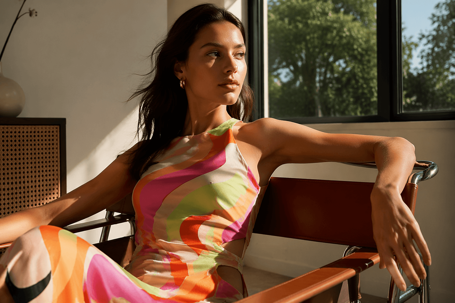
Who What Wear UK reads the season as an unmistakable swing toward more expressive pigments, and that matches the mood on the runways and in the market. The point is not to pick one loud shade and call it a day, but to treat color as part of the outfit’s attitude: glossy, optimistic, and deliberate. Summer 2026 wants the kind of brightness that looks at home on a satin slip, a skimpy bikini, or a printed scarf tied low on the hip.
Pantone’s Spring/Summer 2026 Fashion Color Trend Reports make that shift feel official rather than theoretical. The New York report, released on September 11, 2025, frames the palette as a mix of divergent colors meant to unleash individual expression, while also naming a more contemporary anxiety in fashion: designers are pushing back against AI and creeping homogenization through more personal color use. In other words, color is becoming a form of resistance as much as a styling choice.
Pantone’s SS26 reports point to a broader reset
Pantone’s London report, released on September 18, 2025, says the season reimagines the past with a forward-thinking twist. It features ten standout colors plus six seasonless shades, and the palette is designed to balance mood-boosting brights with neutrals, heritage shades, modern mid-tones and neo-elegant hues. That mix matters because it makes the trend wearable: the brights do the talking, but the quieter shades keep them from feeling costume-like.
Leatrice Eiseman, Pantone’s executive director, called the color story a reflection of authenticity, wearability and “individualized expression.” That is the real shift to watch. Summer 2026 is not asking you to abandon practicality, only to stop dressing like restraint is the default setting.
The most useful way to read the Pantone reports is as a retail roadmap. The first places you will see the shift are the categories that already reward visual impact: printed dresses, swimwear, resort separates, scarves, and easy accessories that let color do the work without a full wardrobe overhaul. Loud shades tend to arrive first in smaller, lower-commitment pieces, then spread into dressing when people realize they feel fresher than another round of beige.
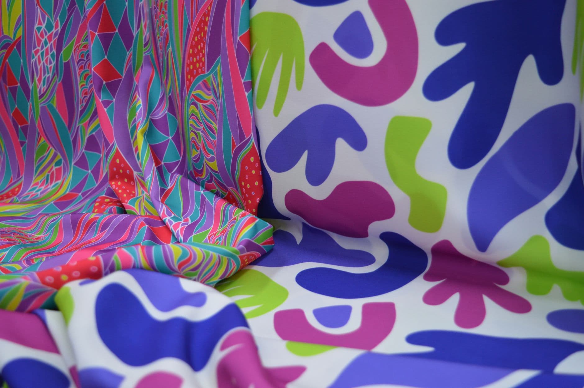
Why Y2K brights feel current again
Y2K is back in the conversation because the era understood color as a mood, not a compromise. Think shiny finishes, candy-like saturation, and palettes that looked better photographed under a club light than under office fluorescents. Summer 2026 borrows that confidence, but filters it through a more polished, grown-up lens, so the effect lands as chic rather than nostalgic for nostalgia’s sake.
That is where Pucci comes in. Emilio Pucci, born in 1914 and died in 1992, built a signature around intensely colored prints, and by the early 1960s his lightweight silk jersey dresses were popular with the international jet set. His work was widely copied and came to symbolize the youthful, optimistic spirit of the 1960s. That history matters now because the current Pucci-era callback is not just a print reference, it is a proven luxury language that has always linked color with movement, travel, and ease.
The Pucci connection also explains why these prints feel especially at home in summer. They flatter bare skin, they hold up in strong light, and they turn even a simple silhouette into something with momentum. When the pattern is this bold, the cut can stay clean: a column dress, a fluid shirt, a high-waisted bikini, a scarf knotted over a tank. The print carries the look.
What to wear if you want in now
The smartest way to adopt the trend is to start with pieces that look intentional but not precious. Choose one saturated item and let everything else support it, or lean into a print that already includes multiple colors so the styling reads effortless rather than overworked. The goal is freshness, not overload.
A few useful rules of thumb:
- If you love Y2K brightness, keep the silhouette streamlined. A vivid top or dress looks sharper when the cut is simple.
- If you want Pucci energy without going full archive, choose a print with clear movement and a palette that mixes brights with a grounding neutral.
- If you prefer subtle color, take the Pantone route and use modern mid-tones, heritage shades, or one of the six seasonless shades as the base, then add a braver accent.
- If you want your wardrobe to feel current fast, start with accessories. A scarf, shoe, or bag in a louder pigment changes the tone of everything around it.
Why teal still belongs in the conversation
WGSN and Coloro named Transformative Teal the 2026 Colour of the Year in September 2024, and it gives the brighter summer palette an earthier anchor. WGSN ties the blue-green shade to redirection, ecological responsibility, and resilience, which makes it feel like the steadier counterpart to the season’s high-voltage brights. The company also says 98 percent of respondents report that color influences purchasing decisions, and searches for teal rose 9 percent year over year on Google Trends.
That is the bigger retail story underneath all the visual noise. Color is not just decoration, it is a buying trigger. When a shade starts showing up in reports, search data, and runway palettes at once, it usually lands first in the pieces people touch most often: swimwear, soft tailoring, and easy summer separates. By the time it reaches the rest of the wardrobe, the message is already clear.
Summer 2026 is moving toward color that feels lived-in, not decorative. Between Pantone’s expressive palettes, WGSN’s teal signal, and Pucci’s enduring legacy, the season’s most convincing looks will be the ones that wear brightness with confidence and just enough control.
This article was produced by Prism’s automated news system from verified source data, official records, and press releases, then run through automated quality and moderation checks before publishing. The system is built and supervised by the people who set the standards it runs under. Read our full AI policy.
Did this article answer your question?


