Muted Spring Pairings Give Old Money Wardrobes a Fresh Edge
Muted spring colours are making old-money dressing look sharper, with cream, khaki and soft neutrals delivering polish through restraint, texture and tonal contrast.

The power of a quieter palette
Muted spring dressing is not about disappearing into beige. It is about making colour work harder by keeping it soft, edited and tonal, so the clothes look deliberate rather than decorative. Who What Wear’s spring 2026 view of the classic dresser leans exactly there: combinations should contrast, but remain versatile, which is why khaki is being treated as a lighter answer to dark brown, a shade that behaves like a neutral and sits easily beside tan, beige, cream and white.
That shift matters because the old money wardrobe has always relied on discipline. Recent fashion coverage keeps returning to the same markers: quality fabrics, precise craftsmanship, clean cuts and a neutral palette that reads as subtle rather than loud. Carolyn Bessette Kennedy remains the clearest reference point for that mood, because her appeal was never about novelty. It was about restraint that still felt expensive.
Cream and khaki, the combination that does the most with the least
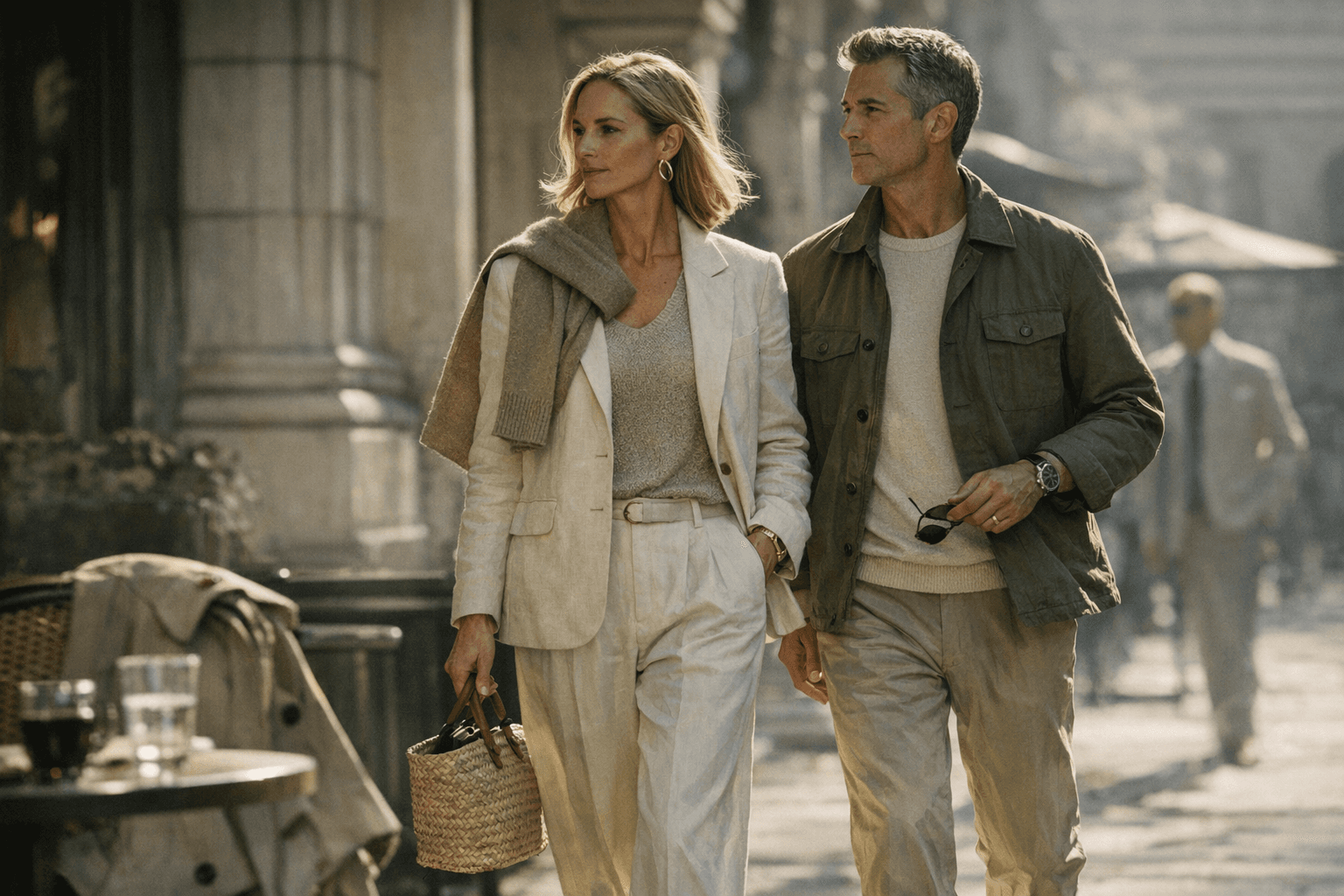
Cream with khaki is the most useful spring pairing in the group because it has enough contrast to feel styled, but not enough to feel forced. In linen, the pairing looks especially good when both pieces have a matte, sun-warmed finish, like a cream shirt with fluid khaki trousers or a sleeveless dress under a softly tailored khaki jacket. The effect is country-house polished, the kind of dressing that feels calm even when the silhouette is simple.
What gives it strength is that khaki reads as a neutral with a little more character than beige. It is lighter than dark brown, but it still carries weight, which means it can anchor silk, cotton poplin and light wool without making them look precious. That balance is what makes the combination feel current in spring 2026: not brighter, not trendier, just more composed.
How texture turns simple colour into something richer
The real lesson in this palette is that tone alone does not create luxury. Texture does the heavy lifting. A cream silk blouse against khaki cotton poplin will always look more expensive than the same colours in flat jersey, because the eye reads the difference between sheen and structure. Likewise, a light wool blazer over a linen skirt gives the outfit depth without needing a bolder hue.
This is where old money dressing stays interesting. The palette is muted, but the outfit is not bland, because each fabric has its own voice. Linen brings air and ease, silk adds softness and movement, cotton poplin sharpens the line, and light wool introduces enough body to make a simple dress feel considered. When the colours stay restrained, texture becomes the finishing touch that keeps everything from looking uniform.
The pairings that feel most refined
The beauty of this spring mood is that it does not require a total wardrobe refresh. Who What Wear’s broader spring 2026 coverage leans into easy, elevated elegance, which means the best combinations are the ones that can move through a week without ever looking overdone. A cream dress with a khaki jacket, tan trousers with a beige knit, or white cotton with khaki tailoring all sit comfortably in that register.
A few combinations deserve special attention:
- Cream with khaki, for the clearest old money contrast.
- Tan with beige, for tonal dressing that feels especially polished in linen.
- White with khaki, for crispness that still reads soft.
- Beige with cream, for the kind of quiet layering that works in silk or light wool.
- Khaki with dark brown accents, for depth that stays grounded in neutrals.
None of these relies on statement colour, and that is the point. The interest comes from scale, surface and proportion. A sleeveless cream column dress looks sharper with a khaki blazer thrown over the shoulders than with a bright accent, because the restraint gives the outfit its authority.
Why this palette feels especially right now
There is a commercial logic behind the return to polished understatement. The Business of Fashion and McKinsey’s State of Fashion 2026 says the fast-growing mid-market segment has overtaken luxury as the main value creator, while brands are moving upmarket in response to value-seeking consumers and pressure on luxury pricing. In other words, shoppers still want polish, but they are more selective about where they find it.
That helps explain why restrained dressing has such momentum. The appetite is not for obvious status. It is for product that feels elevated in finish, cut and wearability. Muted spring pairings answer that perfectly, because they signal discernment without shouting, and they make clothes look more expensive by refusing to overcomplicate them.
How to wear old money neutrals without looking flat
The easiest way to keep this palette alive is to think in terms of contrast, not decoration. A cream dress needs the grounding effect of khaki if you want it to feel country-house refined. A tan skirt needs the sharpness of a white shirt or poplin top. A beige suit needs silk or fine knit somewhere near the face so the outfit does not collapse into sameness.
The classic dresser’s instinct is not to chase every colour that appears in the season’s mood board. It is to choose shades that work together and fabrics that give them dimension. That is why spring 2026’s most appealing looks are less about a new colour story than a smarter one. The wardrobe looks fresh because it has been edited, and it looks expensive because it never tries too hard.
This article was produced by Prism’s automated news system from verified source data, official records, and press releases, then run through automated quality and moderation checks before publishing. The system is built and supervised by the people who set the standards it runs under. Read our full AI policy.
Did this article answer your question?