Bold Spring 2026 Color Pairings That Elongate Petite Silhouettes
Spring’s boldest color pairings can do more than refresh a wardrobe. Placed with intention, they lengthen petite frames, sharpen proportions, and make every outfit feel deliberate.

The petite advantage in spring’s bold-color moment
Spring 2026 is giving petites a rare gift: color that works like tailoring. The strongest pairings, from butter yellow with cool blue to chartreuse with burgundy, do not just feel fresh. They can stretch the eye upward, create cleaner lines, and keep a shorter frame from looking chopped into pieces.
That matters because the season’s color conversation is not subtle. Pantone’s Fashion Color Trend Report for New York Fashion Week Spring/Summer 2026, released on September 11, 2025, lays out a palette built around 10 standout colors and six seasonless shades. The mix includes Acacia, Marina, Muskmelon, Alexandrite, Lava Falls, Dusty Rose, and Tea Rose, all part of a broader push toward personal expression and authenticity in reaction to AI-driven homogenization. In other words, the loudest thing about spring’s colors is not their brightness. It is their point of view.
Why color placement matters more on petite frames
On a petite body, contrast can either lengthen or interrupt. The trick is not avoiding bold color, but controlling where the eye lands. Vertical continuity, whether through tonal dressing or a pair of colors that fade into each other, usually reads longer and leaner than sharp, high-contrast blocking that cuts the body in half.
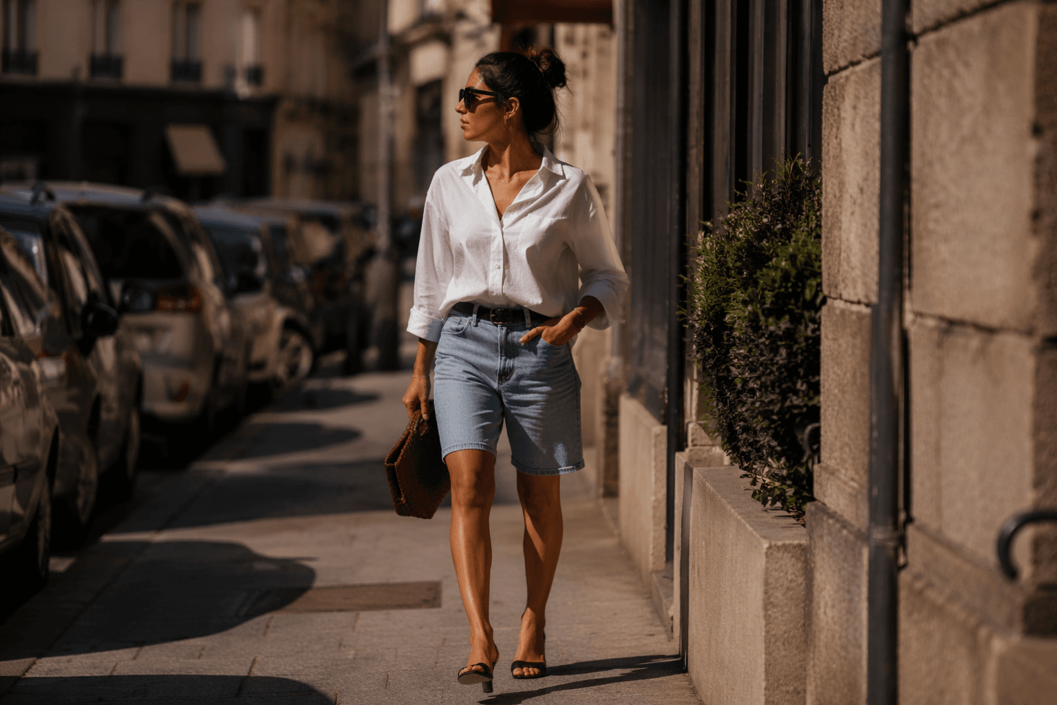
That is why petite dressing benefits so much from deliberate proportion play. Who What Wear’s petite style guidance notes that shoppers 5'4" and under often need petite-specific sizing or alterations, because the right fit helps a smaller frame look more streamlined. The same advice makes the case for high-rise bottoms, which visually lift the waist and make legs appear longer. Once the fit is right, color becomes the next tool, not the first problem to solve.
The best color pairings are the ones that keep moving
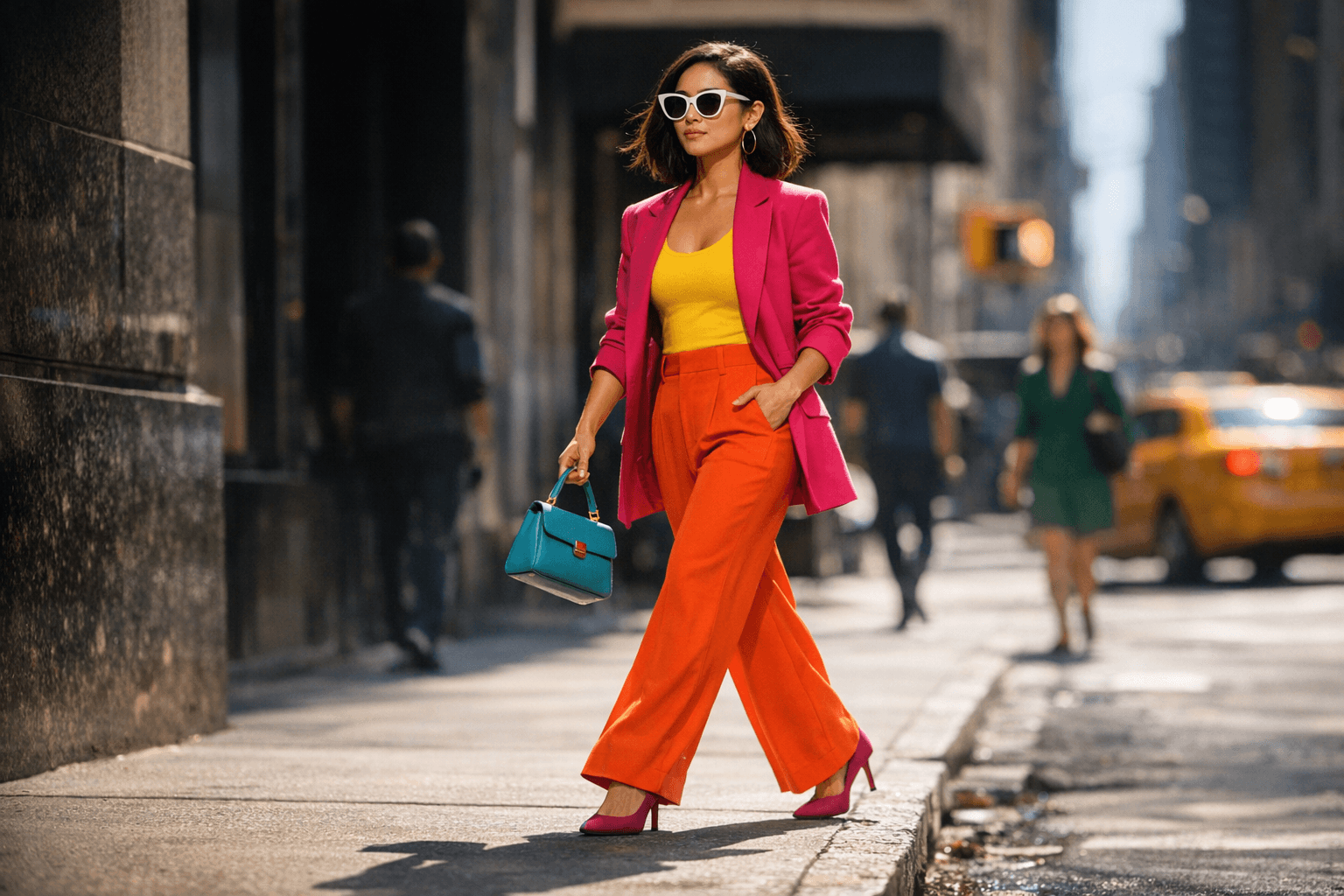
Butter yellow with cool blue is one of spring’s smartest combinations because it feels light without becoming flat. The key is to let one shade dominate and the other support, rather than splitting the body into equal blocks. A butter-yellow top with cool-blue trousers, for example, can carry the eye from shoulder to hem in one clean sweep, especially if the pieces share a similar softness in fabric, such as a fluid cotton poplin or a lightweight knit.
Bubblegum pink with merlot works differently. It is richer, moodier, and a little more unexpected, which is exactly why it can look chic on a petite frame when the colors are layered rather than boxed off. Think a pink blouse tucked into merlot trousers, or a merlot skirt grounded by a pink cardigan worn open over a matching column underneath. The closer the shades sit in depth, the less likely they are to feel visually severing.
Chartreuse with burgundy is the most dramatic of the trio, and it can either elongate or segment depending on proportion. Used in a top-and-bottom split with a clean waistline, it delivers contrast with polish. But if the colors are divided too evenly across the torso and legs, the effect turns choppy fast. On petites, that pairing works best when one hue takes up most of the outfit and the other appears as an accent, not a 50-50 collision.
Tonal dressing still wins when you want length
For petites, tonal dressing is the quiet power move. A head-to-toe range of yellow, blue, pink, or burgundy keeps the eye traveling without interruption, which is especially useful when the silhouette is already compact. Even when the pieces are not identical, staying within the same color family helps create one long visual line instead of several short ones.
This is where spring’s palette gets interesting. Pantone’s emphasis on individuality does not mean every outfit has to shout. A close tonal story in Marina, Dusty Rose, or Tea Rose can feel more modern than a hard split of unrelated hues. The look is strongest when texture does the talking, such as matte against sheen, or a crisp shirt against a soft knit, because the difference registers without breaking the frame.
When off-kilter color pairings work, and when they do not
Who What Wear is right to call spring 2026 a season of off-kilter color pairings. These combinations are what keep bold color from feeling predictable, and they are the reason the trend looks fashion-forward rather than costume-y. On a petite figure, though, off-kilter only works if the silhouette stays clean.
- Let one color dominate the look.
- Keep the waist visible when possible.
- Use high-rise bottoms to lengthen the lower half.
- Favor streamlined cuts over too much volume in two competing hues.
- Repeat a shade in a shoe, belt, or bag if you need the outfit to feel connected.
That means a few smart rules:
Oversized shapes can still work, but Who What Wear’s petite guidance makes clear that fit becomes even more important when volume enters the picture. A boxy jacket in two loud colors can overwhelm a small frame unless the proportions are precise. The same jacket, cropped just right and paired with a high-rise pant, can suddenly look sharp and leggy.
The runway says this is not a passing street-style trick
The appeal of spring’s color story is that it is not confined to influencers or styling hacks. WWD’s spring 2026 runway coverage points to bold color at Prada, Valentino, and Dior, which tells you everything you need to know about how serious this direction is. When houses with that kind of reach lean into vivid color, the message is clear: this season is about conviction, not caution.
That runway backing matters for petites because it validates the idea that color can behave like structure. A strong pairing is not just decoration. It can define the line of the body the way a seam, dart, or hem would. The smartest spring looks use color to shape the eye, not distract it.
How petites should wear the season now
The easiest way to make spring’s color story work is to think in columns, not contrasts. A butter-yellow top with cool-blue trousers can feel long and light if the rise is high and the hem is clean. A merlot base with a pink layer reads richer when the deeper shade anchors the lower half. Chartreuse deserves a disciplined hand, especially when burgundy enters the mix, because the more controlled the placement, the more polished the result.
Pantone’s palette, with its 10 standout colors and six seasonless shades, gives the season a broad enough range to suit different wardrobes and skin tones. The real lesson is not to wear more color, but to place it better. On a petite frame, the right pairing can lengthen the body, sharpen the silhouette, and make bold dressing look effortless instead of overworked.
Spring 2026 is not asking petites to disappear into neutrals. It is asking them to use color with precision, and that is where the best-dressed small frames will have the advantage.
This article was produced by Prism’s automated news system from verified source data, official records, and press releases, then run through automated quality and moderation checks before publishing. The system is built and supervised by the people who set the standards it runs under. Read our full AI policy.
Did this article answer your question?