Coffee brewing chart still shapes how experts measure extraction
The old brewing chart still fixes more bad cups than most app-driven gadgets, but it works best when you use it to separate strength from extraction.
Ernest E. Lockhart’s 1957 paper, *The Soluble Solids in Beverage Coffee as an Index to Cup Quality*, still underpins the Coffee Brewing Control Chart, which tells you whether a bad cup is weak, under-extracted, over-extracted, or just mis-scaled. Modern brewing setups can hide the real problem behind beautiful gear and expensive beans.
Why the chart still matters
That Coffee Brewing Institute publication ran 13 pages. The Institute was established in 1952 to encourage the coffee industry to learn more about coffee. Lockhart’s work helped push coffee evaluation toward numbers instead of vibes, and the classic chart is still widely used around the world by coffee experts.
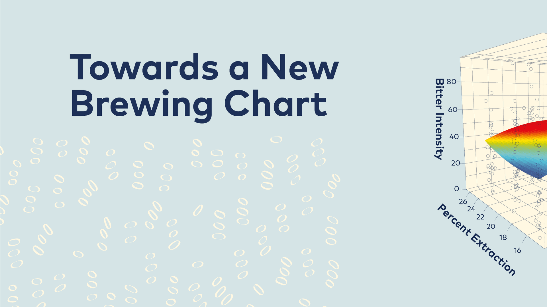
The chart uses a simple structure. Total dissolved solids, or TDS, sit on the vertical axis, extraction yield sits on the horizontal axis, and brew ratio runs diagonally through the graph. That layout gives you a fast read on what the brew is doing: low extraction tends to taste sour or grassy, high extraction tends to taste bitter, low TDS reads as weak, and high TDS reads as strong. More recent versions also trimmed away some of the old prescriptive labels, including “bitter” and judgment words like “under-developed.”
Where it still helps in a home kitchen
The chart separates concentration from extraction, two problems that get tangled all the time. If your cup tastes thin and sour, the chart points you toward both more dissolved solids and more extraction, which is where grind size, brew time, temperature, and agitation all come into play. If your coffee tastes harsh or bitter but still drinks weak, you may have pushed extraction too far without building enough concentration, which is usually a brew ratio problem as much as a grind problem.
Home brewers often fix the wrong variable. They will grind finer when the cup is actually under-dosed, or they will add coffee when the issue is really an under-extracted brew. The chart gives you a better triage system: decide whether the cup is weak, sour, bitter, or some ugly combination of all three, then move in the direction the graph suggests instead of making random changes.
A few practical scenarios make this obvious:
- If your pour-over with a washed light roast tastes sharp, lemony, and hollow, the chart says you are probably too low on extraction and too low on concentration. Finer grind, slightly longer contact time, or a little more agitation can move you in the right direction.
- If your French press tastes muddy but still thin, that is not the same as a well-extracted strong cup. You may need a heavier brew ratio, because concentration and extraction are not the same thing.
- If your espresso shot tastes bitter but the drink still feels watery, the chart helps you stop blaming only grind size. You likely need to rethink dose, ratio, or both, because you can over-extract a weak cup just as easily as an over-concentrated one.
Where the classic chart starts to bend
The chart was built for a world that was more comfortable with broad sensory labels and more uniform brew methods. That is why newer versions have pulled back some of the older value judgments, and why the Specialty Coffee Association and UC Davis are actively re-examining the scientific assumptions underneath it. The chart still works, but it is no longer the last word on what a brew tastes like or why.
That tension shows up most clearly with immersion brewing. In the Specialty Coffee Association’s immersion-brewing research, full-immersion brews at equilibrium can only move vertically on the classic chart by changing brew ratio. In plain English: once an immersion brew has equilibrated, you can adjust strength by adding or removing water-to-coffee ratio, but you are not getting the same kind of horizontal movement in extraction yield that you might expect from other brew styles. That is a big reason why a cupping bowl, a French press, or a carefully controlled immersion recipe can feel “stuck” on the chart in a way a pour-over does not.
Modern light roasts add another wrinkle. The chart still gives you a language for sour, bitter, weak, and strong, but those descriptors can flatten the very specific flavors you get from cleaner, lighter coffees. A washed Ethiopian that tastes sharp and floral is not the same as a badly under-extracted cup that happens to be sour, and the updated language matters because the old chart could blur that distinction.
Why the new research is not just academic
The current push around brewing data comes from the Specialty Coffee Association, the Coffee Science Foundation, and the UC Davis Coffee Center, which teamed up on a two-year Brewing Fundamentals project to re-evaluate brewing assumptions, measurement tools, sensory information, and consumer research. The result is the Sensory and Consumer Brewing Control Chart, built from years of data and designed to combine new coffee science with consumer preference data in a more user-friendly way.
The brewing conversation has moved beyond “is it under-extracted or over-extracted?” The newer chart is designed to connect technical brew numbers with what people actually prefer in the cup. UC Davis calls its Coffee Center the first academic research facility in the United States dedicated entirely to coffee, and it celebrated its grand opening on May 3, 2024.
How to use the chart without overthinking it
You do not need to turn every brew into a lab exercise. You need the chart when the cup is giving you a clear problem and you want a clear fix. It is especially useful when you are troubleshooting a brew recipe you already repeat, because it tells you whether to move extraction, concentration, or both.
The chart is worth checking when you are chasing a sour pour-over, a bitter immersion brew, or a weak espresso shot that should have more presence. It is less useful when you are trying to explain every nuance of a modern light roast or every behavior of a full-immersion brew at equilibrium.
This article was produced by Prism’s automated news system from verified source data, official records, and press releases, then run through automated quality and moderation checks before publishing. The system is built and supervised by the people who set the standards it runs under. Read our full AI policy.
Did this article answer your question?