TART kombucha concept shows a cleaner, more premium branding direction
TART's stripped-back kombucha look shows how less clutter can signal purity, premium value, and shelf credibility without falling into generic wellness cliches.
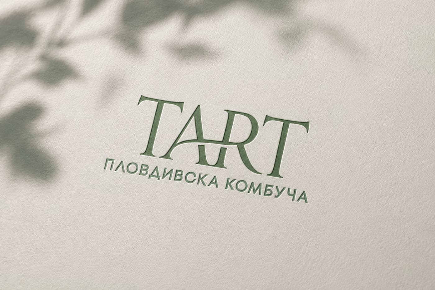
Posted on Behance on June 24, 2026, the TART kombucha concept strips the visual noise down to type, color, and spacing and makes the package feel premium instead of plain. It frames kombucha as fresh, calm, and ingredient-led, with the product image doing the persuading instead of a crowded label. For small-batch makers, a cleaner package can make a bottle feel more credible, more giftable, and less like another overworked wellness drink.
What minimalist premium actually looks like
The TART concept uses elegant typography and a restrained color palette to carry most of the brand story. At a glance, that tells shoppers the drink is thoughtful, carefully made, and not trying too hard.
That is the real shape of minimalist premium in kombucha: the label has to feel composed, not empty. The type needs enough confidence to stand on its own, the color system needs to hint at flavor without turning loud, and the spacing needs to create a sense of calm that matches the beverage’s natural origin and carefully selected ingredients. In a category where a bottle can read as medicinal, sugary, or artisanal in seconds, restraint becomes a useful signal.
A practical way to think about it is this:
- Let one strong type system lead, instead of stacking multiple fonts and competing headlines.
- Use a limited palette that distinguishes flavors without turning the label into a fruit salad.
- Keep ingredient language clean and specific, so the package feels transparent rather than promotional.
- Leave visual breathing room, because open space can read as confidence on a crowded shelf.
Why the look matters more now
The market around kombucha has grown large enough that branding is no longer only for specialty coolers. Grand View Research estimates the U.S. kombucha market at USD 1.62 billion in 2024 and projects 13.6% CAGR from 2025 to 2030. Its North America estimate is USD 1.88 billion in 2024, with 13.7% CAGR over the same period.
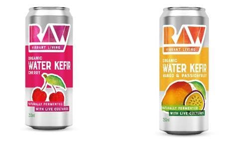
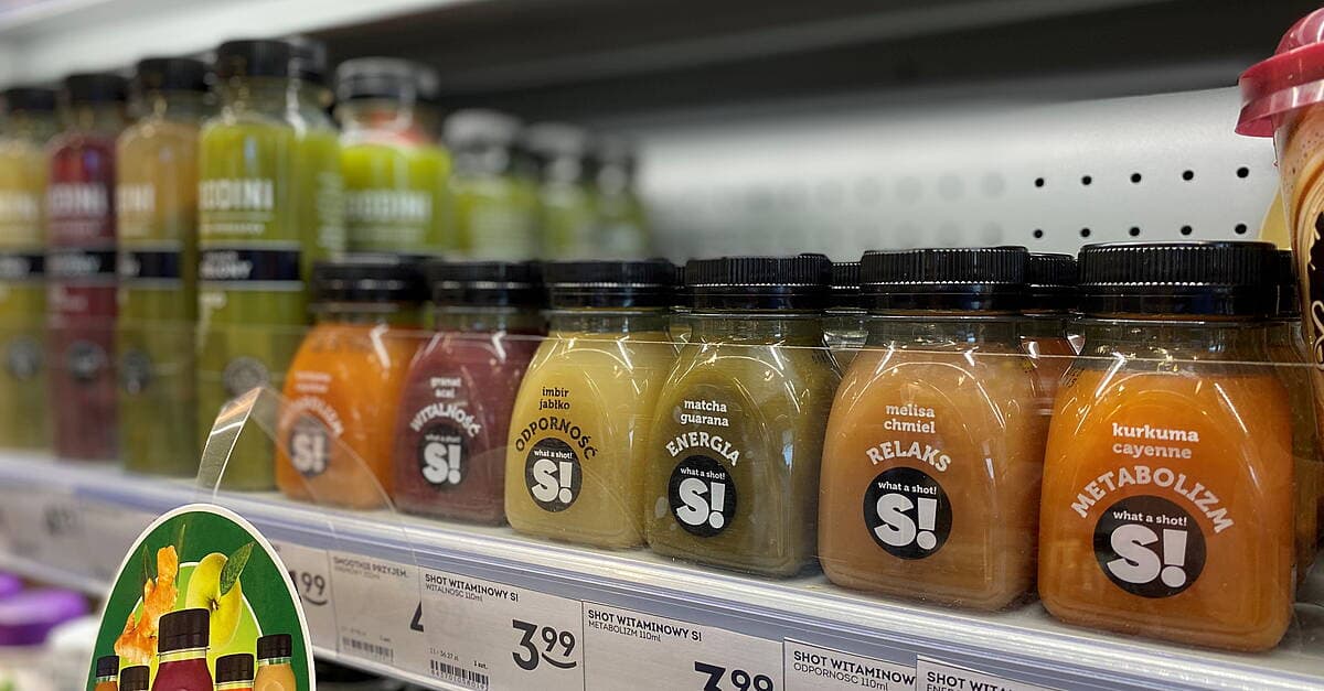
That growth is tied to rising consumer interest in healthy, functional beverages, more attention on probiotics and gut health, lower sugar preferences, and broader flavor innovation. Kombucha is now commonly found at Whole Foods Market, Target, Walmart, and 7-Eleven. Once a drink is moving through that many channels, the label has to work in a specialty aisle and in a mainstream checkout run.
That is why pared-back branding keeps reappearing. A clean label can help a bottle avoid the cluttered wellness look that has become common in functional beverages, while still feeling premium enough for direct-to-consumer sales, taproom fridges, and gifting.
What earlier kombucha rebrands reveal
This direction is not new to the category, but it keeps evolving. By 2022, kombucha packaging often favored apothecary or minimal graphic treatments, which fits a drink built around fermentation, wellness, and natural ingredients. Cove’s redesign pushed in a different direction, using color and fruit illustration to make taste more visible while still aiming for a premium position.
Cove’s own growth shows why packaging decisions became more important. The brand launched in 2016, sold at a local farmers market in Halifax within months, and was in more than 1,000 stores across Canada by 2022. That kind of scale forces a visual identity to do more work than it does at market stalls. What looks artisanal at small volume can start to disappear once the brand sits beside better-known beverages across a wider retail network.

The 2024 Pentawards received more than 2,000 entries from over 60 countries. Rebrands are considered vital for appealing to both existing and new generations.
The regulatory floor underneath the design
The cleanest label in the cooler still has to survive the legal side of kombucha. Under Alcohol and Tobacco Tax and Trade Bureau rules, kombucha with 0.5% alcohol by volume or more is regulated as an alcohol beverage under federal law. Label classification for kombucha at or above that threshold is determined case by case, based on formulation and production method.
For anyone bottling a micro-batch line or scaling up a home ferment, fermentation, sugar management, and conditioning are not just recipe decisions; they can affect how the product is classified and what the packaging can say. A minimalist label may look effortless, but the strongest versions are built on clear product knowledge, accurate wording, and a package that matches what is actually in the bottle.
How to read the trend for your own bottles
The lesson in TART is not to copy the look letter for letter. The concept succeeds because the branding, the ingredient story, and the product promise all point in the same direction, which is the part many homemade or micro-batch labels miss when they get overloaded with icons, claims, and decorative noise.
This article was produced by Prism’s automated news system from verified source data, official records, and press releases, then run through automated quality and moderation checks before publishing. The system is built and supervised by the people who set the standards it runs under. Read our full AI policy.
Did this article answer your question?