Epomaker Glyph wins over reviewer with typewriter style and great sound
The Glyph looks like a retro novelty, but two weeks at the desk made it click: dual screens, linear switches, strong acoustics, and tri-mode convenience.
The Epomaker Glyph is the kind of keyboard that looks ready to be written off as desk jewelry, right up until you actually start typing on it. Its retro, mid-century typewriter styling and oversized displays grab attention first, but the real story is that a reviewer spent two weeks on the board and came away treating it like a new favorite, not a passing curiosity.
What the Glyph gets right
The easiest mistake to make with the Glyph is assuming the look is the product. It is not. The board leans hard into a typewriter-style identity, but the point of the design is to back up the visual drama with a typing experience that feels deliberate enough to keep you at the desk. That is why the review lands more like a reality check than a hype cycle: the Glyph earns its place by being satisfying to use, not by looking clever in product shots.
That matters in a hobby where a lot of boards sell a story before they sell a feel. Enthusiast buyers know the difference between a keyboard that photographs well and one that keeps pulling your hands back to it. The Glyph apparently crosses that line because the combination of styling, sound, and switch choice turns it into something that feels like a destination board rather than a themed novelty.
Linear switches do the heavy lifting
At the center of the appeal are the linear switches. That detail matters more than the typewriter styling, because linear switches are what keep the experience smooth, quick, and uncomplicated when the novelty wears off. If you spend hours typing, you are not just buying a look, you are buying a force curve, return feel, and the way key travel settles under your fingers.
That is where the Glyph seems to surprise people. The board does not need a long explanation about what makes it fun, because the typing feel itself is doing the work. For readers who usually live in the world of tactiles, lubed linears, and carefully chosen spring weights, the practical question is simple: does it still feel good after the first hour? The reviewer’s two-week run suggests that it does.
The sound is the real hook
This is also a sound-first keyboard in the way enthusiasts actually mean it. The appeal is not just that it is quiet or loud, but that the acoustics feel intentional enough to make the board memorable. That is the sort of thing people chase when they talk about a board being thocky, muted, or clickier, and the Glyph lands on the side of the spectrum that makes it feel like a finished product instead of an empty shell.
That is important because a lot of retro-styled boards stop at the gimmick. They look interesting, then sound hollow, sharp, or forgettable. The Glyph’s stronger acoustics are what separate it from that crowd, and they are likely the reason it stops being a one-week experiment and starts becoming a board someone keeps on the desk.
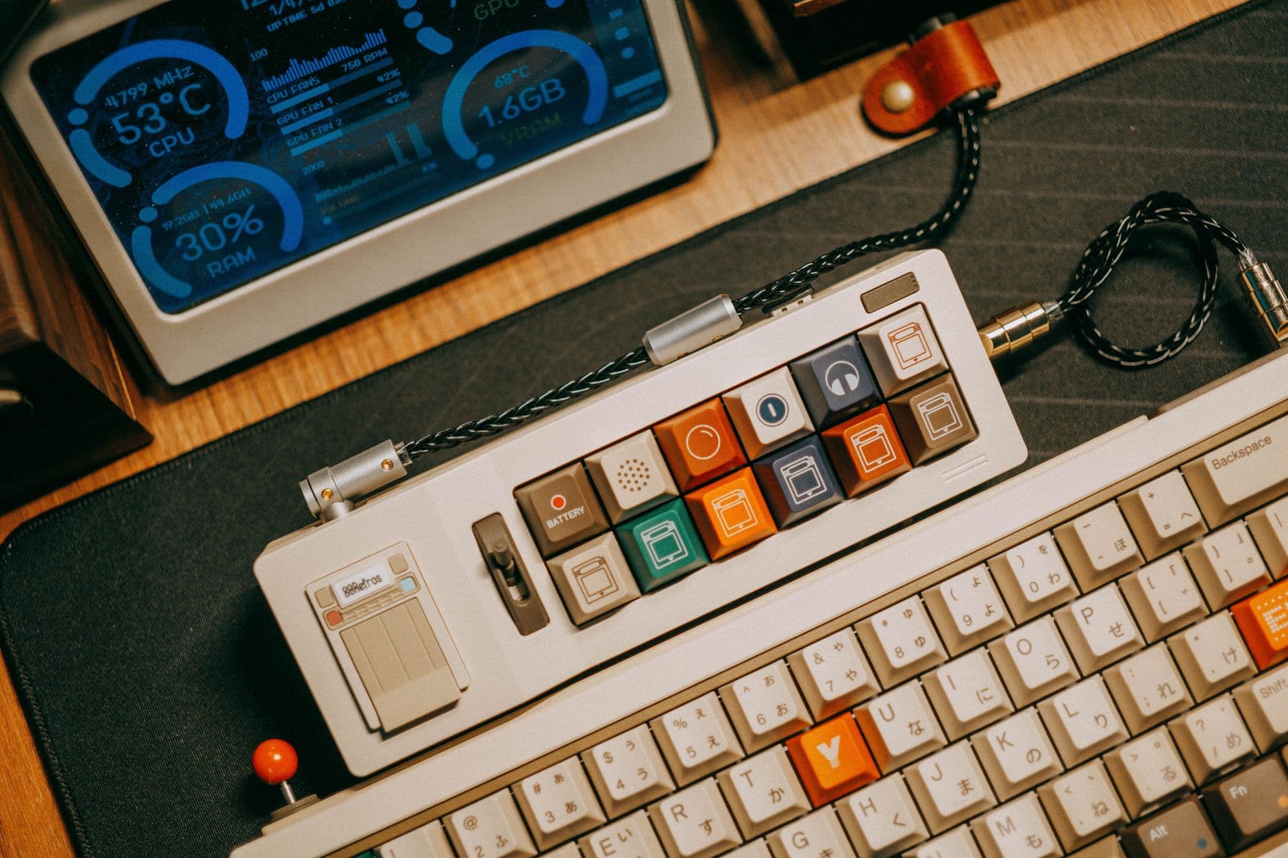
Dual screens and typewriter styling are not just decoration
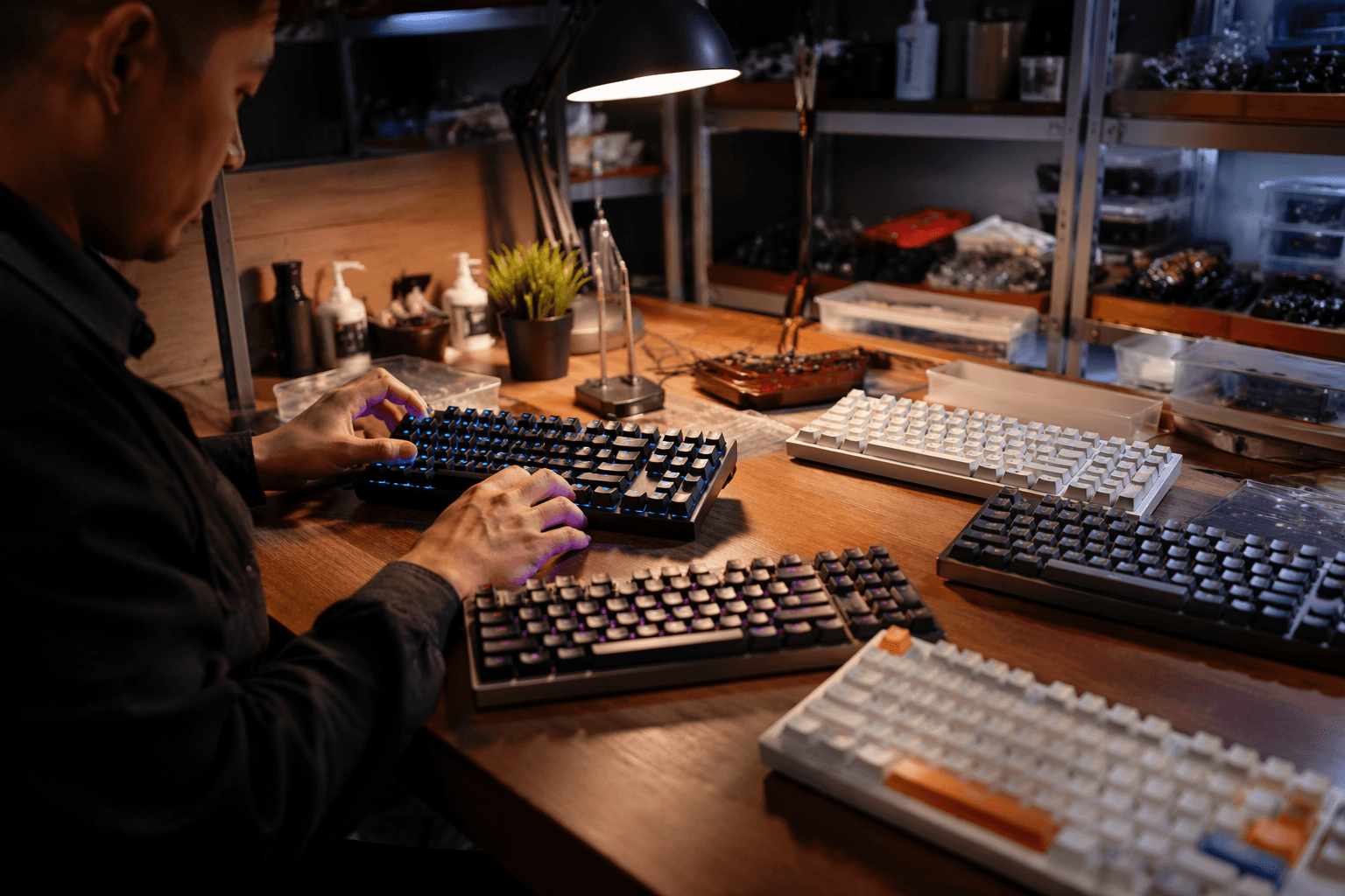
The dual screens are the wildest visual choice here, and they are a big part of why the Glyph stands out in a sea of polished but forgettable prebuilds. Combined with the huge displays and the typewriter-inspired shell, they give the board a kind of theatrical presence that few mainstream boards even try to reach. It feels intentionally overbuilt in personality, which is a nice change from the endless parade of safe rectangular cases.
Still, this is where taste divides the room. If you want minimalism, the Glyph will feel like too much keyboard. If you want a board that turns typing into a visual event without collapsing into pure cosplay, the combination of screens and retro cues is exactly the kind of excess that hobbyists tend to forgive when the typing actually backs it up.
Tri-mode wireless makes the idea more practical
The other detail that keeps the Glyph grounded is tri-mode wireless support. That gives it a more desk-friendly profile than a lot of statement boards, because it can move between devices instead of living tethered to one setup. For buyers who want a keyboard with personality but still need it to function across a work machine, a laptop, and maybe a second system, that flexibility matters.
This is one of the places where the Glyph starts to look less like reviewer bait and more like a genuine crossover board. A lot of enthusiast favorites are judged on feel alone, but the real world also includes battery convenience, desk clutter, and switching between devices. The Glyph’s wireless setup helps it escape the “cool to own, annoying to use” trap that sinks so many visually ambitious boards.
How it stacks up against enthusiast staples
Against the usual enthusiast benchmark, the Glyph is not trying to win on customization depth alone. It is trying to arrive with enough sound, enough feel, and enough personality that you do not have to spend a weekend tuning it into something usable. That is a meaningful distinction, because many beloved customs only become magical after foam changes, plate swaps, and switch tinkering.
The Glyph’s strength is that it seems to deliver a convincing out-of-box experience. That will not replace a fully modded personal build for people who want absolute control over every layer of the typing sound, but it does hit a sweet spot that many prebuilt boards miss. It gives you a strong tactile identity, a memorable acoustic profile, and a wireless setup that makes the whole package easier to live with.
That is the real reason the Glyph works. It looks like a novelty until the first long typing session tells a different story, and by the end of two weeks, the typewriter styling is no longer carrying the board. The feel and the sound are, which is exactly what a serious keyboard has to do if it wants to stay on the desk after the first impression fades.
This article was produced by Prism’s automated news system from verified source data, official records, and press releases, then run through automated quality and moderation checks before publishing. The system is built and supervised by the people who set the standards it runs under. Read our full AI policy.
Know something we missed? Have a correction or additional information?
Submit a Tip