How to judge October birthstone opal by color, tone and pattern
Opal can look like two different gemstones at the same price. The real test is play-of-color, body tone and pattern, judged under controlled light.
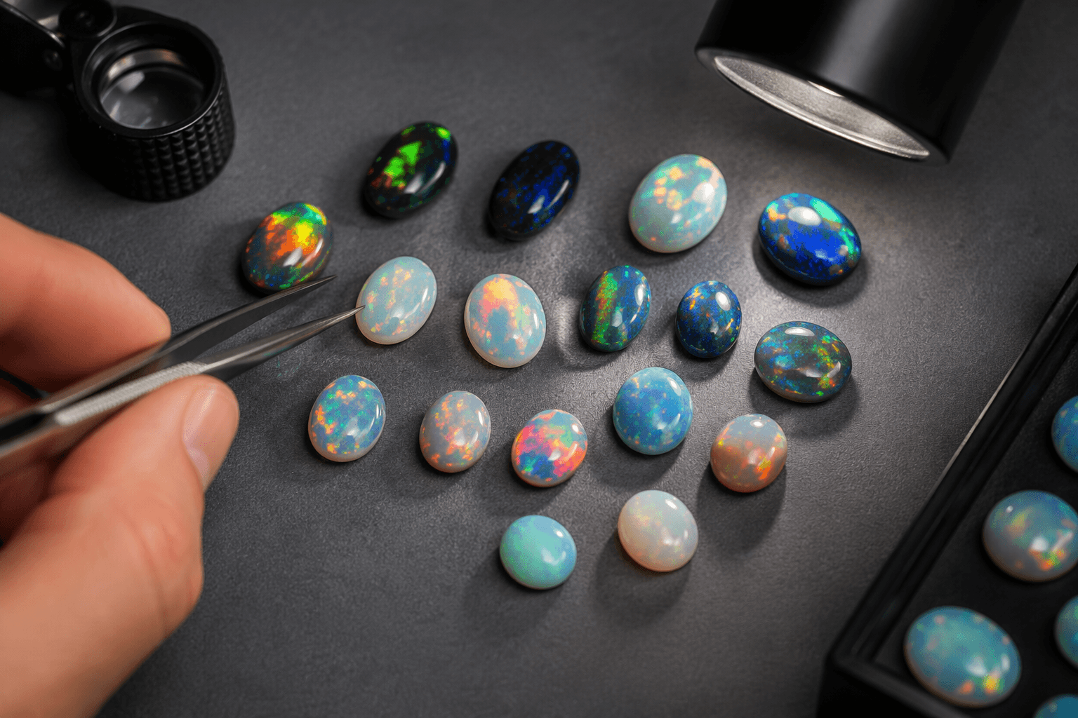
An October opal can shift from luminous to sleepy with a change in angle. GIA recommends judging the stone under controlled lighting, because individual opals vary widely in appearance and quality. That is why two opals with similar price tags can feel worlds apart once they are worn.
Read the flash first
Opal’s signature is play-of-color, the moving scatter of spectral flashes that appears as the stone turns. In a good stone, the color does not sit still as decoration; it travels across the face, which is why opal often looks more alive in motion than it does in a still product photo. This is also why opal is usually cut as a cabochon, with a domed top that preserves and displays the color play instead of breaking it up with facets.
The visual question is not simply whether the stone flashes. It is how strongly the color appears, how broad the flashes are, and whether the pattern feels concentrated or spread out. A small opal with sharp, lively color can feel more luxurious than a larger stone whose flashes are pale or timid.
Body tone changes the mood
Body tone is the backdrop that the color plays against. In trade grading, it is commonly described on the N scale from N1, the darkest, to N9, clear and translucent, with N1 to N4 generally read as black body tones, N5 to N6 as dark, and N7 to N9 as light. The scale is read from the face, not confused with play-of-color, and it measures the combination of opaqueness and darkness that gives the stone its overall mood.
That backdrop changes the entire design effect. A darker body tone can make the color look sharper, denser and more dramatic, while a lighter body tone can make the same flashes read airy, milky or fresh. In October jewelry, that means a black or dark opal can carry a stronger cocktail-ring presence, while a light or crystal opal can feel softer in a pendant or everyday stud.
Pattern is where the personality lives
Pattern is the arrangement of the color across the stone, and it is where two opals that seem similar in a web photo can diverge completely in person. The flashes may be concentrated, broad, scattered or banded, and that distribution changes whether the gem feels electric, orderly or quiet. CSIRO describes opal assessment as highly subjective because it depends on human observation of flashes of colour, body tone, colour, brightness and pattern.
Some pattern names are already part of the trade vocabulary. Pinfire describes tiny pinpoint flashes, flashfire suggests larger, more explosive bursts, Chinese writing refers to line-like shapes, rolling flash moves as the stone turns, and harlequin or mosaic presents angular flashes laid out in a striking grid-like effect. In an October 19, 2022 post, GIA Education wrote that harlequin or mosaic displays angular flashes of play-of-color and is the most valuable opal pattern.
A stone with a quieter pattern may still be beautiful in a minimalist bezel, but a vivid harlequin stone can dominate a setting even when the gem itself is not large.
Shape, dome and setting matter more than size
Because opals are commonly cut as cabochons, the dome shape becomes part of the grading conversation. A well-proportioned dome can bring the color closer to the eye and help the pattern read cleanly across the surface, while a shallow or poorly oriented cut can mute the life in the stone. Surface area matters too: a broad opal face can show more of the pattern, but if the color is weak, size alone will not rescue it.
For rings, the best opal is often one that keeps its color visible in ordinary hand movement, because a ring spends its life under changing angles and mixed light. Pendants have more room to show a larger face and more nuanced pattern, while earrings can favor stones with clear, bright color that reads quickly at a glance.
Retailers and educational sources often rely on stone-by-stone descriptions, and that caution is justified. Photos can flatten the differences between a broad rolling flash and a concentrated pinfire stone, or hide how much the body tone shifts from face-up to side view. In-person viewing is still the surest way to see whether an opal has true brightness or just a good camera angle.
October has two very different birthstone voices
GIA lists October’s two birthstones as opal and tourmaline. Tourmaline brings a more straightforward chromatic story, but opal is the stone that changes character from one setting to the next.
Geoscience Australia, which last updated its opal page on May 14, 2025, identifies opal as Australia’s national gemstone. Much of the stone’s modern prestige is tied to the country’s mining story and supply chain. The American Gem Society dates a major opal discovery to 1952, which helped cement the gem’s place in contemporary jewelry culture.
How to judge the stone you are actually looking at
The most useful way to compare October opals is to hold the same three questions against every stone: how strong is the play-of-color, how dark or light is the body tone, and how does the pattern sit across the face? A similar price can hide a very different answer to each question. One opal may be modest in size but brilliant under movement, while another may be larger but flat because the body tone is too pale or the pattern too sparse.
This article was produced by Prism’s automated news system from verified source data, official records, and press releases, then run through automated quality and moderation checks before publishing. The system is built and supervised by the people who set the standards it runs under. Read our full AI policy.
Did this article answer your question?