E-Color Diamonds: When the Premium Beats Better Cut or Carat
E color can look breathtaking in the right ring, but in many popular settings it is money you will not see. Spend the premium only where metal, shape, and scale make whiteness read.
The decision usually happens under bright showroom lights: a platinum solitaire, a crisp round brilliant around 1.50 carats, and two nearly identical stones on paper. One is E color. The other is F or G. The price gap feels personal, because it is not “extra,” it is the difference between staying at 1.50 and crossing into 1.70, or between a competent cut and a truly electric one.
That tradeoff matters more than ever when budgets have edges. The Knot’s 2024 Jewelry & Engagement Study put the average engagement ring cost at $5,200, down from $6,000 in 2021, $5,800 in 2022, and $5,500 in 2023. BriteCo, working from anonymized U.S. insurance appraisal data, reported a 2025 average engagement ring cost of $6,504. Survey versus appraisal is not an apples-to-apples comparison, but the message is the same: most people are shopping in the mid-thousands, where a single color grade can decide the entire design.
What you are paying for with E color, in real life
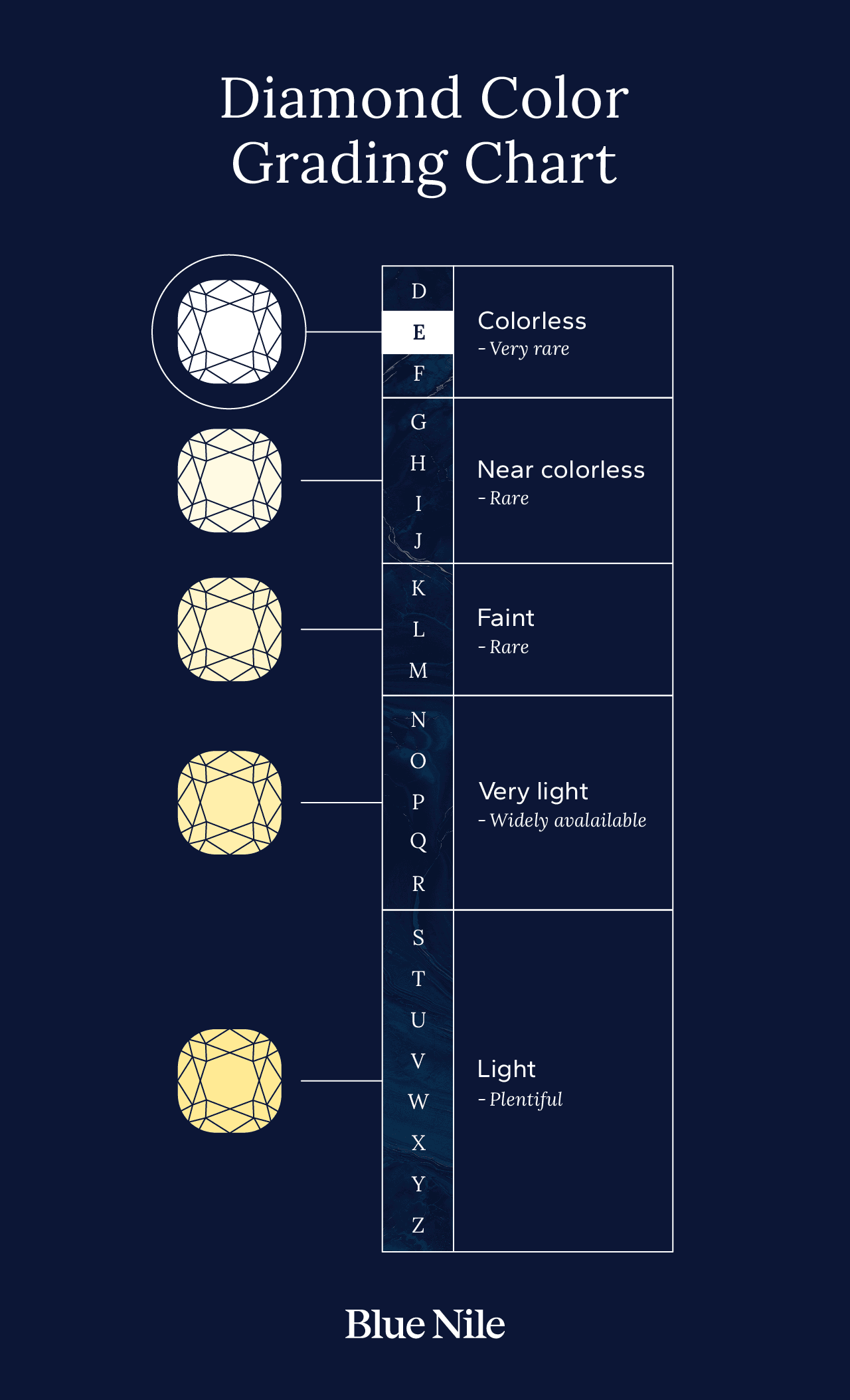
E sits at the very top of the modern color conversation because the Gemological Institute of America established the D-to-Z color system in the early 1950s and issued its first diamond grading report in 1955. In that system, D is the highest “colorless” grade, then E, then F, followed by G, H, and onward, each step representing a defined range of body color.
Here is the part consumers find emotionally confusing: the difference between E and F can be subtle face-up, yet it can still move price meaningfully because the market treats those top letters as scarce. The trade also has its own scaffolding. Rapaport created the Rapaport Price List in 1978, and it is published weekly, Thursdays at 11:59pm ET, as a benchmark for asking prices of polished diamonds. It is not a record of what a stone actually sold for, but it shapes expectations. When you choose E, you are buying into the premium end of that expectation system.
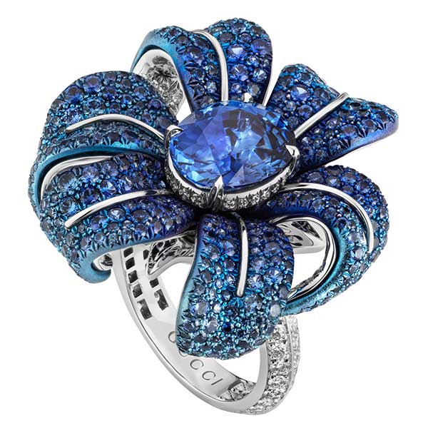
The settings where E color is visibly meaningful
Platinum or white-gold solitaires, especially clean, minimal ones
If your ring is an icy, architectural solitaire in platinum or white gold, color has nowhere to hide. A plain-shank solitaire, a knife-edge band, a sleek bezel, even a six-prong “Tiffany-style” basket, all behave like a white frame around the diamond. That frame can make any warmth in the stone easier to notice, particularly in daylight.
This is exactly why the American Gem Society emphasizes that its graders evaluate diamonds loose, so metal does not influence perceived color. A mounting can change what you think you see. In a white metal, the eye has a high-contrast reference point, and E’s “coolness” reads as intentional, like a fresh sheet of paper.
Step cuts: emerald and Asscher
If you love an emerald cut or an Asscher, E earns its keep more often than it does in a round. Step cuts act like calm windows rather than glitter bombs. Their broad facets and slower patterning make body color and transparency easier to perceive, especially across the large “hall of mirrors” center.
In other words, step cuts do not distract you from color. They present it. If you are building a ring around clean geometry, long lines, and that particular glassy elegance, E can be the difference between “platinum sleek” and “platinum, but a little creamy.”
Larger center stones, where the eye has more surface area to judge
Carat is not just weight, it is canvas. As the face-up size increases, your brain has more area to read color, and subtle warmth has more room to show itself. If you are shopping in sizes where the center stone dominates the hand, the premium for E can be easier to justify because you will actually live with the difference.
This is also where the opportunity cost becomes stark: the same money that buys E might instead push you to a larger spread, or into a higher-performing cut. So E makes the most sense when your design goal is “clean white presence,” not “maximum sparkle for the dollar.”
The settings where E is largely wasted
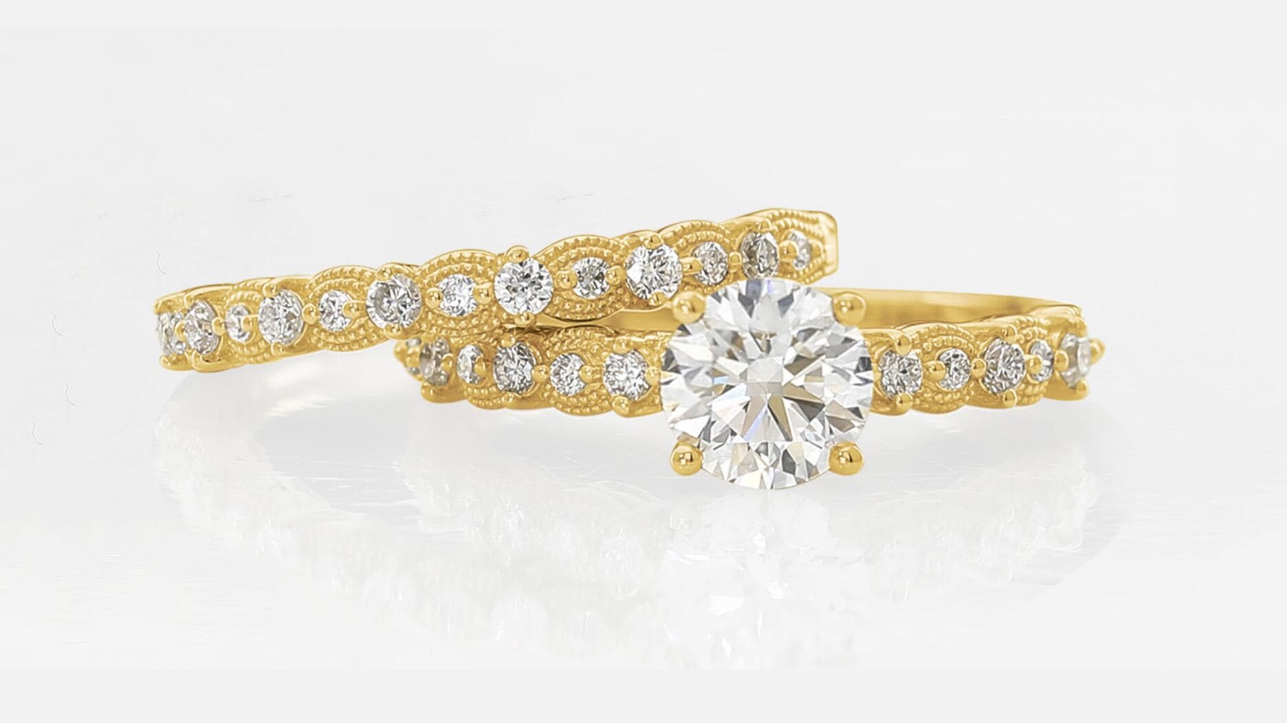
Yellow-gold and rose-gold cathedrals
A yellow-gold cathedral, with its shoulders rising to meet the head, is not just romantic architecture. It is also a warm environment. The AGS points out a practical visual truth: a diamond set in yellow gold can appear less yellowish than one in a white-metal mounting. Warm metal can mask warmth in the stone.
That means you can often step down from E to F or G in a yellow-gold cathedral, keep the face-up look you want, and reinvest the savings where the ring will show it: a better cut, a sturdier head, a more comfortable shank thickness, or hand-finished details that keep prongs elegant instead of bulky.
Halos and busy micro-pavé frames
A halo is a spotlight, but it is a noisy one. When a center stone is surrounded by a ring of small diamonds, your eye reads the composition as a field of sparkle, not a color study. In many halo designs, the center’s body color is visually “averaged” by the surrounding scintillation, especially if the halo stones are bright and well-matched.
This is where paying for E can feel like buying a silk lining no one sees. If the design is meant to dazzle, cut quality and make matter more than that last notch of whiteness.
Round brilliants chosen for fire and scintillation
Round brilliant diamonds are engineered to return light. A strong cut can dominate your perception so completely that E versus F or G becomes a footnote until you compare stones side-by-side in neutral lighting.
That is the practical, not theoretical, case for reallocating budget. If you are choosing a round specifically for that “flash from across the table,” prioritize the cut that delivers it. Color can come second.
Bezel vs prong: why it changes the E conversation
A prong setting, especially a minimal four- or six-prong, exposes more of the diamond’s edge and lets in more light. It also gives you less metal influence, which can make subtle tint easier to notice against a white-metal band. In that scenario, E can look satisfyingly crisp.
A bezel does something different. It frames the stone with a continuous ring of metal. In yellow gold, it can be wonderfully forgiving, letting you choose a slightly warmer color without the diamond looking “off.” In platinum, a bezel creates a clean, modern outline that can reward higher color, but it also puts white metal in constant contact with the stone, which heightens contrast and can make warmth feel more apparent.
Trust, grading reports, and the lab-grown reality
E color exists in both mined and laboratory-created diamonds, and that is not a small footnote in an engagement ring purchase. The Federal Trade Commission updated its Jewelry Guides in 2018 and has been explicit that sellers should clearly and conspicuously disclose laboratory-created diamonds, using terms such as “laboratory-grown” or “laboratory-created” immediately preceding the word “diamond.” In 2019, the FTC sent warning letters to companies about diamond advertising disclosures across mined, lab-created, and simulated categories.
In the U.S., you will most commonly encounter GIA reporting, and the lab landscape has consolidated further. AGS Laboratories announced it would close at the end of 2022 and merge its lab operations into GIA in 2023, a shift widely discussed by industry writers including Katherine Bodoh, Rob Bates, and Joshua Freedman. The takeaway for your purchase is simple: E is only as meaningful as the grading system and disclosure practices behind it, so read the report carefully and make sure the stone’s origin is clearly labeled.
A simple rule set that spends your money where the ring shows it
Use E color like a design tool, not a moral virtue.
- Pay for E when the ring is platinum or white gold, the design is minimal, and the shape is a step cut, or the stone is large enough that your eye can read its body color easily.
- Save the premium when the setting is yellow or rose gold, especially cathedrals and bezels, or when the design is visually busy, like halos and micro-pavé, where sparkle and craftsmanship carry the look.
- Reallocate the difference into what people actually notice first: top-tier cut quality in rounds and ovals, precise setting craftsmanship, a secure and refined head, and side stones that match in brightness and proportion.
E color is exquisite when it serves the ring’s aesthetic, the way platinum and an emerald cut can look like pure intention. Everywhere else, the smartest luxury is not the whitest letter on paper, it is the most beautiful ring on the hand.
This article was produced by Prism’s automated news system from verified source data, official records, and press releases, then run through automated quality and moderation checks before publishing. The system is built and supervised by the people who set the standards it runs under. Read our full AI policy.
Did this article answer your question?