How to Build Balanced 925 Sterling Silver Ring Stacks in 2026
Master three precise rules, Thin (1–2mm)+Medium (3–4mm)+Thin, texture contrast, and one focal ring, to craft balanced, collectible 925 sterling silver stacks.

The most persuasive modern stacks treat rings as chapters of a personal story. Ahmad Assoum’s Visual Balance Science • 2026 Edition frames that story in three exact prescriptions and a practical playbook: precise band widths, deliberate texture contrast and a single resting point for the eye. Below, each rule and every practical addendum is laid out so you can build balanced 925 sterling silver ring stacks that read as intentional styling, and as saleable inventory for retailers.
1. Balance thickness: thin + medium + thin
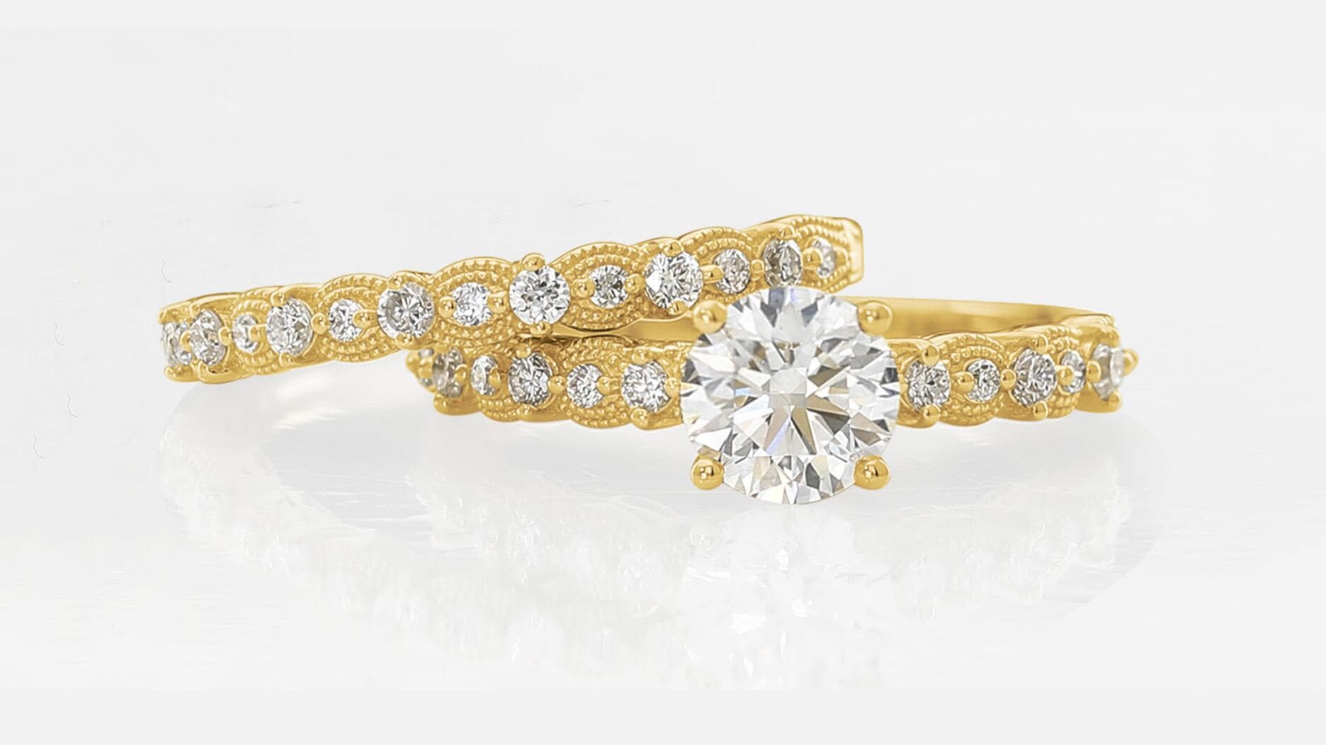
Vary band widths to create visual rhythm; Jewelry Towns prescribes Thin (1–2mm) + Medium (3–4mm) + Thin as the working formula. The rationale is concrete: differing widths make the eye move smoothly across the stack instead of stopping abruptly, while Jewelry Towns warns, "Never stack identical widths, this creates visual rigidity that fatigues the eye." For shoppers and merchandisers, list band widths in millimetres on product pages and present recommended trio sets that follow this numeric recipe.
2. Contrast texture: pair polished with matte or oxidized
Texture is how light sculpts a stack. Jewelry Towns explains that polished surfaces create sharp highlights while matte or oxidized finishes diffuse light, "polished creates sharp highlights, matte diffuses light softly", so pairing them gives depth and photographic drama. Practical pairings to test: polished + matte, smooth + hammered, and polished + oxidized; Stellaamore illustrates this with combos such as a wide smooth band next to a thin twisted ring and a hammered piece beside a high polish.
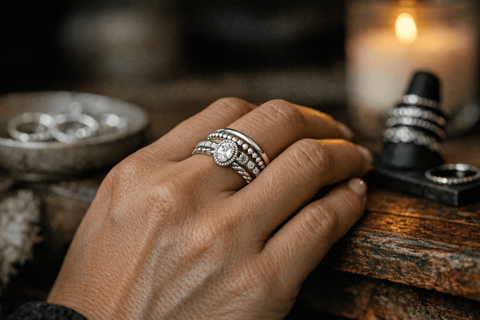
3. One focal point: limit statement pieces to ONE per stack
Keep a single statement to let the eye rest: "Limit statement pieces to ONE per stack," Jewelry Towns instructs, adding that too many competing elements create visual chaos. Place that focal ring in the center of the stack for maximum impact, Jewelry Towns’ prescription, and then put the stacked grouping on a prominent finger for attention. Stellaamore complements this by advising you to place your focal ring "on a finger, often the middle or index finger, since it draws the most attention."
4. Start small and edit with intent
Begin your narrative with one meaningful ring and add deliberately: "Your stack should reflect your journey, not follow someone else's formula. Start with one meaningful ring. Add slowly. Remove what no longer serves you," Jewelry Towns counsels. That edit-first approach keeps collections cohesive and prevents impulse doubling that dilutes the focal piece. For collectors, track which combinations are worn most, those are the ones to reproduce as curated sets.
5. Distribute across fingers for compositional balance
Stellaamore encourages multi-finger choreography rather than wearing rings on every digit. Try two on the index, three stacked on the middle, one statement on the ring finger and a pinky accent; spacing stacks across both hands, busy on one, clean on the other, creates equilibrium. This distribution also lets one hand carry a bolder narrative while the other remains understated, a useful merchandising shot for product pages.
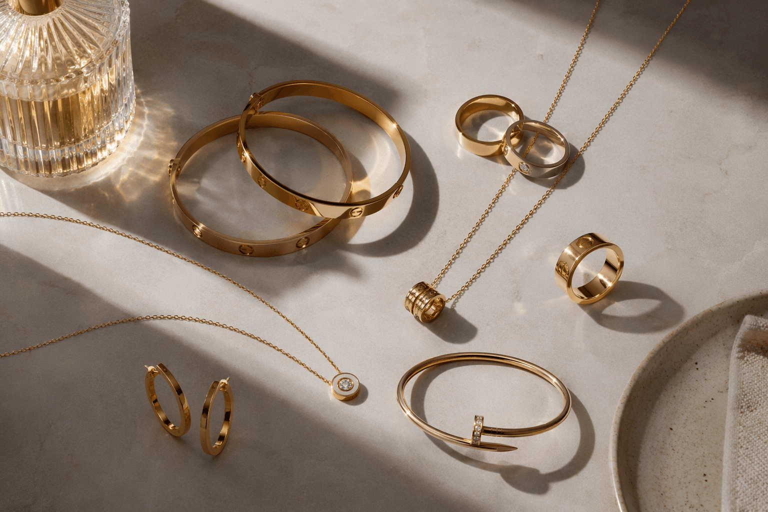
6. Choose metals and themes deliberately
Decide whether your signature is cohesive or eclectic: all silver yields a minimalist, modern language; mixed metals read fashion-forward and layered. Stellaamore suggests thematic stacks, celestial, botanical, architectural, to weave disparate shapes into a single story. For retailers, offer curated theme sets and clearly label them; for buyers, choosing a theme simplifies selection and ensures visual unity.
7. Prevent slippage without soldering
If you dislike permanent joins, Withclarity’s practical guidance is indispensable: "To keep stacked rings in place without soldering, consider using a thin spacer ring, choosing bands with similar widths, or opting for rings designed to stack together." These options reduce movement while preserving flexibility and are easy to communicate in product descriptions and care guides. Retailers can sell spacer rings as add-ons or bundle them with popular stack configurations.
8. Photograph for texture and depth
A Lighting & Camera Guide is now essential for selling stacks online, Jewelry Towns integrates one into its site architecture, to demonstrate how finishes respond to light. Because polished and matte surfaces behave differently under illumination, show close-ups that capture both highlights and diffuse surfaces; include the band-width metadata (1–2mm, 3–4mm) in captions. Good imagery explains the physics the copy cites: how light plays across a hammered edge versus a high polish.
9. Use odd/even counts and symmetry as style levers
Stellaamore points out that odd numbers create an organic, eclectic feeling while even counts favour symmetry and simplicity. Make this explicit in styling notes and samples: present an odd-stack look for editorial, an even-stack look for minimal customers, and swap a central focal piece to see how the narrative shifts. These small copy cues help shoppers self-select by aesthetic preference.
10. Tailor stacks to style personas
Fashionweekonline and TRISHHNA sketch audience archetypes to help curate assortments: if you’re edgy, oxidized silver, bold shapes or skull motifs suit you; if you’re glamorous, choose statement pieces with sparkle and intricate design. TRISHHNA’s starter rule, "Every good ring stack needs a hero ring, the one that grabs attention", works across personas; select a hero that reads true to the persona and assemble supporting bands that echo the theme without competing.
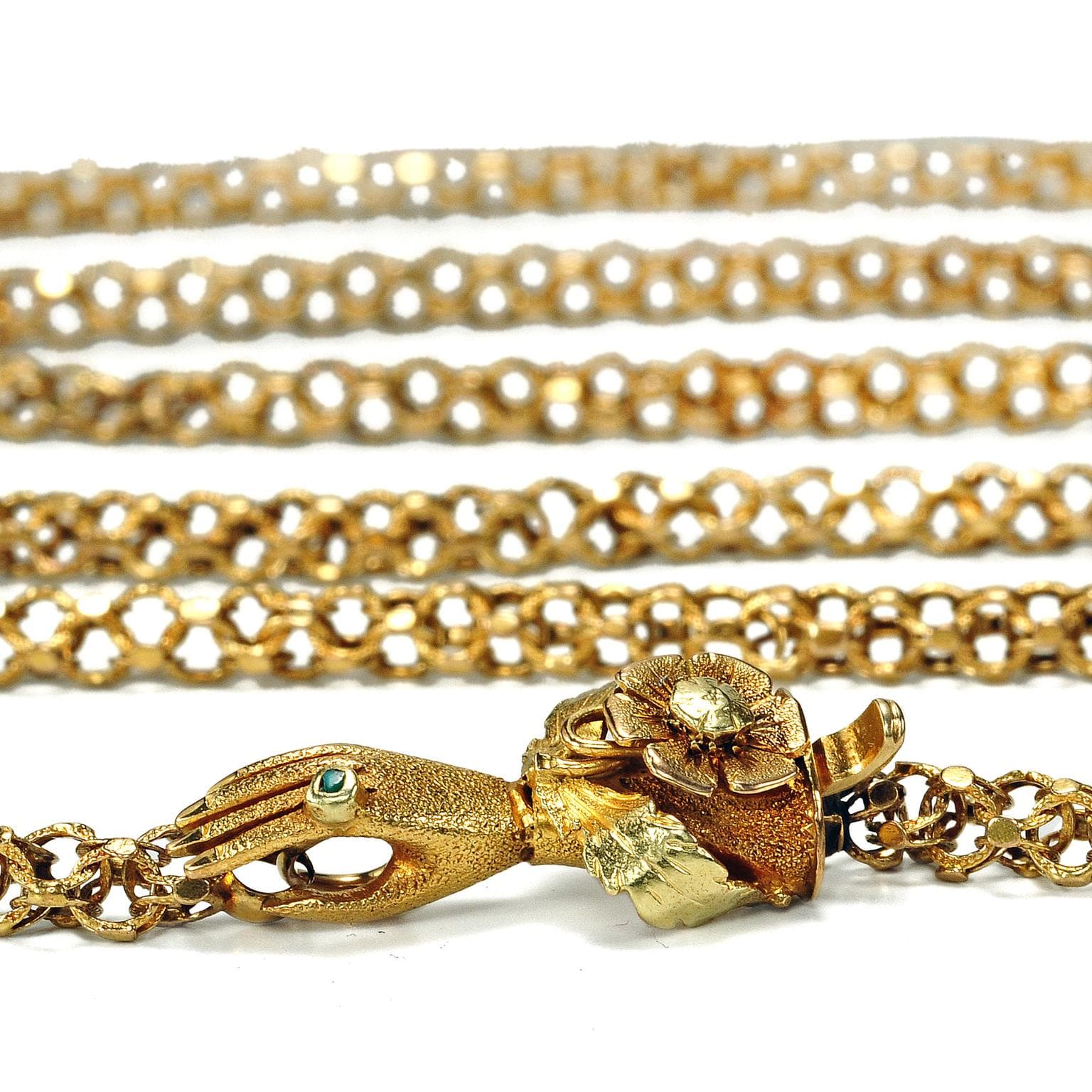
11. Verify metal and market the hallmark
Genuine 925 sterling silver and visible hallmarking matter to trust and resaleability; multiple retailers stress "Real 925 Sterling Silver" and visible "925" stamps. Make hallmark photos part of the product gallery and state retailer policies clearly, examples of commerce copy to borrow: "Real 925 Sterling Silver • Free Worldwide Shipping • 30-Day Returns." Retailers should also highlight any in-house protection plans, Stellaamore references a "Clarity Commitment Protection Plan", but confirm coverage terms before publishing.
12. Merchandising, UX and retail-ready recommendations
Merchandise stacks as modular systems: offer varied widths, spacer rings, and matched sets, and enable a mix-and-match shopping experience that displays band-width (mm), finish and suggested focal placement. Include extended product metadata, a Lighting & Camera Guide, and straightforward policies, shipping, returns and protection, to reduce buyer friction; Jewelry Towns combines editorial and commerce with site sections such as Quick Answer, Finger Anatomy Guide, 3 Golden Rules and Shop Stacking Rings, and closes its guide with a retailer-style footer: "© 2026 Jewelry Towns."
Conclusion Stacking rings in 925 sterling silver is a craft of proportion, contrast and restraint, an approach that reads less as trend-chasing and more as wearable narrative. Follow the three golden rules, Thin (1–2mm) + Medium (3–4mm) + Thin, deliberate texture contrast, and a single focal piece, then layer in distribution, anti-slippage tactics and clear retail presentation. Do that, and each stack becomes a small, collectible story built to wear and to keep.
This article was produced by Prism’s automated news system from verified source data, official records, and press releases, then run through automated quality and moderation checks before publishing. The system is built and supervised by the people who set the standards it runs under. Read our full AI policy.
Did this article answer your question?