TASAKI's First Metal Collection Brings Modular Layering to Its Pearl Legacy
Thakoon Panichgul's five-sphere 'balance' forms in polished metal were built to layer with TASAKI's pearls, not replace them.

TASAKI built its six-decade reputation on one material above all others: the pearl. So when the Japanese maison unveiled its first-ever Metal Jewellery Collection, designed by Thakoon Panichgul and fronted by TWICE member MOMO, it wasn't simply adding a new finish to its catalog. It was proposing a new grammar for how the brand's most iconic forms could live in the world.
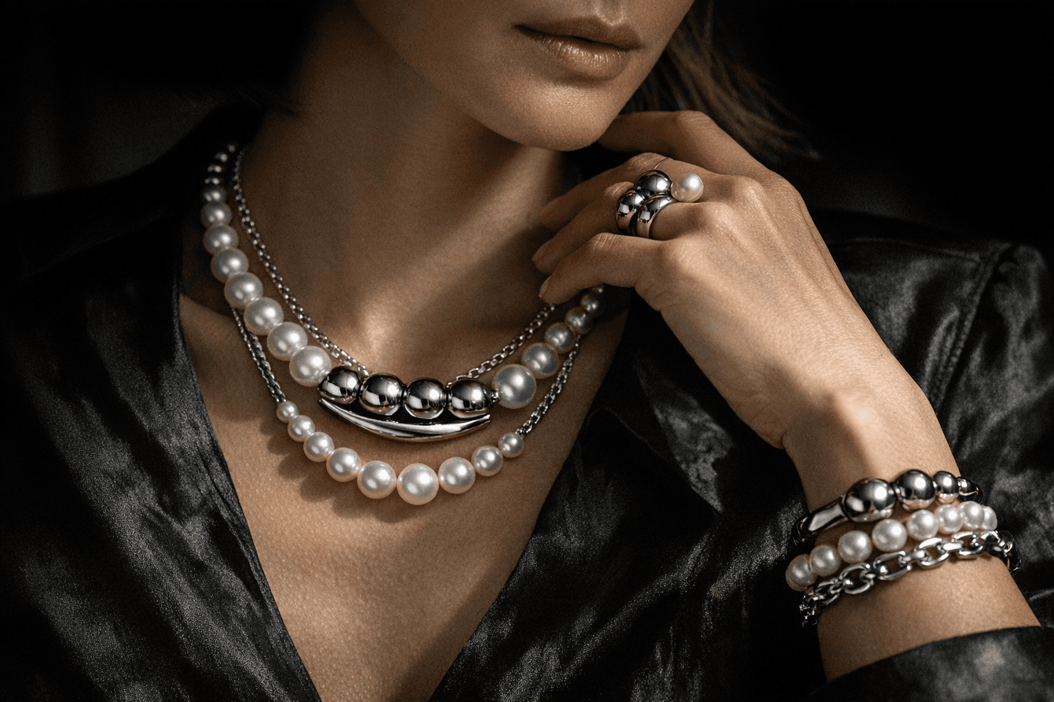
The collection reworks TASAKI's signature 'balance' motif, originally rendered in cultured pearl, into precision-engineered polished metal spheres. The flagship interpretation suspends five spheres in linear sequence; a streamlined 'balance neo' version distills that vocabulary down to three. Both read as architectural exercises in proportion and negative space, the kind of restraint that makes a piece legible as considered jewelry design rather than incidental ornament. Alongside these, the 'Danger Horn' forms introduce sculptural asymmetry to the lineup, their angular silhouettes in deliberate counterpoint to the roundness of the sphere series.
What makes the collection conceptually coherent, rather than just commercially opportunistic, is the layering logic built into its construction. Each metal piece was engineered to work in combination with the others and, crucially, to be mixed with existing TASAKI pearl pieces. That's not incidental versatility; it's a specific design proposition. The high-shine finishes were calibrated to harmonize across mixed-metal stacks while also functioning as structural anchors in multi-strand looks where pearls provide softness and the metal spheres provide weight and geometry.
Panichgul's approach is notable for what it refuses to do. Rather than abandoning TASAKI's heritage forms in pursuit of a harder, more fashion-forward aesthetic, he used the metal translation to interrogate what the 'balance' motif is actually doing: it's a study in suspended weight, in the visual tension between sphere and void. Metal, with its higher reflectivity and more rigid drape, makes that tension more legible, not less.
The choice of MOMO as the collection's face extends that logic into styling territory. Her profile as a member of one of K-pop's most visually deliberate acts gives the launch a built-in audience for precisely the kind of curated, intentional layering the collection is designed to support.
In a 2026 fine jewelry market where appetite for mixed-material stacking has pushed brands to think in systems rather than single statements, TASAKI's Metal Jewellery Collection offers a more disciplined answer than most. The maison didn't introduce metal to compete with gold-forward houses. It introduced metal to make its pearls more versatile.
This article was produced by Prism’s automated news system from verified source data, official records, and press releases, then run through automated quality and moderation checks before publishing. The system is built and supervised by the people who set the standards it runs under. Read our full AI policy.
Did this article answer your question?