Cartier shows how minimalist jewelry can still feel iconic
Cartier’s LOVE, Trinity, and Juste un Clou prove minimalist jewelry lasts when the silhouette carries the story, not a logo plaque or extra ornament.
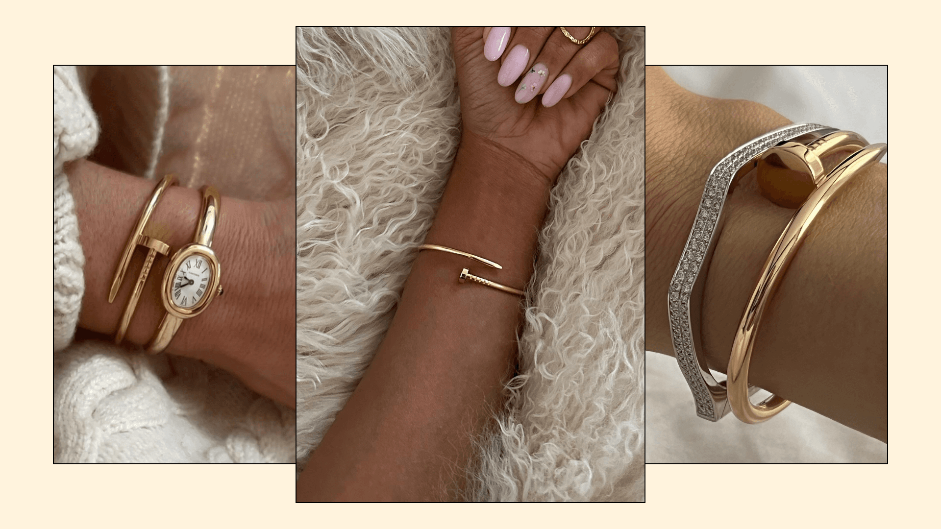
Cartier’s sharpest jewelry shows that minimalism does not have to whisper to be effective. The house builds its identity around “Architecture and purity” and “Geometry and Contrasts,” then repeats a few disciplined forms until they become unmistakable: an oval bracelet with screws, three interlinked gold bands, a nail turned sleek, a watch-shaped line, a panther, a simple sphere.
Cartier’s code for minimalist luxury
Cartier’s own design language gives the clearest blueprint for buying minimalist jewelry with staying power. In its “The Culture of Design” framing, the maison says collections such as Tank, Trinity, Juste un Clou, Santos de Cartier, Love, Panthère, and Ballon Bleu rest on four principles: the purity of the line, the accuracy of the shape, the precision of proportions, and the precious details. That order matters. The jewelry reads as minimal because the form is edited first, then finished with restraint.
This is a different idea of minimalism from the tiny, barely-there pieces that dominate so many trend cycles. Cartier’s branding calls these collections “instantly recognizable,” which is the clue for anyone buying with a long horizon in mind. Lasting minimalist jewelry usually has a clear visual code, a strong silhouette, and very little surface noise.
LOVE: industrial detail turned into a clean object
The LOVE bracelet, introduced by Cartier New York in 1969 and designed by Italian-born Aldo Cipullo, is one of the clearest examples of minimalism becoming iconic. Its oval bangle form is pared down, then defined by two small screws and a screwdriver-style fastening. That hardware is not an afterthought, it is the whole idea: an industrial detail translated into precious metal.
That is why LOVE still feels modern. It does not depend on a large logo, a colored stone, or a decorative surface to do the work. The bracelet’s power comes from repetition and discipline, the same two screws, the same oval outline, the same compact profile every time it appears on the wrist.
For a buyer, that makes LOVE a useful benchmark. If a piece can be identified from shape and construction alone, and still works in daily wear, it is closer to enduring minimalist value than to logo-driven status jewelry. If the identity lives mostly in a nameplate or oversized branding, the piece tends to age with the season that made it loud.
Trinity: three bands, one rhythm
Trinity goes back to 1924, when Louis Cartier created the design. Cartier describes it as three bands of gold, white, yellow, and rose, harmoniously interlinked and moving to the same rhythm, which is exactly why it remains a lesson in restraint. Nothing about Trinity depends on surface decoration; the interest comes from how the rings or bands meet, overlap, and move together.
Cartier has also revisited Trinity through its centenary storytelling in 11 chapters, a reminder that a minimalist object can carry a century of narrative without becoming visually busy. The design is still legible because its geometry is so clear. Three colors, one repeated form, no clutter.
That is what makes Trinity especially useful as a buying guide. It shows that minimalism can be soft, architectural, and symbolic at the same time. When the form is strong enough, the piece does not need added sparkle to hold attention.
Juste un Clou: when reduction becomes the design
Juste un Clou, designed by Aldo Cipullo in New York in 1971, is perhaps Cartier’s most literal example of reduction. The concept takes a nail and transforms it into a bracelet with a sleek, polished profile, turning something ordinary and utilitarian into a luxury object through proportion and finish. It is minimalist not because it disappears, but because it edits the idea down to its essence.
A 2021 Phillips article on Cipullo and Cartier, citing jewelry scholar Vivienne Becker, places him at the center of Cartier’s modern icons and underlines how decisive his design language became. That matters because Juste un Clou does not rely on symbolism piled on top of the object. The nail shape is the symbolism, and the metal finish does the rest.
For minimalist buyers, Juste un Clou is a reminder to look for transformation rather than decoration. The best pieces do not simply subtract detail. They sharpen a familiar form until the shape itself becomes the ornament.
How to buy minimalist jewelry that will still read as luxury later
The most durable minimalist pieces share Cartier’s logic: clean geometry, disciplined repetition, limited surface detail, and everyday wearability. They can sit next to denim or eveningwear, photograph cleanly, and still hold their own when worn alone. That versatility is what keeps them from feeling like one-season objects.
A practical way to judge a piece is to ask whether the silhouette could stand on its own without branding.
- Does the design have one clear idea, such as an oval, a trio of bands, or a single continuous line?
- Is the detail structural, like screws or interlinked bands, rather than purely decorative?
- Do the proportions feel balanced enough that the piece would still look intentional at arm’s length?
- Is the metal doing the visual work, with white, yellow, or rose gold carrying the contrast?
- Would the piece still make sense if the logo disappeared?
When a jewel answers yes to those questions, it is usually closer to Cartier’s model of minimalist luxury than to logo-driven status jewelry. The house’s most enduring forms do not chase decoration; they turn restraint into a signature.
This article was produced by Prism’s automated news system from verified source data, official records, and press releases, then run through automated quality and moderation checks before publishing. The system is built and supervised by the people who set the standards it runs under. Read our full AI policy.
Did this article answer your question?