How to Spot True 1920s-1930s Art Deco Jewelry From Lookalikes
A true Art Deco jewel gives itself away in the metal, the cut, and the clasp. Learn the small archival clues that separate a 1920s original from a later geometric imitation.
The first clue is usually hiding on the back
Turn the ring, brooch, or bracelet over before you admire the front. The reverse often tells you more than the glittering surface ever will: a true 1920s or 1930s Art Deco jewel behaves like a small archive, with a construction language that is crisp, deliberate, and period-specific. Look for platinum, sharp geometry, and a setting that feels engineered rather than merely styled. That difference matters because “Art Deco” is often used as a catch-all label on estate listings, even when a piece is only borrowing the look.
The original style emerged in western Europe in the 1910s and 1920s, took its name from the Exposition Internationale des Arts Décoratifs et Industriels Modernes in Paris in 1925, and matured into a major American style in the 1930s. That timeline is your first filter. If a piece has the right silhouette but the wrong construction, it is often a later revival, not a period original.
Start with the metal, because the metal rarely lies
Platinum is one of the most useful early clues. Fine Art Deco jewelry often uses platinum mounts because the metal supports the era’s clean, architectural forms and allows delicate stonework to stay visually light. The Metropolitan Museum of Art’s examples include a Georges Fouquet dress ornament from about 1923 in jade, onyx, diamonds, enamel, and platinum, and a Cartier brooch from about 1925 in platinum with diamond, amethyst, almandine, pearl, and ruby. Those pieces show how Art Deco favored a cool, precise setting that frames color and contrast rather than softening it.
Later geometric jewelry can imitate the silhouette in gold, silver, or modern white metal, but the feel is different. Platinum tends to sit with a dense, refined weight, and on an authentic piece the metalwork usually looks integral to the design, not merely decorative. If the setting looks too bright, too light, or too uniform in a way that suggests mass production, pause before calling it Deco.
Stone cuts are the next archive of evidence
At first glance, Art Deco reads through geometry. At closer range, it reads through cut. Period pieces commonly feature baguette-cut and calibré-cut stones, along with old-cut and single-cut diamonds. Those cuts create the clean lines and stepped surfaces that define the style, and they are especially important because they reflect how the jewel was made, not just how it was meant to look.
Calibré cuts are especially revealing. Stones shaped to fit a design with exacting precision, often around curves or angular borders, suggest a level of hand-finishing that is hard to fake convincingly. Baguette-cut diamonds reinforce the period’s linear rhythm, while old- and single-cut stones often appear in the smaller accents that give a jewel sparkle without smoothing out its architecture. When a seller uses “Art Deco” for a piece that lacks these cuts entirely, the label may be more fantasy than fact.
Black-and-white contrast is one of the style’s signatures
True Art Deco loves contrast. The period’s most legible jewels often pair black onyx or enamel with diamonds, platinum, and pale stones to create a stark graphic effect. The Metropolitan Museum of Art’s holdings show this clearly in combinations such as jade, onyx, diamonds, enamel, amethyst, almandine, pearl, ruby, emerald, and rock crystal. The palette is rarely random. It is orchestrated, designed to read like a line drawing made luminous.
That black-and-white tension is one of the easiest areas for later lookalikes to miss. A revived piece may borrow zigzags or sunburst motifs, but if the contrast is too polite, too symmetrical in a modern way, or missing the hard-edged interplay of light and dark, it may be Deco-inspired rather than Deco-era. Authenticity is often felt in the severity of the design.
Milgrain should look hand-applied, not printed on
Milgrain, the fine beaded edging that softens an outline without blurring it, is another hallmark worth inspecting closely. On period jewelry, it often frames a stone or edge with an almost lace-like precision. It is one of those details that rewards a loupe, because the best milgrain does not look machine-stamped; it looks patiently applied, bead by bead, as part of the original composition.
This is where later pieces frequently give themselves away. Revival jewels may imitate the outline, but their beading can look overly regular, shallow, or decorative rather than structural. In true Art Deco work, milgrain is not an ornament added at the end. It is part of the design’s grammar, a way to sharpen the transition between metal, stone, and space.
Learn the difference between period construction and period style
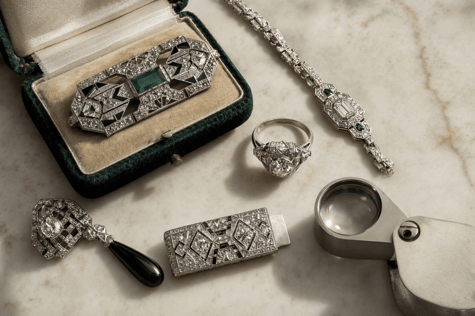
A convincing silhouette is not enough. True 1920s-1930s jewelry usually has construction details that feel coherent with the era: platinum mounts, carefully fitted stones, and a general sense that the piece was designed from the inside out. Christie’s cataloged Art Deco diamond bracelets with old-, single-, and baguette-cut diamonds in platinum, including circa 1935 examples, which is exactly the kind of dated documentation that helps anchor a jewel in its proper moment.
By contrast, later geometric revival pieces may reproduce the vocabulary without the construction logic. The front can look right, yet the underside, hinge, or clasp may feel modern in a way that breaks the spell. If the jewel looks too polished, too symmetrical in every hidden component, or too newly manufactured beneath an antique face, assume the surface may be doing more work than the object itself.
What to inspect in photos before you message a seller or bid
A good listing should let you examine the jewel like evidence. If the seller only shows the front, you are missing half the story. Ask for clear images of the clasp, the underside, the side profile, and any marks inside the band or on the back of a brooch. The strongest listings usually show the places where craftsmanship cannot hide.
- Inside a ring band, look for maker’s marks, metal marks, and any signs of resizing.
- On a brooch, study the pin stem, catch, and hinge. Period construction often looks refined but not sterile.
- On a bracelet, inspect the clasp and safety mechanism, because these can reveal later repair or replacement.
- On every piece, check the reverse for openwork, finishing style, and the logic of how the stones are secured.
- Compare the setting to the stones. Calibré, baguette, old-cut, and single-cut stones should look like they belong to the architecture, not pasted onto it.
Photographs that include the reverse are especially valuable because they expose whether the jewel has the weight, finish, and assembly of a period object or merely the styling of one.
A quick framework for separating original Deco from later lookalikes
If you want a fast first-pass decision, use this sequence:
1. Confirm the material. Platinum is a strong period clue.
2. Study the geometry. The best Deco feels crisp, streamlined, and symmetrical.
3. Check the cuts. Baguette and calibré stones are especially telling.
4. Read the contrast. Black-and-white pairings are more convincing when they feel severe, not decorative.
5. Inspect the edges. Hand-applied milgrain should look alive under magnification.
6. Flip the piece. The clasp, underside, and finishing often reveal the truth faster than the front.
That framework will not replace an in-person evaluation, but it will spare you from the most common mistake: mistaking a later geometric jewel for a true Art Deco original. The real thing usually feels like it was built with intention, not styled for effect. In that distinction, the difference between a lookalike and an authentic jewel becomes visible, and then undeniable.
This article was produced by Prism’s automated news system from verified source data, official records, and press releases, then run through automated quality and moderation checks before publishing. The system is built and supervised by the people who set the standards it runs under. Read our full AI policy.
Did this article answer your question?