Saint Meinrad Refreshes Visual Identity to Strengthen Community Outreach
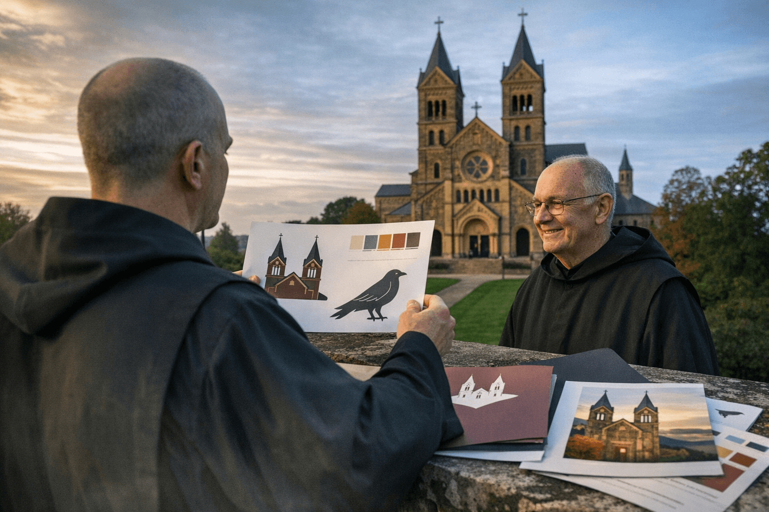
Saint Meinrad Archabbey and its Seminary & School of Theology unveiled a refreshed visual identity on Jan. 5, 2026, updating fonts, templates, a broader color palette and a brand guide while retaining signature emblems such as church towers and ravens. The institution says the redesign, developed over about nine months, is intended to support mission-driven work and outreach, changes that could affect how residents access spiritual care, education and community services in Dubois County.
Saint Meinrad Archabbey and its Seminary & School of Theology introduced a refreshed visual identity on Jan. 5, 2026, aiming to modernize communications for both print and digital use. The rollout preserves longstanding emblems, including the church towers and ravens, while adding design flexibility through a broader color palette, updated fonts, templates and a formal brand guide. The work was developed over roughly nine months, Saint Meinrad said.
The update is more than cosmetic for a local institution whose programs touch parish life, education and outreach across Dubois County and beyond. Consistent, accessible branding can clarify how residents find and engage with programs such as retreats, continuing education and pastoral services. For people seeking spiritual support during illness or bereavement, clearer communications may make it easier to learn about available services, hours and contact points.
A coherent brand guide also helps partner organizations and service providers recognize and coordinate with the archabbey. Health systems, hospices and community social service agencies often rely on faith-based institutions for chaplaincy, grief counseling and community-based support. Improved templates and digital-ready materials may streamline collaboration and public information campaigns, and they can make it easier to adapt materials for different audiences and platforms.
The refresh also has equity implications. Accessible typography and templates that scale to multiple formats can improve legibility for older adults and residents with visual impairments, and a flexible color palette can support inclusive design practices. While the archive of symbols links the new look to Benedictine heritage, the expanded toolkit is intended to help the archabbey meet contemporary communication needs across diverse communities.
Local leaders and service providers will watch how the new identity translates into outreach on the ground. Consistency across mailings, websites and social media can reduce confusion about where to turn for clergy support, educational offerings and public events. For residents who depend on clear notices about schedules, referrals, or community gatherings, a thoughtful communications approach is a practical public service.
Saint Meinrad said the refreshed identity supports its mission-driven work and outreach going forward. As materials roll out across platforms, the visual changes may help the archabbey and seminary sustain longstanding community roles while adapting to modern expectations for accessibility and partnership.
This article was produced by Prism’s automated news system from verified source data, official records, and press releases, then run through automated quality and moderation checks before publishing. The system is built and supervised by the people who set the standards it runs under. Read our full AI policy.
Did this article answer your question?