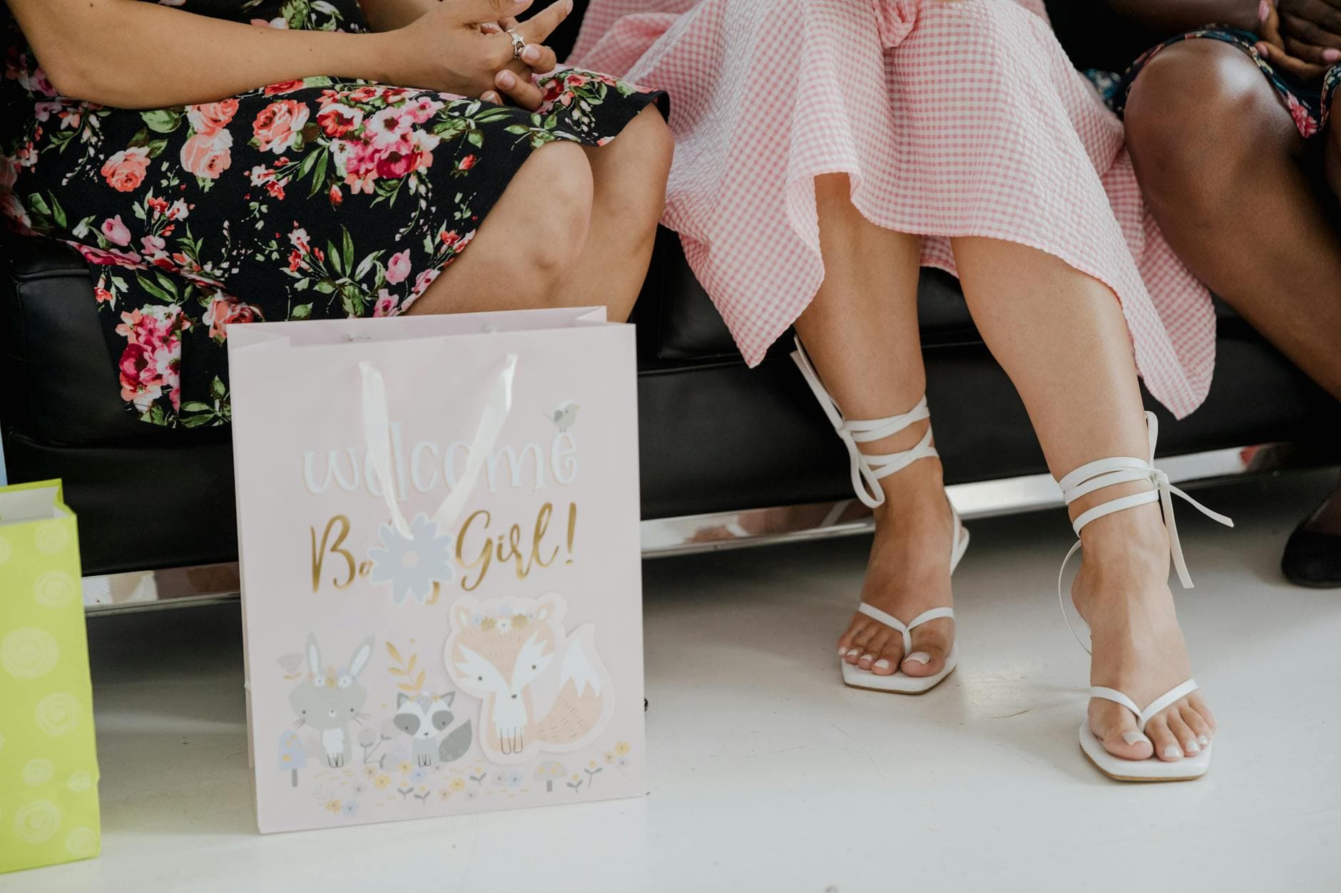
Baby Shower Welcome Signs, How to Size and Place Them Right
The right baby shower welcome sign does more than look cute. Sized for the venue and readable from the doorway, it guides guests in and sets the whole mood.

Why the welcome sign earns its spot at the door
A baby shower welcome sign is not just decor sitting on an easel. It does two real jobs at once: it tells guests they are in the right place, and it sets the emotional tone before anyone has even taken a seat. That is why the best signs feel intentional, not improvised. They help reduce confusion, steady the flow at the entrance, and give the event a polished first impression that matches the rest of the setup.
That practical role matters in hospitality terms. Wayfinding guidance from Stratus Unlimited and Mood Media treats signage as a tool that lowers guest stress and improves navigation, and the same logic applies here. A good shower sign should do more than photograph well. It should make arrival easier, especially when guests are filtering through a home entrance, an apartment hallway, a hotel foyer, or a restaurant private room.
Start with the venue, not the design
The fastest way to miss on a welcome sign is to pick a pretty layout before you think about where it will live. A design that looks balanced in a mockup can vanish in a hotel foyer or crowd a narrow hallway. Venue logic comes first: decide the space, then choose the size.
For most home entrances and apartment showers, 18x24 inches is the sweet spot. It is large enough to read at a glance without overpowering the doorway. If the event has a venue with a foyer or dedicated entrance area, 24x36 inches becomes the standard, because the sign needs more presence to hold its own in a larger arrival zone. In a restaurant private room, the guests are already inside the building, so a smaller tabletop format often works better than a full entrance board.
There is also a clear line where a sign becomes too small to do its main job. Signs smaller than 16x20 inches are difficult to read from more than 8 feet away, which makes them much better as table signs than as entrance signs. If the sign is meant to catch people at the threshold, size is not a decorative detail. It is the difference between a helpful cue and a piece of wall art.
Readability is the part that gets ignored until it fails
Most people think about color and florals first. The better question is how far away the sign has to read. Signazon’s letter-visibility chart uses a simple rule of thumb: every 1 inch of letter height provides about 10 feet of readability. That is a useful starting point when you are deciding how large the wording needs to be for the actual approach path.

Tupp Signs takes the same idea a step further with a visibility calculator built around viewing distance and readability. That approach is the right one for welcome signage because the sign is only successful if guests can read it before they pass it. In a narrow apartment corridor, you can get away with less. In a foyer with more distance, you need larger type and a more open layout.
The legibility details matter too. A 2019 paper on large-format signage in buildings notes that letter width and the use of case affect readability at distance. In plain English, chunky letters that are too compressed or too stylized are harder to scan quickly. The U.S. Access Board also ties character height to both the height above the finished floor and the horizontal viewing distance, which reinforces the same point: placement and scale work together. ICC A117.1 goes even further by allowing uppercase, lowercase, or a combination, but only when the characters stay conventional in form, not italic, oblique, script, highly decorative, or unusual. If you want the sign to be read fast, clean type beats fuss every time.
Placement changes everything
A sign does its best work where it meets the guest’s line of sight naturally. That is why an entrance display on an easel usually performs better than a board tucked beside a gift table. The sign should greet people at the point where they are deciding whether they are in the right place, not after they have already wandered inside.
For home and apartment showers, that often means placing the sign near the front entry, at the first clear pause point. In a hotel foyer, give it breathing room so it does not get lost against the architecture. In a restaurant private room, a tabletop sign or a smaller display near the host’s welcome point can be more effective than a full-size board because the audience is already inside and moving through a shorter path.
The display style should match the physical environment too. An easel works well on hard floors and at indoor entrances. A board that looks sturdy on a studio backdrop may need more support in a live setting. If guests approach from a distance, step back and check what the sign reads like from 8 feet, 10 feet, and beyond. That is where the useful flaws show up.
Outdoor showers need a different plan
Outside, wind becomes the enemy instead of walls. Rigid boards can look polished, but they can also catch air in a way that makes the whole entrance feel unstable. For outdoor baby showers, weighted easels, frame stakes, or fabric signs are often the smarter move because they hold up better when the weather refuses to cooperate.
This is one of those choices that looks minor on paper and obvious in real life. If the sign is fighting the breeze, it stops feeling like a welcome moment and starts feeling like a problem. A weighted setup keeps the entrance calm, readable, and safe, which is exactly what you want when people are arriving with gifts, bags, and attention split in half.
Wording should carry the theme, not just the greeting
Generic welcome text gets the job done, but it rarely earns the memory. The wording should reflect the mom-to-be’s style and the event theme, which is why customization has become such a big part of the baby shower sign market. Many customizable signs are now ordered with the guest of honor’s name and the shower date, turning the sign into both decor and event identification.
That detail matters more than it sounds. A personalized sign feels like part of the planning stack, not a last-minute add-on. It can echo the invitation, the color palette, or the shower concept without becoming busy. If the event is soft and classic, keep the language simple and elegant. If it is playful, let the wording carry some of that energy, but do not sacrifice clarity for cute phrasing.
The best signs still read instantly. That means the theme should support the message, not bury it. Clean type, a clear hierarchy, and enough contrast will usually do more for the final look than piling on extra graphics.
The useful rule is simple: design for the guest’s first five seconds
A baby shower welcome sign works when it solves three problems at once. It needs the right size for the venue, the right lettering for the viewing distance, and the right placement for the way guests actually walk in. When those pieces line up, the sign stops being background decor and becomes part of the event flow.
That is the real shift in baby shower signage. It is no longer an afterthought. It is a functional first impression, and when it is sized and placed well, it makes the entire entrance feel calmer, clearer, and more finished.
Sources:
Know something we missed? Have a correction or additional information?
Submit a Tip