Nintendo explains how UI design can delight players
Nintendo treats UI as part of the game itself, turning maps, menus and loading screens into anticipation, not dead time.
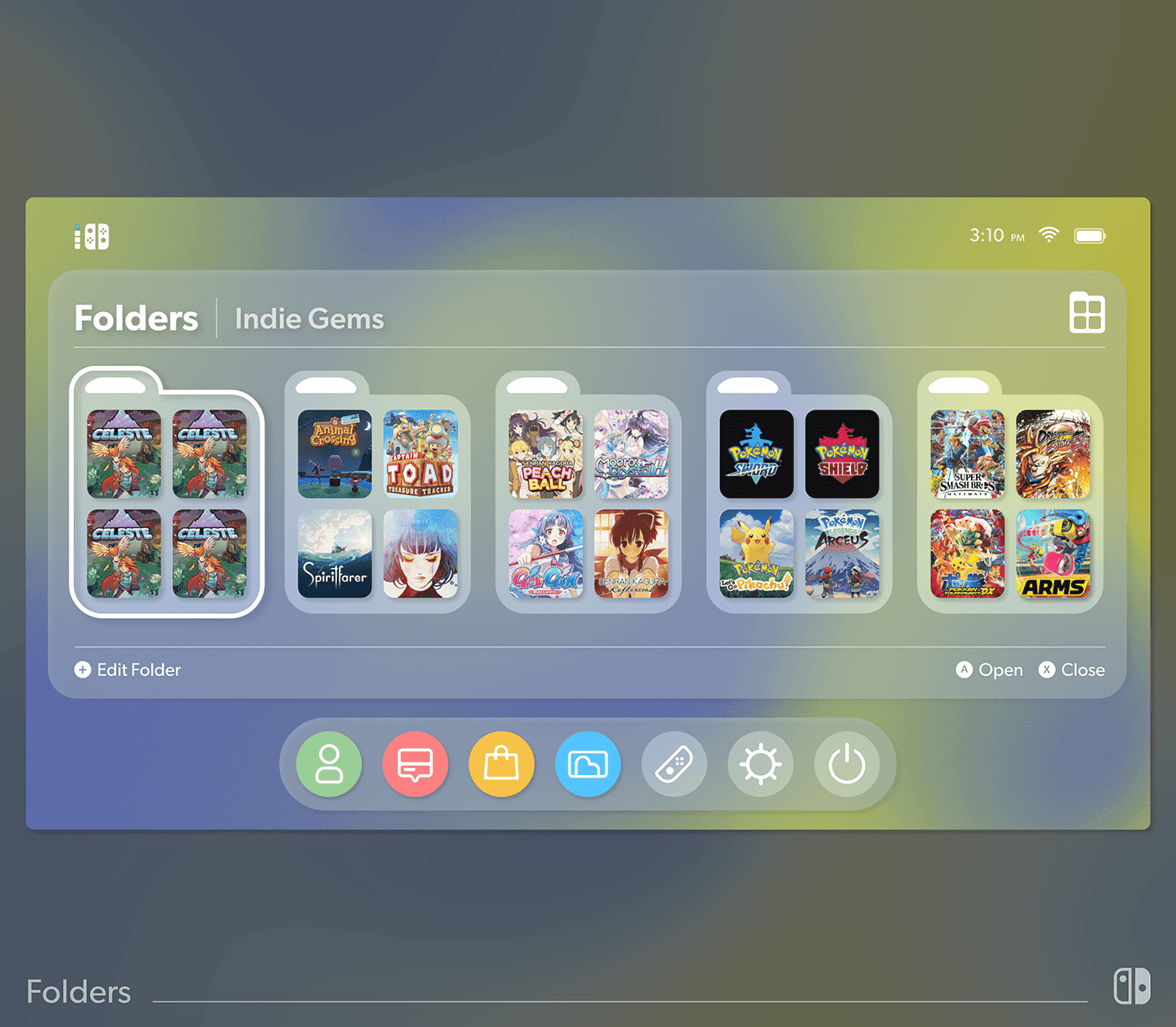
Nintendo’s UI standard is emotional as much as functional
Nintendo’s UI team is being asked to do more than arrange buttons and menus. The company’s recruiting materials frame UI and UX as the contact point between the game and the customer, a place where curiosity and anticipation should emerge naturally rather than be forced. That is a revealing standard for anyone working in game development at Nintendo: the interface is not a layer on top of the experience, it is part of the experience itself.
The company refreshed its “work keywords” recruiting materials on March 13, 2026, and the UI/UX page makes the expectation explicit. In Nintendo’s framing, good interface work does not just help players proceed. It helps them feel something while they proceed, whether that is reassurance, excitement, or a small burst of delight before the action begins.
Designing for anticipation, not just efficiency
Nintendo’s examples show how that philosophy changes ordinary UI decisions. A map, a loading screen, or a recipe display can become a moment of anticipation rather than a pause to endure. That matters because the company appears to judge friction differently from many other software teams. Some friction is acceptable if it deepens the feeling of adventure, but it still has to feel intentional and playful.
That is a useful lens for designers, QA testers, and producers alike. A menu can be technically correct and still miss the point if it drains energy from the player. At Nintendo, the question is not only whether the interface works, but whether it preserves the mood the game is trying to create.
Why Breath of the Wild changed the UI conversation
Nintendo uses The Legend of Zelda: Breath of the Wild as its clearest example of this approach. The game was developed around the idea of “rethinking the conventions of Zelda,” and the UI concept followed that same logic: it should be better if it were not there. That does not mean the interface disappears. It means the interface stops calling attention to itself and instead serves exploration, pacing, and mood.
The practical result was a more streamlined presentation. Even the loading screens were used with intent, showing gameplay tips so waiting time became useful time. For developers, that is a reminder that Nintendo’s quality bar is not limited to the core mechanics. It extends into every in-between moment, including the seconds when the player is not actively controlling the character.
For QA, that raises the bar in a different way. The issue is not just whether a screen loads or a prompt appears. It is whether the feel of the game survives those transitions. If the interface is part of the emotional contract, then a clunky pause can weaken the experience even when there is no bug.
Tears of the Kingdom goes further without going bland
Nintendo says The Legend of Zelda: Tears of the Kingdom pushed that thinking further. The goal was deeper immersion without making the UI bland or invisible. Instead of treating the interface as something to hide completely, the team tried to make it function like part of the player’s preparation.
One example is the warp destination map. Nintendo says it was designed to turn loading time into “preparation time,” encouraging exploration outside the field rather than making teleportation feel like empty downtime. That is a small but telling design choice. It shows how Nintendo connects utility to pacing, and pacing to emotion.
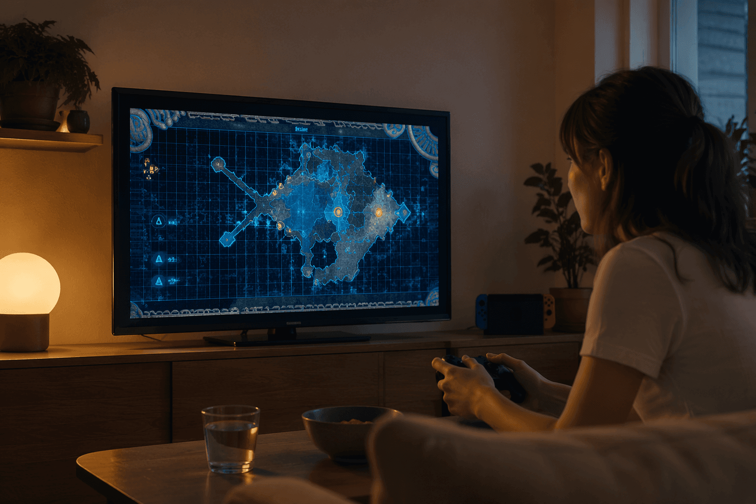
The cooking UI makes the same point in a different way. Nintendo says the team used cooking notes and recipe memo-style UI so players could browse appealing food icons and feel anticipation before cooking. The logic is rooted in everyday behavior: people often enjoy looking at food photos or restaurant menus before they eat. Nintendo translated that familiar habit into game design, making a routine action feel rewarding before the result even appears.
For designers, that is a strong signal about the company’s instincts. Nintendo does not seem interested in separating practical information from charm. The challenge is to make both appear in the same space, so the player feels informed and delighted at once.
Daigo Shimizu’s career shows how broad this work can be
The featured designer, Daigo Shimizu, joined Nintendo in 2009, and his credits show how interface thinking can stretch across hardware, systems, and software. His listed work includes Nintendo 3DS system OS in 2011, Wii U system OS in 2012, Nintendo Labo in 2018, Breath of the Wild in 2017, and Tears of the Kingdom in 2023. That mix matters because it suggests Nintendo values designers who can move between system-level usability and game-level emotion.
For candidates, the signal is clear: at Nintendo, UI work is not confined to making things legible. It is expected to shape the tone of the product. A strong interface designer is not only a navigator of screens. They are a contributor to brand identity, player trust, and the sense that the product has been thought through from the first tap to the last reward.
The scale behind the polish
Nintendo’s sales data show why these choices matter commercially as well as creatively. As of March 31, 2026, the company reported 155.92 million Nintendo Switch hardware units sold worldwide and 1,528.14 million software units sold worldwide. The Legend of Zelda: Tears of the Kingdom had sold 22.56 million copies worldwide on Nintendo’s top-selling-title chart.
At that scale, a subtle interface choice can affect an audience larger than many studios ever reach in a generation. A loading screen, a recipe display, or a map transition is not a minor detail when millions of players see it. Nintendo’s design standards reflect that reality: polish is not decoration, it is part of the product’s reach.
A longer Nintendo pattern, from Miiverse to modern UI
This approach also fits Nintendo’s history. Wii U’s Miiverse was a built-in network service that let players share experiences through Mii-based communities, screenshots, and handwritten posts. Nintendo said some games integrated Miiverse directly into gameplay, so players could see other people’s comments within the game world itself.
That older system helps explain the company’s current philosophy. Nintendo has repeatedly tried to make menus, network features, loading states, and system services feel like part of play rather than separate from it. The pattern is consistent: the company often uses interface design to create social connection, emotional lift, and a sense of motion.
For employees inside Nintendo, that creates a demanding but coherent standard. UI is not the backstage machinery of a game. It is one of the places where Nintendo decides whether a product feels merely functional or distinctly Nintendo.
This article was produced by Prism’s automated news system from verified source data, official records, and press releases, then run through automated quality and moderation checks before publishing. The system is built and supervised by the people who set the standards it runs under. Read our full AI policy.
Know something we missed? Have a correction or additional information?
Submit a Tip
