Gray-on-Gray Groutfits Return as a Polished Capsule Wardrobe Staple
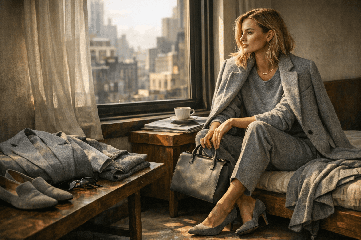
Groutfits are back looking sharper than ever: a gray-on-gray capsule that reads polished, not lazy. Margot Robbie just gave the formula a celebrity-grade reset.
The new case for gray
The best groutfit is not a compromise. It is wardrobe math with better lighting: one gray knit, one gray trouser or legging, and one tonal outer layer that makes the whole thing look deliberate in five minutes flat. That is the real appeal of the gray-on-gray return. It solves the daily problem of looking put together without reaching for black again, and it does it with a cooler, softer edge.
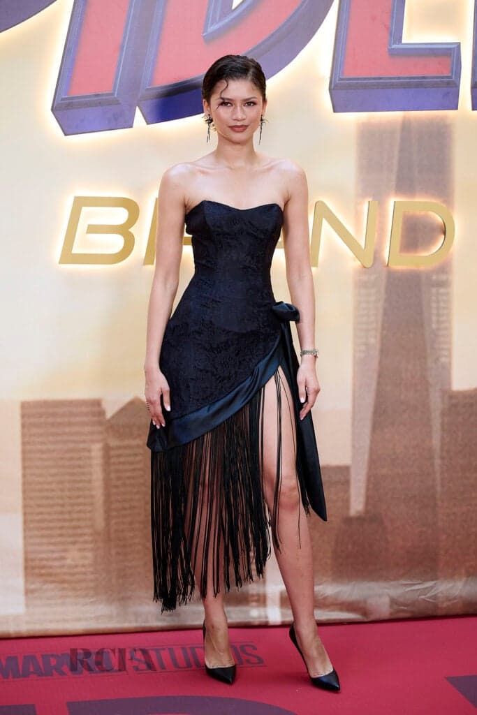
Margot Robbie, Anne Hathaway, and Hilary Duff all backing the look gives the comeback instant range. This is not just off-duty celebrity dressing anymore. It is a polished capsule uniform that can swing from school run to coffee to a cleaner, more editorial version of errands without losing the easy feel that made the original idea stick.
Why groutfits keep coming back
The word itself has been around since at least 2009, and Urban Dictionary defines a groutfit as an outfit made completely of gray, basically a gray top and gray bottoms. That older definition matters because it shows this was never some glossy fashion-week invention. It started as a blunt, practical shorthand for dressing head-to-toe in one shade, then slowly got more interesting as people realized gray could do more than look sleepy.
Bustle places the trend’s original rise in the 2010s, when normcore and athleisure changed the way people thought about comfort dressing. That era made casual clothes feel intentional, especially with style stars like Gigi Hadid and Kendall Jenner turning sweats, leggings, and easy separates into a visual language of their own. The current groutfit revival is tapping back into that same instinct, but with better shape, better fabrics, and much less “I just gave up.”
From drab to designed
What makes the comeback work is that the look has been recut away from its most boring version. Older coverage from 2015 already knew the trick: groutfits, or gray outfits, worked best when they had texture and tonal layering. That is the difference between a slouchy sweatsuit and a real outfit. When the shades stay in the same gray family, small changes in surface, weight, and drape start doing the style work for you.
Grazia framed the idea the same way, treating gray as something better than a fallback neutral. The smartest street stylers were using concrete tones and keeping them out of the boring realm by leaning into texture and tonal depth. That is why the modern groutfit reads as capsule thinking, not trend-chasing. It is the same color story, but it is built like a system.
The Kim Kardashian effect
A lot of the look’s staying power runs through the gray-on-gray celebrity era linked to Kim Kardashian. In 2015, monochrome sweatsuits and cement-hued separates were everywhere in celebrity street style, and that visibility helped gray feel fashion-forward instead of flat. Sydne Style also tied the mood to Kardashian gray, alongside Kendall Jenner and Kylie Jenner, which tells you exactly why the formula landed so hard: it looked relaxed, but it never looked accidental.
Bustle later described 2015 as the year the monochromatic look dominated wardrobes, with Kim Kardashian among the most visible names in the mix. That history is part of why today’s groutfit revival feels familiar in the best way. It is not inventing a new silhouette. It is polishing an old one until it works again.
How to build the capsule
If you want the groutfit to read elevated, start with three pieces and make each one earn its place.
- One gray knit, preferably something with body, so the top does not collapse into loungewear.
- One gray trouser or legging, depending on whether you want sharper structure or a more athletic line.
- One tonal outer layer, like a coat, cardigan, blazer, or zip-up, in a gray that is close but not identical to the base.
That near-match is the point. Total sameness can flatten the whole look, but slight shifts in ash, heather, charcoal, and cement make it feel styled. The formula works because it creates visual rhythm without introducing another color that breaks the mood.
Why gray beats black here
Black is easy, but gray has more range. It softens the silhouette, makes knits look richer, and gives tailoring a quieter kind of polish. A gray knit against a gray trouser can feel expensive in a way black sometimes does not, because the eye reads the variation in texture before it reads the color. That is why the look can move from sweatsuit casual to more polished monochrome dressing without changing the basic recipe.
The trick is to let the fabrics do the talking. A brushed fleece sweatshirt next to a wool trouser feels far more considered than a matching set that is too uniform. A ribbed knit with a smooth legging or a structured coat over a soft base keeps the outfit alive. The whole point is to make gray look edited, not exhausted.
The modern groutfit mindset
This is why the current groutfit renaissance feels bigger than a passing celebrity moment. It is a reminder that capsule dressing does not have to mean black, beige, or another safe fallback. Gray can be the hero neutral, especially when the shape is clean and the texture is doing real work.
The best version of the look is the one that feels almost too simple until you see it on. Then it clicks: tonal gray can make five-minute dressing look intentional, current, and quietly expensive. That is the kind of uniform that keeps coming back, because it fixes a real problem and makes the fix look cool.
This article was produced by Prism’s automated news system from verified source data, official records, and press releases, then run through automated quality and moderation checks before publishing. The system is built and supervised by the people who set the standards it runs under. Read our full AI policy.
Did this article answer your question?