Blurr Bureau Brings Quiet Luxury to Nuda Pasta's Packaging Design
Blurr Bureau's packaging for pasta brand Nuda borrows directly from fashion's quiet-luxury playbook, proving that charcoal, script type, and restraint translate just as fluently to a grocery shelf.
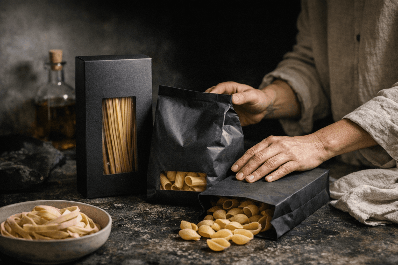
Pasta has never been fashion's problem to solve. The grocery shelf has its own logic: bright colors, rustic photography, golden wheat fields and hearty typography signaling abundance. Blurr Bureau apparently didn't get that memo. The studio's packaging identity for Nuda strips the category back to something that reads less like a box of rigatoni and more like a tote from a Milanese boutique.
The design vocabulary is deliberately narrow. A flowing script carries the brand name, then steps back to let clean sans-serif details handle the supporting information, the same typographic hierarchy that Loro Piana uses to separate its house name from product labeling, or that The Row employs on its shopping bags. On Nuda's box, the contrast does two things simultaneously: it signals craft (the script) and restraint (the sans-serif), without either element competing for dominance.
Color is where the restraint becomes impossible to ignore. The palette moves through deep charcoals, warm neutrals, and muted tones, deliberately avoiding the warm yellows and terracotta reds that dominate pasta packaging. In fashion terms, think Bottega Veneta's intrecciato bags before Daniel Lee arrived: nothing shouting, everything communicating. Charcoal on food packaging is almost countercultural. It refuses the warmth-and-comfort shorthand that grocers and brands have leaned on for decades.
The single most instructive choice is the small transparent window cut into the box. It reveals the pasta inside and functions as the only visual illustration on the entire package. Dieline noted that this reinforces the idea of transparency, and in a broader sense, it's what old-money dressing has always understood: let the material speak. You don't photograph the cashmere. You let people touch it.
That migration of aesthetic code from closet to grocery shelf is the genuinely new thing here. The project intentionally avoids comfort-food visual hustle and borrows heritage, restraint, and material-led cues from fashion's quiet-luxury playbook to reframe a commodity as premium. As Dieline put it: "Its confidence in doing less feels genuinely new."
So what separates real quiet luxury from a brand that just went beige? Five signals to look for: a typographic hierarchy that uses contrast rather than decoration; a palette anchored in neutrals without any compensating pop of color; negative space treated as a design element rather than a budget shortcut; a single material or structural detail that rewards close inspection (the window, the paper weight, the deboss); and brand language that names what the product is without promising an experience. Three red flags that reveal performative minimalism: neutral colors applied to a cluttered layout, a script logo used without any genuine typographic system to support it, and transparency signaled through language rather than materiality.
The Nuda packaging does none of the red-flag moves. It performs the quiet-luxury codes correctly because it understands what those codes originally meant in fashion: that restraint is a position, not just an absence. Brands like Brunello Cucinelli and Jil Sander built entire identities on that logic. Blurr Bureau has now demonstrated the same logic translates intact to a box of pasta, which, given how rarely the grocery aisle attempts genuine design ambition, is a more surprising achievement than it first appears.
Know something we missed? Have a correction or additional information?
Submit a Tip