Geometric tattoo prompts improve when abstract designs get concrete limits
Abstract tattoo prompts stop failing when they get specific. Three to five limits can turn a loose sketch into geometry that reads on skin.
Abstract tattoo prompts get better the moment they stop behaving like open-ended mood boards. In the AI for Tattoo test notes, adding just three to five concrete constraints pushed usable abstract drafts from 2 out of 10 to 6 out of 10, a sharp jump that matters anywhere geometry has to survive contact with skin.
Why vague prompts break down
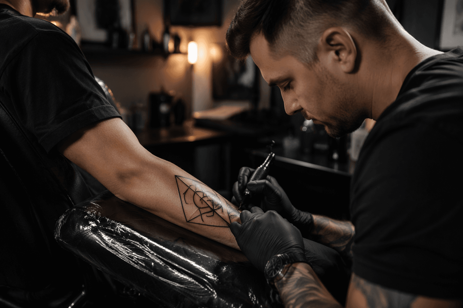
For geometric tattoo fans, the big takeaway is simple: abstract work is not random, it is directed ambiguity. The strongest prompts give the machine enough structure to make repeatable shapes, clean edges, and a believable composition, instead of spraying out decorative noise that looks fine on a screen and falls apart as body art. That is especially important because healed lines widen slightly, soft gradients compress, and a draft that seems airy in preview can turn muddy once it is scaled and inked.
AI tattoo guidance published in 2026 pushes the same point from another angle. If the design is going onto actual skin, the prompt has to account for sizing, contrast, line weights, and placement tuning before anyone calls it finished. In practice, that means the draft stage is less about dreaming up a vibe and more about building a tattooable structure that can be handed to an artist without forcing a full redraw.
The four decisions that shape a usable abstract design
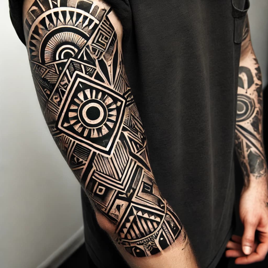
The most useful framework in the guide breaks abstract tattooing into four axes: geometry, texture, value structure, and placement flow. Geometry sets the silhouette and gives the design its bones. Texture sets the attitude, whether the piece feels sharp, grainy, smooth, or fractured. Value structure controls readability, especially when black, gray, and negative space have to carry the image. Placement flow decides whether the piece follows the body or fights it.
That breakdown is especially relevant to geometric tattoos because the style already depends on symmetry, proportion, and repeatable structure. A design that leans into that order has a much better chance of becoming a real tattoo instead of a pretty concept.
A practical prompt usually works best when it stays short at the core and then layers in constraints. One clean formula is:
1. Name the subject or intent.
2. Add geometry language.
3. Add texture language.
4. Lock the placement.
5. Block what you do not want with negative prompts.
A request for a general mood might produce something painterly, but a request for “a protective geometric wolf with faceted symmetry, high contrast, stippled texture, forearm placement, no watercolor, no clutter” gives the model a much narrower lane. The point is not to micromanage the image. It is to prevent the draft from drifting away from tattoo logic.
Why placement matters as much as style
The guide’s placement advice is one of the most useful parts for anyone building geometric tattoo concepts. A forearm piece, a shoulder cap piece, and a spine piece do not live in the same visual space, so they should not be prompted the same way. Placement cues help the AI frame the design around body movement and usable proportions, which is where abstract work often succeeds or fails.
That same thinking lines up with broader AI tattoo optimization guidance that emphasizes file prep, crisp edges, and healable results. A design that looks balanced in a square crop may need a different aspect ratio for a long forearm layout or a vertical spine run. When the prompt includes the destination, the output becomes easier to translate into stencil-ready art.
Why geometric tattooing is the natural home for this approach
Geometric tattooing is already a style family built around sacred geometry, dotwork patterns, mathematical shapes, symmetrical compositions, mandalas, platonic solids, and geometric animal designs. That makes it a perfect match for constrained prompting, because the style rewards order and punishes ambiguity. If the prompt respects shape language, it is working with the grammar of the style instead of against it.
Tattoodo’s style guides reinforce that point by describing ornamental tattooing as one of the oldest tattoo styles, with roots in ancient tribal traditions, sacred geometry, mandalas, and mehndi-inspired patterning. Its sacred-geometry coverage also points to natural forms like honeybee hives and nautilus shells, which is a good reminder that geometric tattooing has always borrowed from structure found in the world around us. Artists such as Corey Divine are often associated with that precision-driven end of the style, where proportion and repeatable pattern matter as much as subject matter.
That history matters because the new prompting workflow is not replacing the style, it is tightening the entry point into it. The machine is simply becoming a rough drafting tool for a tradition that already values order, balance, and clean progression.
The bigger studio tension behind AI drafts
There is also a real tension beneath the convenience. The Verge has noted that tools like Midjourney, Stable Diffusion, and DALL-E are trained on existing artists’ work, and that many artists have pushed back against copycat risk, unrealistic expectations, and budget pressure. In tattooing, that concern lands hard because the craft depends on original line systems, individual pattern language, and a handoff between concept and execution.
That is why the most responsible use of AI here is as a reference and drafting layer, not a replacement for the artist. The strongest workflow now pairs a constrained prompt with preview tools, reference workflows, and real-skin planning. Tattoodo’s skin preview feature and its catalog of 1.3 million tattoo ideas show how central that visualization step has become, and the same principle applies to AI drafts: if the image cannot be sized, simplified, and placed with confidence, it is not ready yet.
The shift is clear. Abstract prompting gets better when it is forced to act like tattoo design, not poster art. In geometric work, that means fewer loose vibes, more shape language, stronger contrast, cleaner line economy, and a placement plan that the artist can trust from the first sketch onward.
This article was produced by Prism’s automated news system from verified source data, official records, and press releases, then run through automated quality and moderation checks before publishing. The system is built and supervised by the people who set the standards it runs under. Read our full AI policy.
Did this article answer your question?