Why geometric tattoos win, clean lines, black ink, bold meaning
Minimal geometric tattoos look bold because their power comes from placement, spacing, and black-ink contrast, not clutter. The strongest versions turn clean lines into structure with meaning.
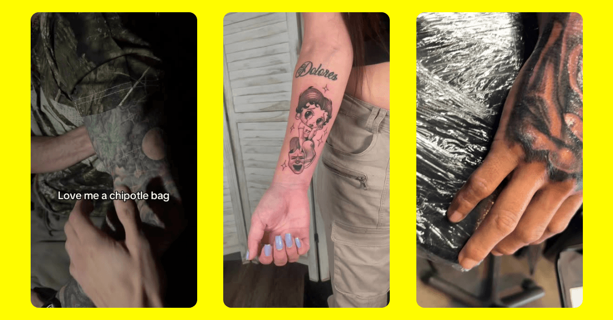
A recent TikTok from Tattoo style made a simple case: strip a tattoo down to precise shapes, black ink, and disciplined spacing, and it sharpens instead of disappearing.
Why minimal linework still reads as bold
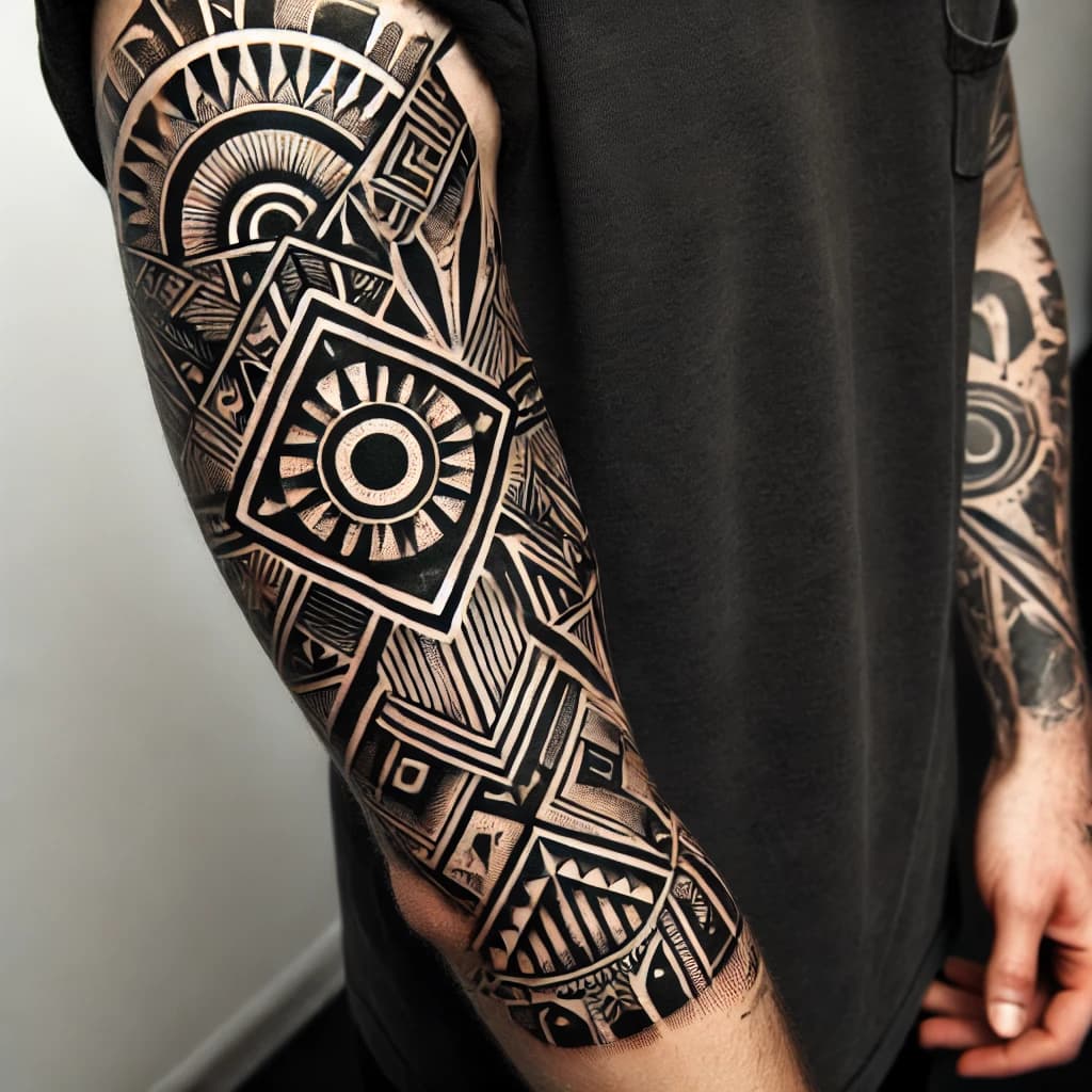
The appeal of geometric tattooing starts with structure. Geometric work leans on sacred geometry, dotwork patterns, mathematical shapes, and symmetrical compositions, the mix Tattoodo uses to frame the style, which is why even a small piece can feel complete rather than underworked. That visual logic is what makes a single triangle, line stack, or repeated angle pattern land so strongly when the proportions are right.
The TikTok treats minimalism as a decision, not a compromise. A geometric tattoo can be tiny or expansive, simple or intricate, but the same core language still holds: repeated forms, negative space, and balanced symmetry.
Black ink is not an afterthought
Black ink sits at the center of this look for a reason. Blackwork tattoos use exclusively black pigment, and Tattoodo places sacred geometry among the most popular blackwork-adjacent aesthetics. In geometric work, that kind of pigment discipline does more than look stark. It keeps edges crisp, preserves the shape language, and makes the contrast do the heavy lifting.
That contrast is what lets the design read instantly. A black triangle on the forearm, a line-based mandala on the chest, or a dotwork composition around a wrist can register at a glance because the eye is not fighting color or shading. For artists, black ink also gives the geometry a more architectural feel.
Placement does the storytelling
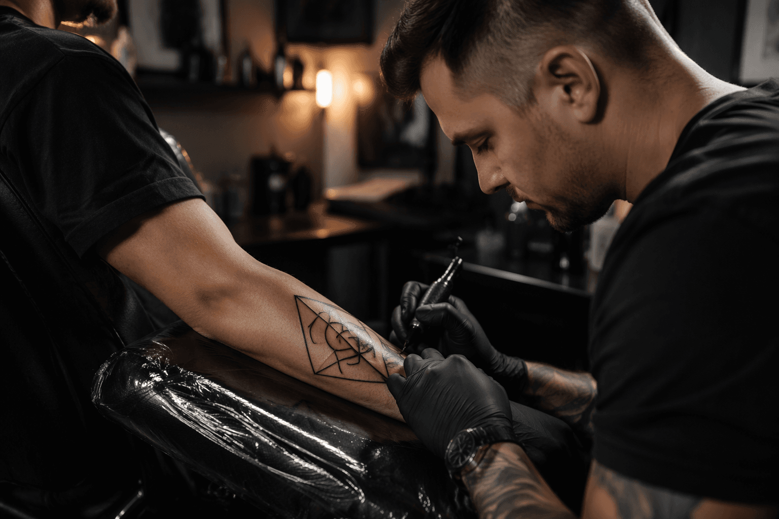
The strongest geometric tattoos are rarely just about the shapes themselves. Placement can make the same design feel meditative, aggressive, private, or formal, depending on where the body carries it. InkedMag treats tattooing as body-driven work, where control, contrast, patience, and the body as a landscape matter as much as the image.
That is especially true with linework and symmetry. A forearm lets verticals and repeated angles stack in a way that feels engineered; a wrist asks for compression and clarity; a chest piece can use bilateral balance; a leg gives room for movement and sequence. The design has to cooperate with the body’s contours.
Spacing is where simple tattoos either breathe or collapse
In geometric tattooing, line spacing is not a minor detail. Too tight, and the piece turns muddy. Too wide, and the structure can feel broken apart. The best work uses negative space as part of the composition, letting the skin itself act like a border, a pause, or a visual hinge.
That is why the TikTok’s point about tiny accents versus complex compositions matters so much. A small geometric tattoo can look striking if the spacing is deliberate, while a larger one needs enough separation between repeated forms, angles, and dots to keep the rhythm readable.
Skin tone contrast and readability
Bold geometric tattoos depend on how clearly the shapes read against the skin. Black pigment gives the strongest baseline contrast, but the result still depends on how the line weight, spacing, and size interact with the wearer’s tone and the exact placement. In practice, the goal is not merely to make a tattoo dark. It is to make it legible.
That is one reason blackwork and geometric styles travel so well together. The darker the structure, the easier it is for the form to hold, especially when the piece relies on symmetry or repeated angles rather than heavy shading.
Meaning does not require clutter
Minimal geometric tattoos often carry more symbolism than they first appear to. Tattoos.com ties minimalist geometric pieces to circles, triangles, lines, and dotted segments that can suggest balance, wholeness, direction, transformation, unity, cycles, and personal journeys. A clean shape can read like a statement precisely because it is not overloaded.
A circle can hold wholeness, a triangle can signal direction or transformation, and a line stack can feel like order made visible.
Older roots, newer language
Geometric tattoos feel contemporary, but the visual habits behind them are older than the current trend cycle. Tattoodo traces bold black shapes, dots, and lines through ritual and sacred tattoo traditions across the globe. Tattoodo also places mandalas and sacred geometry close to this territory, while cultural origins still matter when drawing from those references.
The contemporary version often pares everything down, but it still relies on the same fundamentals that have always made these marks powerful: clarity, repetition, and symbolic order.
How social platforms are shaping the look
Short, clean TikTok visuals now function as idea boards for tattoo clients, helping people narrow style references and push consultations toward more refined compositions.
This article was produced by Prism’s automated news system from verified source data, official records, and press releases, then run through automated quality and moderation checks before publishing. The system is built and supervised by the people who set the standards it runs under. Read our full AI policy.
Did this article answer your question?