Geometric tattoos demand precision, style choices shape lasting results
Geometric tattoos stay crisp only when style choice matches the skin, the placement, and the long game of aging. Know the difference between fine line, blackwork, dotwork, and mandala before you book.
Why geometric tattoos are a style decision, not just a design choice
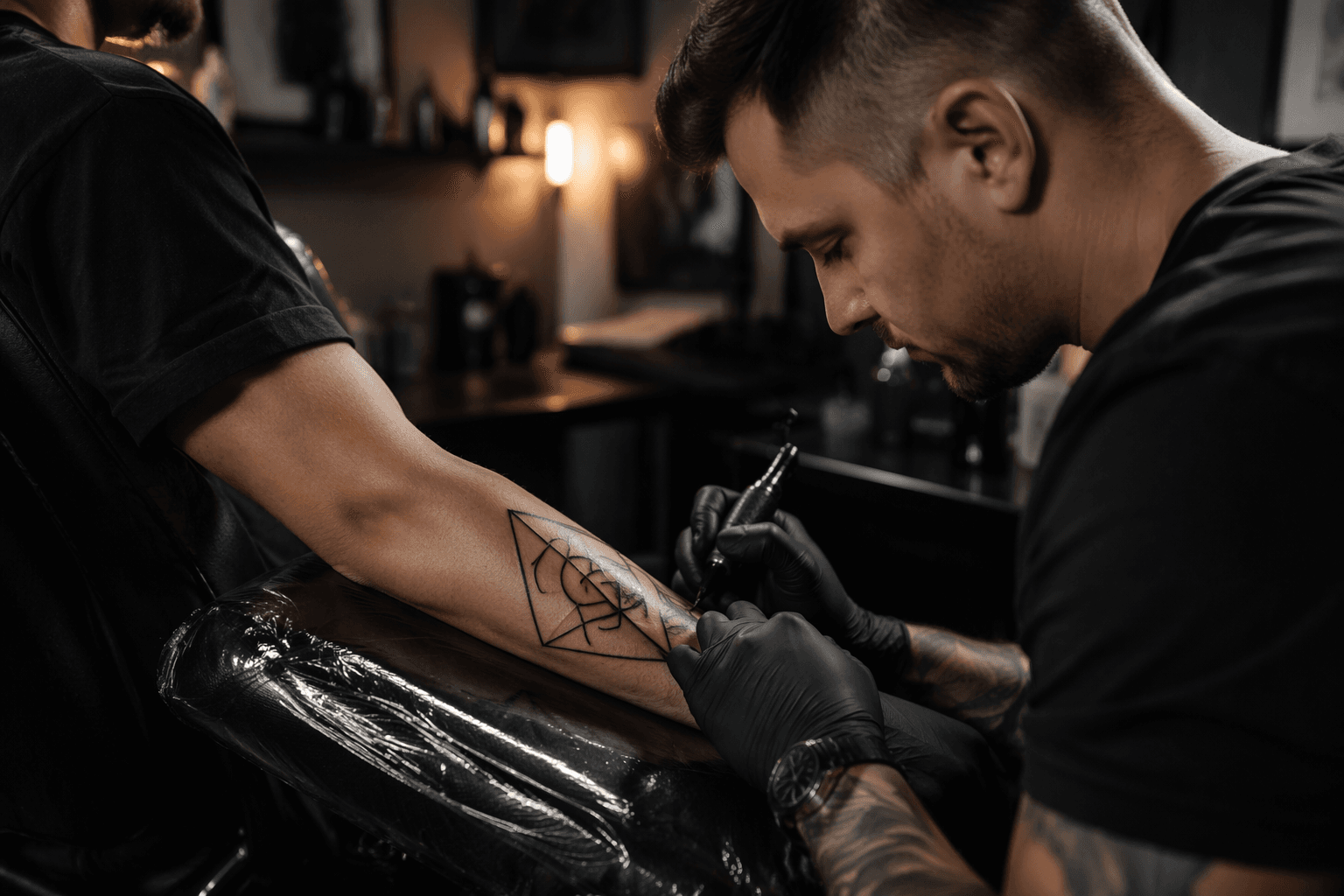
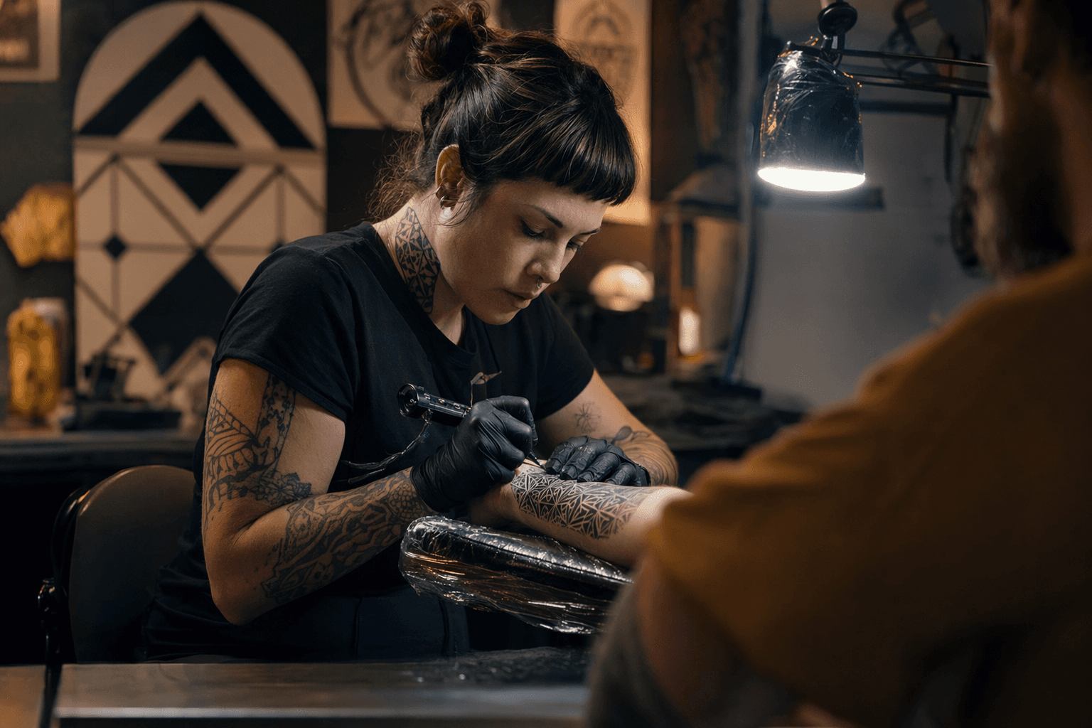
A geometric tattoo looks simple from a distance, then suddenly turns unforgiving when the stencil hits skin. Angles, circles, and line intersections have to land cleanly, because even a small mistake shows up fast in a design built on symmetry. That is why the style is less about picking a motif and more about choosing a visual system, one that tells the artist how precise the lines need to be, how the piece should flow with the body, and how much softness or contrast you want over time.
That idea has deep roots. The oldest tattooed body on record, Ötzi the Iceman, was discovered in 1991 near the Italian-Austrian border, and his roughly 5,300-year-old skin carried 61 tattoos, mostly crosses and parallel black lines. Researchers have interpreted those marks as possibly therapeutic, which is a reminder that body marking has always been more than decoration. In the modern tattoo world, geometric work keeps that same sense of structure, only now the structure is deliberately visual.
What geometric actually means on skin
In tattoo studios, geometric is best understood as a construction language. Artists describe it through sacred geometry, mandala patterns, low-polygon forms, abstract compositions, natural patterns, and architectural elements, all arranged with clean symmetry and exact line placement. The style depends on body flow too, because a perfect drawing on paper can look awkward if it fights the curve of a shoulder, sternum, forearm, or calf.
That is also why geometric tattoos age the way they do. If the underlying structure is planned well, the tattoo keeps reading clearly as years pass. If the spacing is too tight, the lines are too thin, or the placement bends the composition in the wrong direction, the piece can lose clarity and start to blur into itself.
The styles people confuse most often
Fine line
Fine line geometry is all about delicacy. It uses light, narrow lines and a restrained hand, which can make a design look elegant and airy, but it also means the margin for error is tiny. Because the lines are so slim, this style is less forgiving over time, especially in spots that move a lot or get frequent friction.
If you want fine line, say that plainly. Ask for clean, minimal geometry with thin line weight, not a heavy ornamental or blackwork piece that just borrows a few triangles. Fine line works best when the design is kept open and the spacing is generous enough that the tattoo can age without collapsing.
Ornamental
Ornamental sits very close to geometric, and that is exactly why people mix them up. Both rely on symmetry and rhythm, but ornamental leans more decorative, more lace-like, and more intent on framing the body than on presenting pure mathematical structure. Think of it as geometry with a dress code: elegant borders, flourishes, and repeating motifs that often follow the curves of the chest, ribs, spine, or hips.
At consultation, the useful distinction is this: ornamental can be softer and more decorative, while geometric usually emphasizes structure first. If you say you want a geometric tattoo but really mean ornamental framing, you may end up with sharper shapes than you expected. Make the distinction about line density, border treatment, and whether you want the tattoo to feel architectural or filigreed.
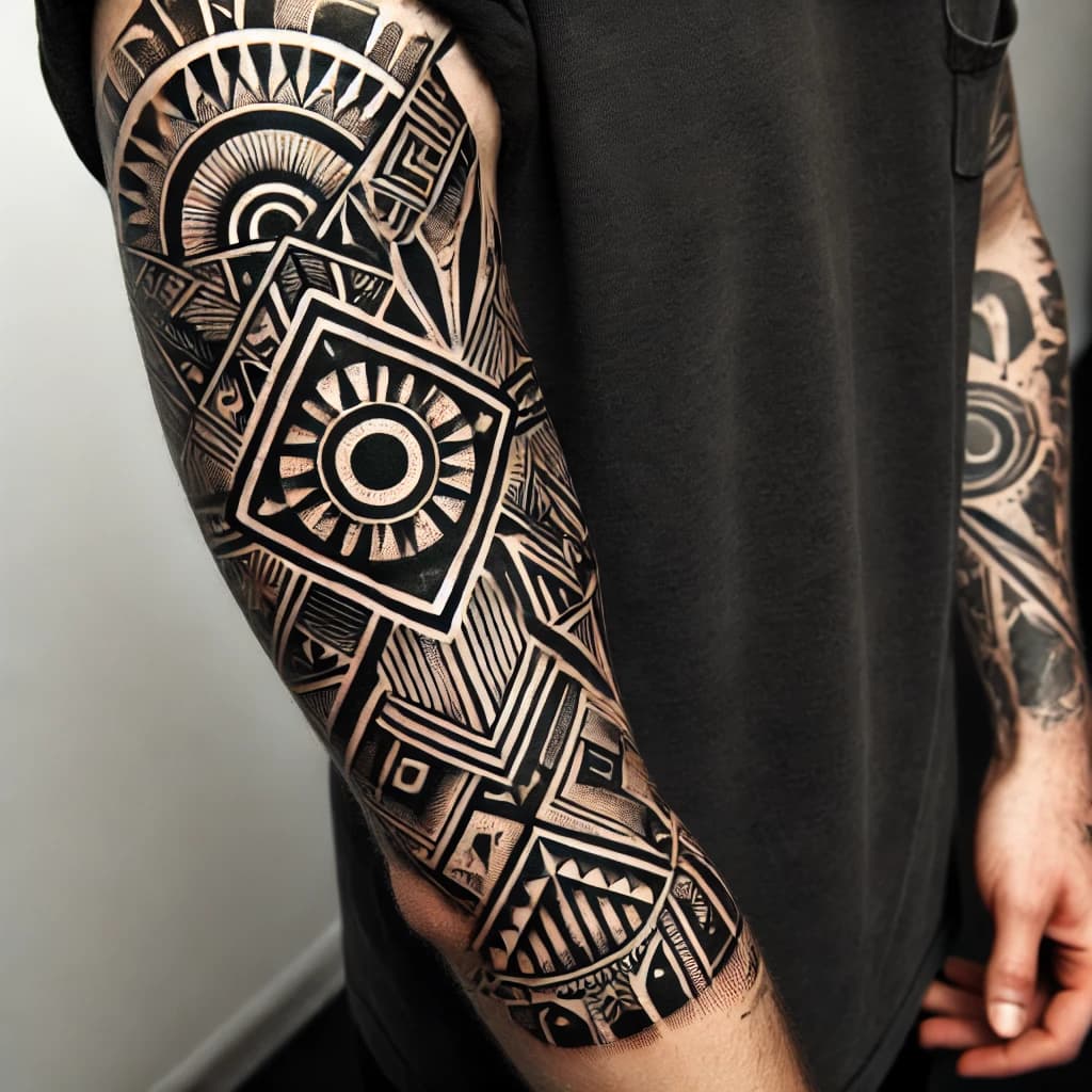
Blackwork
Blackwork changes the entire feel of a geometric piece because it replaces airy structure with visual weight. Heavy black fills, bold contrast, and saturated shapes make the tattoo read from across a room, and that stronger contrast can help a design hold up well as it ages. The tradeoff is that blackwork can feel denser, and once the surface is packed with black, the piece has less visual breathing room.
This is the style to name if you want geometry with force. Say you want bold blackwork geometry, not just geometric outlines. That phrase tells the artist you want strong contrast, solid fills, and a design that anchors itself to the body instead of floating lightly on top of it.
Dotwork
Dotwork softens geometry without giving up precision. Instead of relying only on solid lines or fills, it builds tone, shading, and texture through stippling, which can create mandala halos, gradual gradients, and atmospheric backgrounds around the main structure. The result often feels quieter than blackwork and more textured than pure linework.
Dotwork is also a useful language for aging, because it can make a tattoo look less harsh at first while still preserving the overall shape. But it needs planning, because overly dense dot fields can turn muddy if the spacing is too tight. If you want the piece to read as geometric first and shaded second, ask for dotwork accents rather than a fully stippled design.
Mandala
Mandalas are not just a popular tattoo motif, they are sacred geometric images in Buddhist, Hindu, and Jain art. They function as meditation tools and spiritual diagrams, and in Tibetan Buddhism they were fully realized in their current form by the eighth or ninth century. That is why mandala tattoos often feel both ornamental and geometric at once: they carry radial symmetry, ritual geometry, and a strong center point.
If mandala is what you want, say mandala, not just “something circular.” The difference matters because mandala composition usually depends on repeated rings, balanced spacing, and a focal center that the rest of the tattoo builds around. On skin, they tend to work beautifully on broad or centered placements like the sternum, back, upper arm, or knee area, where the circle can stay legible.
Tribal-influenced
Tribal-influenced geometry is usually about bold patterning, strong black shapes, and a rhythm that follows the body. It can overlap with geometric work when the design uses repeated angles, arcs, and symmetry, but the visual effect is usually heavier and more assertive. Placement matters a lot here, because these designs often want to wrap or track along muscle and joint lines rather than sit like a flat emblem.
If you mean tribal-influenced, be specific about the visual traits you want, such as bold black patterning, wraparound flow, or high contrast. That keeps the conversation focused on shape, scale, and movement instead of leaving the artist to guess whether you want a geometric sleeve, a tribal-inspired band, or a hybrid piece.
What to say in a consultation
The fastest way to avoid getting the wrong style is to talk in comparison points. You do not need to know every tattoo term, but you do need to know whether you want thin or bold lines, open space or dense fill, radial symmetry or linear flow, and a design that reads softly or one that hits hard from a distance. The more clearly you can say those things, the easier it is for an artist to decide whether your idea belongs in fine line, ornamental, blackwork, dotwork, mandala, or tribal-influenced language.
- I want clean symmetry with exact line placement.
- I want it to follow the body instead of sitting flat on top of it.
- I want fine line, not heavy blackwork.
- I want mandala structure, or I want ornamental framing, or I want dotwork shading.
A good geometric consultation sounds like this:
Those distinctions matter because geometric work is unforgiving. The style rewards precision, and it punishes vagueness.
Why the style keeps pulling people in
The popularity makes sense when you look at who is getting tattooed now. Pew Research found in 2023 that 32% of U.S. adults have at least one tattoo, and 22% have more than one. Among tattooed adults, 69% said they got tattooed to honor or remember someone or something, 47% to make a statement about beliefs, and 32% to improve personal appearance. That range of motives helps explain why style literacy matters so much: people are not just buying ink, they are choosing how a meaning should live on skin.
Geometric tattoos answer that need with structure, but only if the structure is right. The best pieces look effortless because every line, angle, and curve was chosen with the body, the aging process, and the style language in mind. That is the real appeal of geometric work: when it is done well, precision is not a detail, it is the whole point.
This article was produced by Prism’s automated news system from verified source data, official records, and press releases, then run through automated quality and moderation checks before publishing. The system is built and supervised by the people who set the standards it runs under. Read our full AI policy.
Did this article answer your question?