Meshtastic newcomer asks for iOS Nodes screen guide as mesh data confuses users
The iOS Nodes screen is where Meshtastic turns radio traffic into a readable mesh map, but its labels and icons only help if you know what to trust.

The Nodes screen is more than a list
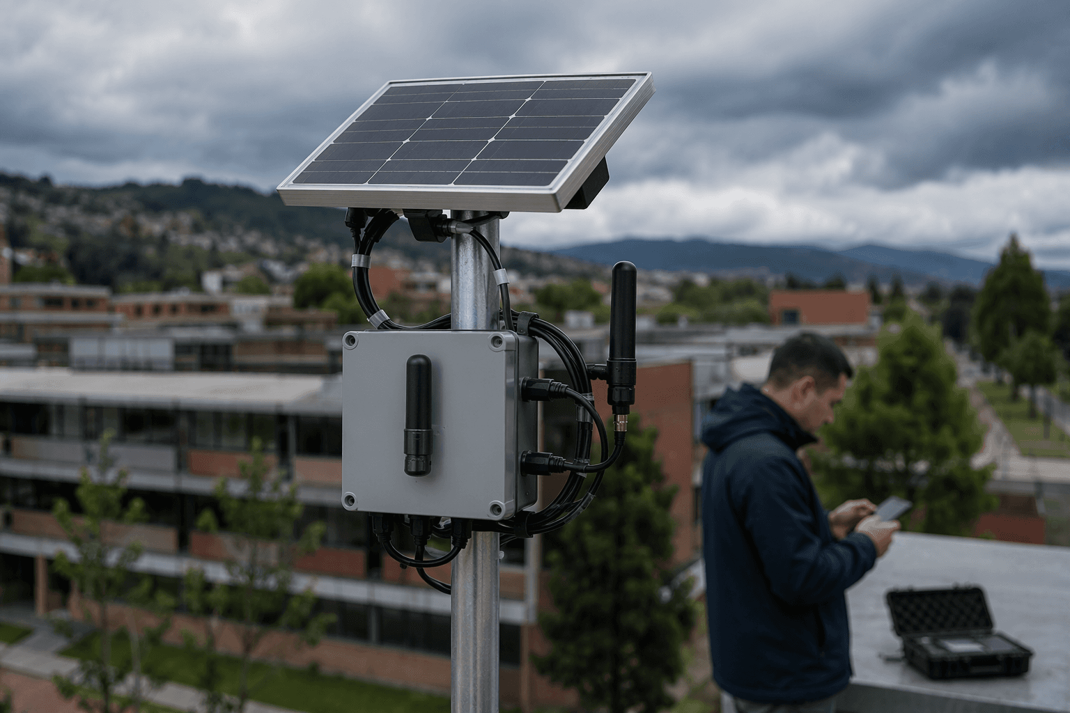
The iOS Nodes screen is where a Meshtastic mesh stops being abstract and starts becoming operational. For a newcomer testing with a Wio Tracker L1, the view can feel overloaded fast: node entries, icons, role labels, hop counts, distances, headings, timestamps, and other symbols all compete for attention. That is exactly why this screen matters so much in an off-grid system where there is no cell tower or internet layer to lean on.

Meshtastic describes itself as an open source, off-grid, decentralized mesh network built on affordable, low-power devices. In that kind of setup, the Nodes screen is not just a convenience feature. It is one of the few places where you can tell whether the mesh is healthy, whether a path is efficient, and whether a device is simply present or actually doing useful work.
Why newcomers get stuck here
The discussion that prompted the request is less about one confusing screen and more about a common adoption problem: users can send messages before they can explain the network they are using. That gap shows up immediately when the screen fills with unfamiliar markers. The poster specifically asks about lock icons, green check marks, orange moon symbols, distance, bearing, “Hops Away,” log icons, and the difference between roles like Client, Router, Client Mute, Client Base, and Unmonitored.
That list tells you what the screen is really doing. It is mixing status, topology, and role behavior in one place, which is powerful but easy to misread. If you do not know what the role labels mean, it is easy to mistake a node that is merely present for one that is actively helping the mesh, or to misread a routing problem as a signal problem.
The role labels are the key to the whole view
Meshtastic’s official configuration guidance is the clearest anchor for the screen, because the roles determine how the mesh behaves. CLIENT is the default general-purpose role, and CLIENT nodes intelligently repeat messages when needed. CLIENT_MUTE still participates in the network, but it never forwards packets from other devices. CLIENT_BASE is a personal base-station role that always rebroadcasts packets from or to its favorited nodes.
Those distinctions matter because they tell you what kind of node you are looking at before you even think about range or signal strength. A CLIENT node is the normal starting point for most devices. A CLIENT_MUTE node is useful when you want participation without acting as a relay. A CLIENT_BASE node is for a more intentional base-station setup, where rebroadcast behavior is part of the job.
Why Router and Repeater deserve extra caution
The labels that most often confuse people are ROUTER and REPEATER. Meshtastic treats these as specialized infrastructure roles for extending network coverage, not as the default choice for ordinary devices. The official guidance warns that using them casually can create packet collisions, reduce delivery, and waste hop budget.
That warning is the practical heart of the issue. A role that sounds more powerful is not always better for the mesh. In fact, the later firmware discussion says there has been a lot of messaging needed to discourage users from choosing ROUTER because the terminology itself leads people astray. The lesson for the Nodes screen is simple: a device that looks more “network-like” is not automatically helping more.
How to read hops, distance, and bearing
Once the role is understood, the next layer is movement and path data. “Hops Away” tells you how many relay steps separate you from a node, which is a routing clue, not just a distance clue. Distance and bearing help you understand where a node sits relative to your own device, but they do not tell the whole story on their own.
That distinction is important in Meshtastic because short distance does not always mean short path. A closer node can still be harder to reach than a more distant one if the mesh is routed poorly or if coverage is uneven. A healthy reading of the screen is less about raw proximity and more about whether the mesh is finding efficient paths with a reasonable number of hops.
Status icons are only useful when you know what they mean
The iOS screen also layers in symbols such as locks, check marks, moon-like indicators, timestamps, and log icons. The newcomer’s question shows the real problem: the interface communicates a lot, but not always in a way that is obvious to someone who has not memorized the legend. Until each icon is tied to a plain-English explanation, the safest approach is to read them as status cues first and conclusions second.
That is where the discussion becomes valuable beyond one user’s question. A screen that is rich in symbols can help experienced operators diagnose routing and network health quickly. For newer users, though, the same density can hide the difference between a node that is unreachable, a node that is merely quiet, and a node that is playing a specific role in forwarding traffic.
The documentation story is part of the product story
This is not an isolated support question. The post is written as a documentation wish list, with the explicit goal of turning the answers into a guide for the iOS Nodes screen. That fits Meshtastic’s current community workflow, since GitHub Discussions is now the project’s main forum and has replaced the older Discourse forum. In other words, the question lives in the same place where users now ask for help and where documentation gaps are most visible.
The iOS app already has formal documentation for the Nodes tab, and the Meshtastic-Apple repository includes a node-list-layout specification area. That points to active work on defining how the list should look and behave, not just how it should be described after the fact. The fact that the node list needs that much specification says a lot about the interface: it is important enough to be precise, and complicated enough to need careful translation for humans.
What to watch for when you open the screen
If you are new to the Nodes view, the useful habit is to sort what you see into three buckets. First, identify the role, because that tells you how a node is supposed to behave. Second, read hops, distance, and bearing as routing clues, not just geography. Third, treat the icons and timestamps as status markers that only become meaningful when you know what the app is signaling.
That approach keeps you from making the most common mistake: assuming that more data automatically means more understanding. Meshtastic’s mesh is built to be efficient on small, low-power hardware, and the Nodes screen reflects that by exposing the network’s behavior rather than hiding it. Once you know which labels carry real operational weight, the dense display stops looking like noise and starts looking like a field guide to the mesh you are actually running.
Know something we missed? Have a correction or additional information?
Submit a Tip