Building a Network SouthEast station scene in OO gauge
Wokingham turns NSE nostalgia into a sharply specific OO-gauge scene, where 1986 branding, old Southern-era bones and station details do the heavy lifting.

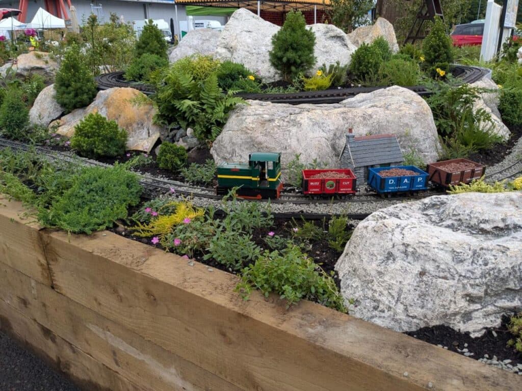
Wokingham is the kind of station scene that makes Network SouthEast feel immediate in OO gauge. Instead of treating NSE as a broad blue-and-red mood board, Dan Evason’s approach turns it into a single place with a recognisable identity, a late-1980s surface, and older railway structure underneath.
Why the NSE era works so well in miniature
Network SouthEast was officially launched on 10 June 1986 at Waterloo by Chris Green, and that launch set the tone for a passenger sector that covered commuter and inter-urban routes across London and the South East. It was part of British Rail’s effort to modernise the railway’s image, and the message was carried through upgraded stations, new rolling stock and a much more deliberate corporate look. That makes the era especially model-friendly because it is visually coherent without being sterile.
The appeal for modellers is that NSE sits in a sweet spot. It is modern enough to feel purposeful, but it is also old enough to carry the texture of pre-privatisation Britain, before British Rail was split up in the 1990s. In practical terms, that means a station scene can be cleaner and more regulated than a 1960s layout, while still showing enough weathering, legacy structure and everyday clutter to feel real.
Why Wokingham gives the scene its identity
Wokingham is the detail that stops this becoming a generic station build. The railway reached the town in 1849 with the opening of the Reading-to-Guildford line, and the direct route to London came later via the Reading-to-Staines line. That layered history matters because it gives the modeller a station that belongs to the old Southern system but is being restyled for the NSE era.
The station’s footbridge is even more useful as a visual anchor. Built in late 1886 and grade II listed, it is described by the town museum as possibly unique to Wokingham. In a miniature scene, a structure like that does two jobs at once: it fixes the location in the viewer’s mind and reminds them that NSE was an overlay on much older railway architecture, not a total rebuild.

How to read the NSE look at platform level
The strongest NSE station scenes do not rely on colour alone. The corporate identity was about station upgrades, clear signage and a more controlled presentation, so the miniature needs to reflect that shift in organisation as much as in paint. Crisp signs, strong colours and cleaner platform furniture are the giveaways that make the era read instantly.
A useful way to think about the look is this:
- signage should feel newly standardized and highly visible
- platform furniture should look tidier and less mismatched
- the overall scene should suggest maintenance and renewal
- older building fabric should still be present, but visually subordinate to the refreshed station image
That balance is the real challenge. If everything is uniformly pristine, the scene loses authenticity. If the older infrastructure overwhelms the corporate refresh, it stops reading as Network SouthEast at all. The art is in showing the station as improved, not rebuilt from scratch.
Building the scene in OO gauge
OO gauge gives enough space to show the relationship between the station buildings, platform edge and footbridge without needing a full-scale terminus. That is one reason Wokingham works so well as a case study: you can compress a recognisable slice of place into a manageable footprint and still preserve the key visual cues. The station becomes a study in selective detail rather than an attempt to copy every inch of the prototype.
The best modelling decisions are the ones that make the era legible at a glance. Use the footbridge as a landmark, then let the platform presentation carry the period. The station furniture, signs and colours should all support the same story: this is British Rail in the NSE years, trying to look modern, confident and better cared for while standing on a much older railway foundation.
That is also where restraint pays off. Network SouthEast was a major image overhaul, but it was not a blank-slate rebuild, so the scene should not feel over-designed. The station’s older history, from the 1849 opening to the late-1886 footbridge, gives the model the right amount of depth beneath the refreshed surface.
What makes Wokingham read instantly as NSE-era
The reason this specific scene stands out is that every layer points in the same direction. The 1986 launch at Waterloo explains the corporate mood, the station upgrades explain the visual language, and Wokingham’s surviving railway heritage supplies the older framework that makes the modernisation believable. In OO gauge, that combination is more powerful than a broad nostalgia theme because it gives the viewer a place, a date range and a railway identity all at once.
That is the real lesson of modelling Wokingham in Network SouthEast form: the scene works because it is not trying to represent all of NSE. It is capturing one station, one era and one very particular moment when British Rail wanted the railway to look sharper, cleaner and more modern, right down to the platform edge.
This article was produced by Prism’s automated news system from verified source data, official records, and press releases, then run through automated quality and moderation checks before publishing. The system is built and supervised by the people who set the standards it runs under. Read our full AI policy.
Did this article answer your question?