Piaget ends Extraleganza trilogy with mother-of-pearl and sapphire color play
Piaget’s final Extraleganza chapter turns pearls into color partners, with mother-of-pearl and sapphire setting the mood for richer, more wearable pearl jewelry.

Piaget’s final 65-piece Extraleganza chapter does more than close a trilogy. With a mother-of-pearl and sapphire pairing at its center, it pushes pearls away from the old idea of white formality and into a sharper, more graphic color story. The message is clear: in the most ambitious jewelry, pearls are no longer the quiet note. They are part of the contrast.
A trilogy built around color
Piaget has framed color as “a legacy,” “a language” and a signature of its Extraleganza universe, and that language has been building for three years. The story reaches back to 1874 in La Côte-aux-Fées, Switzerland, where Georges-Édouard Piaget began making watch movements, then jumps forward to the maison’s modern high-jewelry identity, where gemstones and watchmaking history are treated as one continuum.
The trilogy began with Essence of Extraleganza in 2024, which Piaget positioned as part of its 150th anniversary. That chapter included about one hundred pieces and took more than two years of research to assemble rare emeralds, a useful reminder that this maison likes its color stories to feel earned rather than decorative. Shapes of Extraleganza followed in 2025, drawing on the same 1960s and 1970s spirit while exploring form, color, texture, light and volume.
Piaget has also tied Extraleganza to the house’s historic high-jewelry watches, including the cuff watch and the Swinging Sautoir first introduced in 1969, as well as the Aura watch launched in 1989. That history matters here because it explains why the collection feels sculptural rather than merely gem-heavy. The point is not simply to show stones. It is to choreograph them.
Why mother-of-pearl changes the mood
The most interesting move in the finale is not volume or flash. It is restraint, achieved through mother-of-pearl. In a field of pink and blue sapphires, diamonds, vivid rubies, deep green emeralds, opal and carnelian, mother-of-pearl works like a soft beam of light. It cools the composition without flattening it, which is exactly why it is so useful in contemporary pearl jewelry.
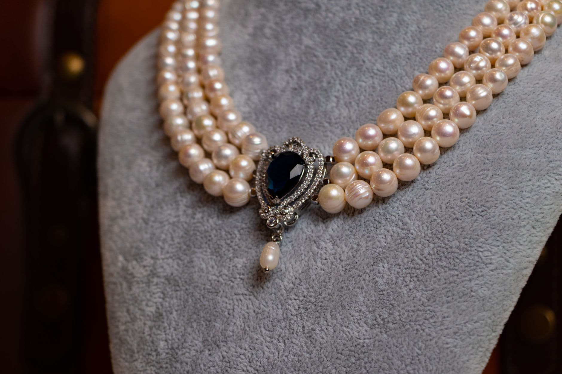
That softness is what makes the sapphire pairing feel modern rather than nostalgic. Piaget’s artistic director Stéphanie Sivrière has said color plays an integral role in the house’s history and heritage, and the collection makes that argument by using contrast as a design tool. A sapphire-and-mother-of-pearl duo can bring out pink hues in a way that a diamond setting often cannot, while black opals with green highlights and ultramarine sapphires create a darker, more electric register.
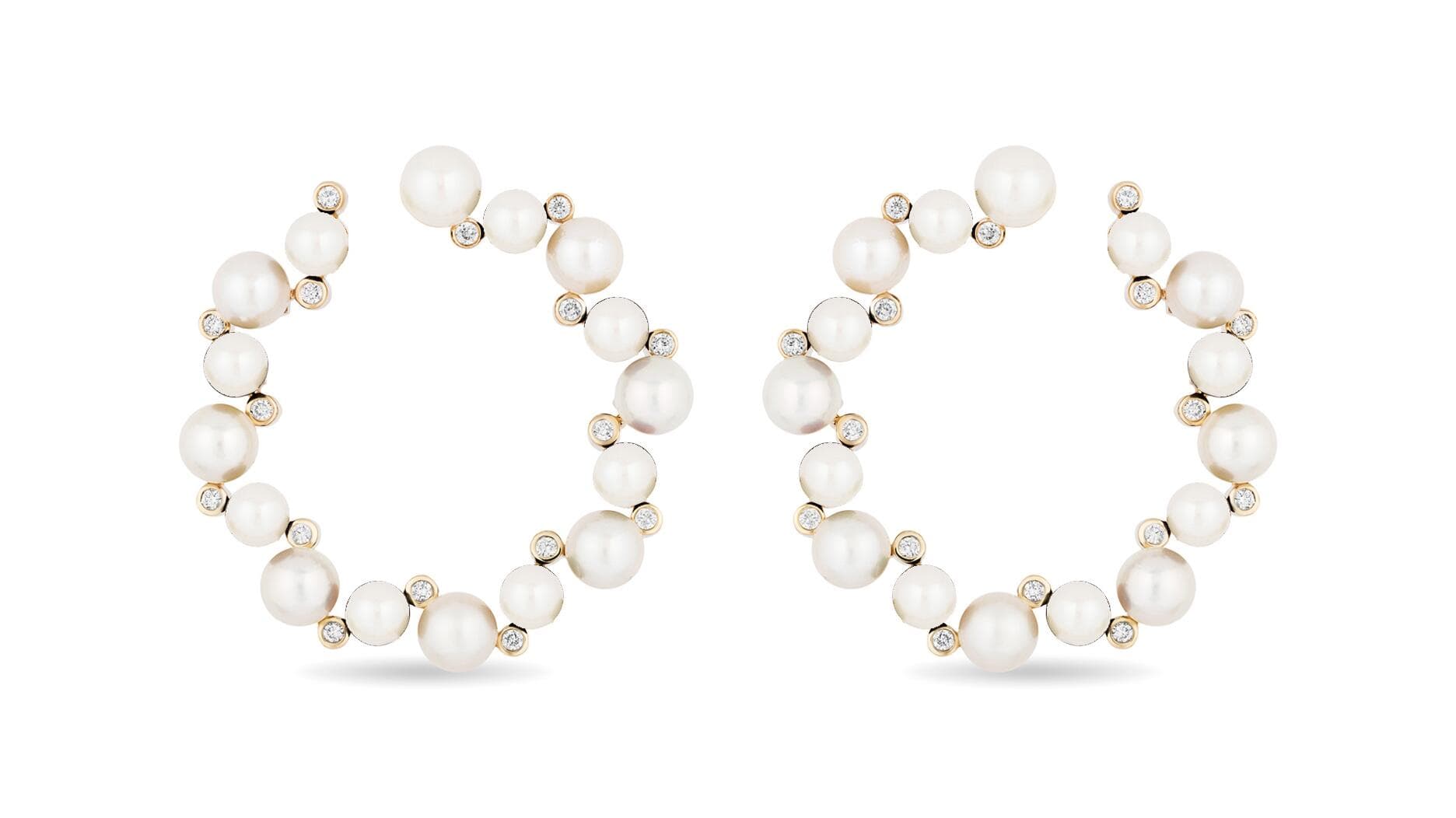
For readers, that is the real takeaway. Pearls are not only returning to style as classic white strands or button earrings. They are being repositioned as surfaces that can hold color beside them. In pearl jewelry, that means mother-of-pearl panels, luminous cabochons and nacre-backed designs can feel just as current as any hard-edged gemstone suite, especially when paired with cobalt, ultramarine, blush pink or leaf green.
The pieces that make the case
Among the new pieces, Blue Illusions is the standout because it turns this theory into a single object lesson. The necklace reportedly took nearly 900 hours to craft, and its center stones make the scale of the ambition obvious: an 8.52-carat cushion-cut Madagascan sapphire, a 3.3-carat paraiba tourmaline and a 13.98-carat black opal. That combination is not about matching tones so much as creating pressure between them, with the opal’s depth giving the sapphire and tourmaline even more intensity.
Piaget’s collection page also highlights Gems Pop, Flamboyant Links and Sunset Prism, names that tell you as much about the aesthetic direction as any technical description. These are not demure pearl jewels designed to disappear against the skin. They are sculptural, high-contrast forms that lean into movement and brightness, which is exactly why they matter as trend indicators beyond high jewelry.
What pearl jewelry can take from this finale
The broader market rarely copies high jewelry stone for stone, but it often translates its logic. In this case, that logic is contrast. A pearl jewel feels most current when it does not try to be a pale standalone object, but instead meets a color that sharpens its glow: sapphire against mother-of-pearl, emerald against nacre, ruby against a creamy shell surface, black opal beside a pale, reflective ground.
That shift has practical consequences for everyday jewelry choices. Bezels can make a mother-of-pearl surface read clean and architectural, while prongs let a sapphire throw more light and emphasize the contrast Piaget is chasing. In smaller pieces, that language is likely to show up in pendants, drop earrings, slim cuffs and rings where one luminous pearl element is paired with a single vivid stone instead of a full parade of gems.
The important change is not that pearls have become louder. It is that they have become more chromatic. Piaget’s finale suggests the future of pearl jewelry is less about purity and more about atmosphere, where creamy nacre, saturated gems and precise construction work together to make color feel newly alive.
This article was produced by Prism’s automated news system from verified source data, official records, and press releases, then run through automated quality and moderation checks before publishing. The system is built and supervised by the people who set the standards it runs under. Read our full AI policy.
Know something we missed? Have a correction or additional information?
Submit a Tip