How initial jewelry turns identity into timeless personal style
A single initial can carry family, partnership, or legacy when the letterform, metal, and chain are chosen with intent. The best pieces read personal, not generic.
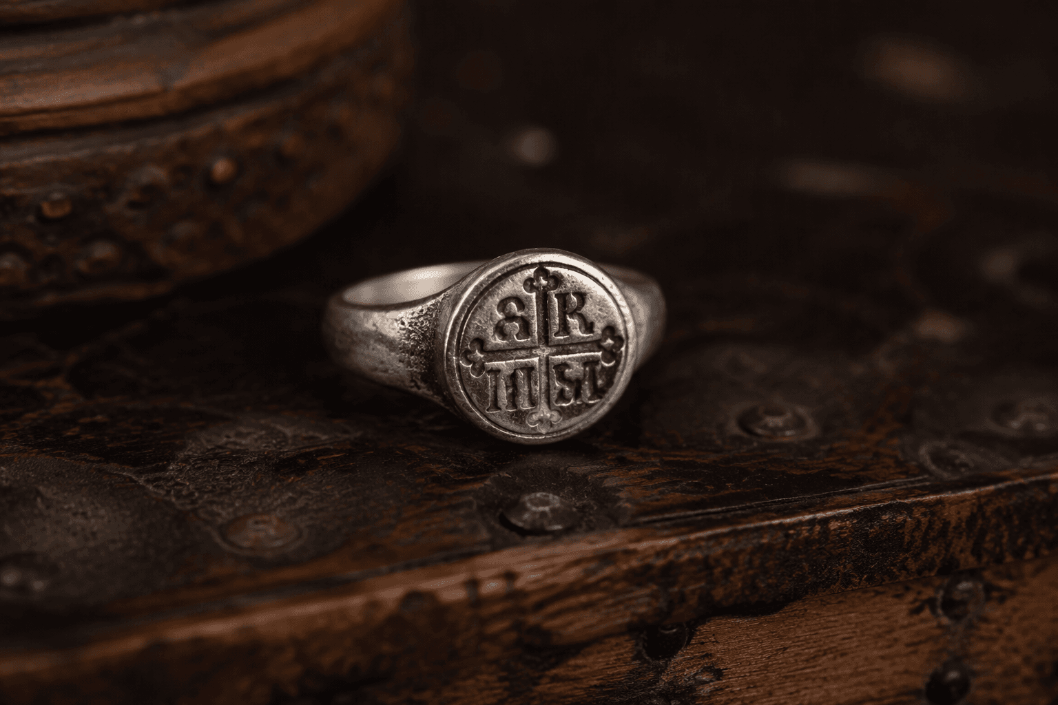
Rulers in early Greek and Roman cultures used monograms to identify the region or ruler from which a coin came. That practical use helps explain why a single initial on jewelry still feels personal.
Why initials still feel personal
Initial jewelry feels enduring because monograms were never just decorative. A letter on a pendant or ring reads as identification before it reads as ornament.
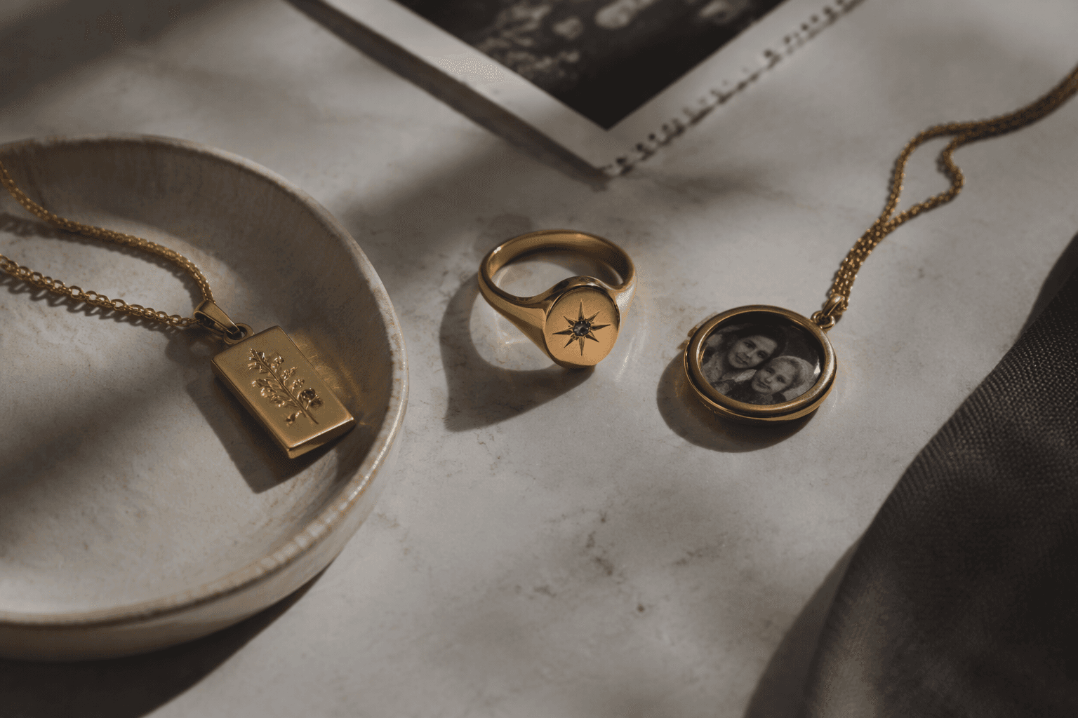
The signet ring deepens that logic. It has a large bezel that can be embellished with a coat of arms, initials, precious stones, and enamel. It was long worn exclusively by men before becoming widely adopted by women.
Choose the format before you choose the font
The biggest mistake in buying initial jewelry is treating every lettered piece as interchangeable. A single-letter pendant says something different from paired initials, and a clustered set of children’s initials has a different emotional register from a monogram that feels more formal and inherited. Hidden initials, engraved inside a ring shank or on the back of a pendant, add privacy for someone who wants meaning without broadcasting it.
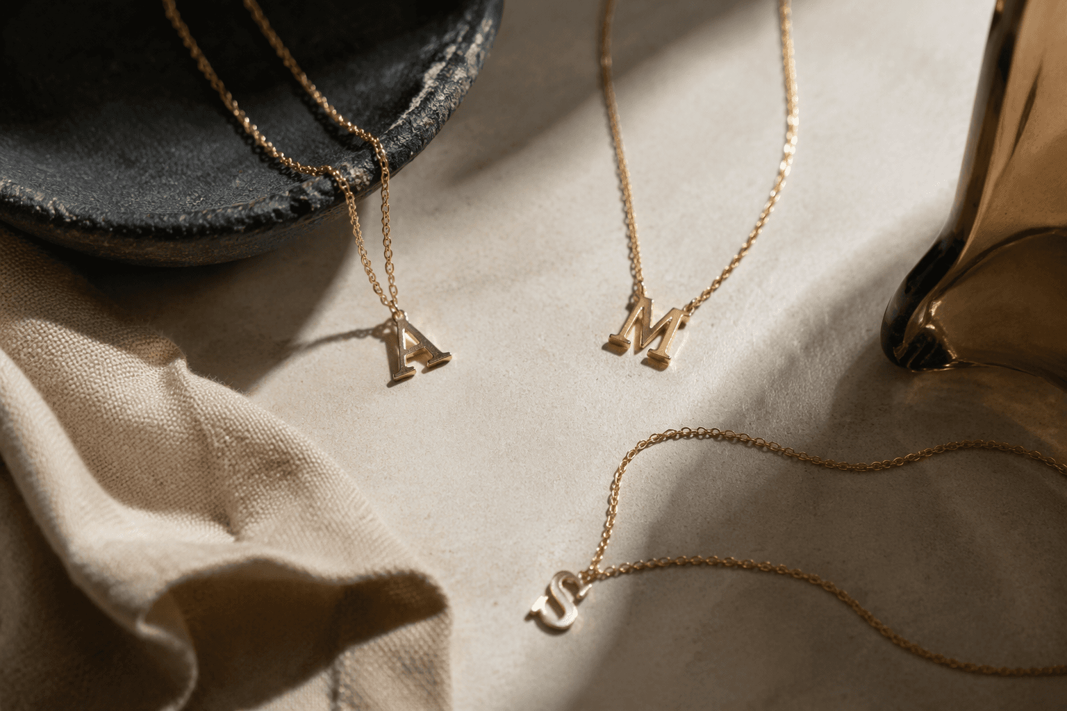
- Single letters work best when you want one clean focal point.
- Paired initials suit couples and can also honor a parent and child.
- Stacked or clustered initials feel right for children, grandchildren, or a family group.
- Monograms lean more traditional and often feel strongest on flat faces.
- Hidden initials are the most discreet option, especially for people who prefer symbolism over display.
The shape of the jewelry should support the number of letters you choose. Flat tags, discs, heart outlines, medallions, and signet faces give the typography room to breathe, while a cramped surface makes even the best engraving look busy. That is why signet-style pieces often work so well: the broad bezel gives the letter more room.
Typography changes the mood
Font is not a finishing touch in initial jewelry; it is the personality of the piece. Block letters read modern and clean, script feels romantic, serif fonts land as classic, and overworked decorative cuts can date quickly if they become too ornate. The same initial can look crisp on one pendant and sentimental on another, simply because the letterform has changed.
Placement matters just as much. A centered initial on a pendant reads as direct and balanced, while a side-set letter on a bar necklace feels more contemporary and directional. On a signet ring, an offset engraving can look intentional if the surface is wide enough, but traditional signets usually keep the letter or monogram centered on the face.
Materials that hold up in real life
Material choice determines how well the piece wears over time. Solid 14k gold, 18k gold, sterling silver marked 925, high-quality platinum, and gold-filled pieces generally age better than thin plating for daily wear, especially when the jewelry will be exposed to lotion, perfume, and moisture. Initial jewelry is often chosen for milestones, not just outfits, and milestone pieces tend to be worn often.
Sterling silver marked 925 means the piece is 92.5% silver, and that stamp is the quickest sign you are looking at real sterling rather than a silver-colored surface. Gold-filled jewelry is a stronger everyday alternative to plating when you want a gold look without moving all the way to solid gold.
14k white gold offers a bright, cool-toned finish with substantial metal content, and the mark itself indicates 58.3% gold. If your wardrobe leans toward silver hardware, black tailoring, or cool neutrals, white gold can make an initial feel sharper and more architectural than yellow gold.
Match the metal to skin tone, wardrobe, and occasion
Metal choice should track skin tone, wardrobe, and occasion. Yellow gold flatters warm skin tones and looks especially good against cream, camel, chocolate, and other saturated neutrals; white gold and silver suit cooler skin tones and a wardrobe built around gray, navy, black, and icy whites. Rose gold sits between those moods and can soften a monogram that might otherwise feel severe.
The occasion changes the answer too. A graduation gift can take a little more symbolism and a little less restraint, while a new-baby piece usually works best when the engraving is legible and the chain is secure enough for daily wear. A wedding or anniversary piece can go more formal, with a monogram or paired initials that feel deliberately composed rather than casually stamped.
Length and fit matter in the same way. A shorter chain keeps a pendant centered at the collarbone, which helps a single letter read clearly, while a slightly longer chain layers more easily with other personalized pieces. Bracelets need enough room to sit flat, and rings need the right sizing so the letter does not twist off-center and lose its visual balance.
Why the category keeps selling
Phoenix Roze frames monogram jewelry as something millennials love.
This article was produced by Prism’s automated news system from verified source data, official records, and press releases, then run through automated quality and moderation checks before publishing. The system is built and supervised by the people who set the standards it runs under. Read our full AI policy.
Did this article answer your question?