Feeding America's Map the Meal Gap tracks local food insecurity trends
County hunger data can steer green bag routes, pantry partnerships, and seasonal drives for A Simple Gesture, replacing guesswork with neighborhood-level planning.

Local food insecurity numbers give A Simple Gesture something more useful than a broad picture of need: they help decide where to send volunteers, which pantries to back, and when to push harder on seasonal drives. A county-by-county map turns hunger into something a route coordinator, a donor recruiter, or a pantry partner can use the same day.
Why local data changes the work
Feeding America’s Map the Meal Gap is built to show how food insecurity and food costs vary at the local level, not just nationwide. The study estimates overall and child food insecurity for every county and congressional district in the United States, and it extends that lens to seniors, older adults, select income groups, and select racial and ethnic groups.
That matters for a neighborhood food recovery nonprofit because the numbers can point to where demand is most concentrated and where capacity is thin. If a chapter wants to expand a Green Bag route, strengthen one pantry relationship, or build a summer campaign around school breaks, county-level data gives staff a concrete reason to focus on one area before another.
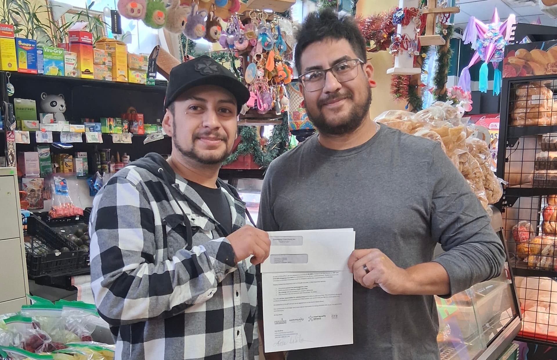
The broader Feeding America network gives those local numbers real operational reach. The organization says its system includes more than 200 food banks, 22 statewide food bank associations, and 60,000 agency partners, food pantries, and meal programs. That scale means the map is not just a research product; it is a planning tool meant to shape action across a national anti-hunger network.
What the map actually measures
Map the Meal Gap is updated annually, and the most recent release cycle matters for planning. Map the Meal Gap 2025 was published on May 14, 2025 and reflects 2023 data, while Map the Meal Gap 2026, which will reflect 2024 data, is scheduled for late July 2026.
The methodology goes beyond a basic poverty snapshot. Feeding America says the study also estimates local federal program eligibility among people experiencing food insecurity, the additional dollars needed by food-insecure people, and the average meal cost for food-secure households. That mix of measures helps a nonprofit understand not only who may need help, but what it takes to close the gap in a specific county.
Feeding America’s Data Commons makes the data more usable still. The portal overlays Map the Meal Gap with additional sources in a single place, which can help staff compare hunger patterns with other local indicators instead of treating food insecurity as an isolated problem. For a group working route by route and pantry by pantry, that makes the map feel closer to a field guide than a spreadsheet.
How A Simple Gesture can turn numbers into action
For A Simple Gesture, county-level hunger estimates are not abstract public-interest research. They can shape where the organization recruits volunteers, where it spends outreach time, and which neighborhoods receive more attention during holiday and summer pushes. A route coordinator looking at a county map can decide where an extra pickup cluster makes sense, while a development lead can use the same data to explain why a new employer partner should support a specific side of town.
The same logic applies to pantry partnerships. If a chapter can point to local food insecurity estimates for older adults, children, or a specific neighborhood, it can make a stronger case for why a pantry relationship needs to grow or why a school-based effort should expand. That is especially useful when the organization is asking businesses, faith groups, and civic clubs to host drives or donate surplus food, because local numbers make the need legible in plain terms.
The timing also matters. Feeding America’s annual releases give chapters a chance to refresh messaging before the most visible giving seasons. A Simple Gesture can use that cadence to build around summer need, when school meals are less available, and the holidays, when food donations rise but demand does too. The more precise the county data, the easier it is to match campaigns to the neighborhoods where the pressure is highest.

What the nonprofit already has in place
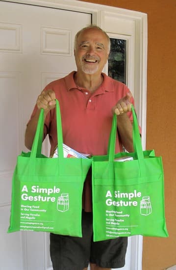
A Simple Gesture-Guilford County was established as a 501(c)(3) nonprofit in 2015, and its model is built around making giving easy through doorstep donations and food recovery pickups. The organization says it has worked to make food donations simple and convenient since 2015, using door-to-door pickups, corporate pickups, and timely food recovery runs to keep local pantry shelves stocked.
Its reported impact shows a large county footprint. As of December 2025, A Simple Gesture says it has helped donate more than 8,000,000 child-size meals and $13,000,000 in food value across Guilford County. The organization also reports 75-plus pantry partners, more than 3,900 recurring food donors, and 200 monthly volunteers, numbers that suggest a network large enough to benefit from sharper local planning.
The scale of the donor base is especially relevant to route design. A Simple Gesture says more than 1,700 food donors and numerous volunteer drivers collect over 132,000 pounds of food each year. In a program built on recurring collection, the difference between a good route and a great one can come down to whether staff know which neighborhoods are producing food and which are absorbing the most need.
How the programs fit the map
A Simple Gesture’s Green Bag Food Donor Program is the clearest example of how local data can shape operations. The program asks residents to donate nonperishable food on a recurring basis so pantry shelves stay stocked, which means route density, neighborhood participation, and pantry demand all matter at once.
The Food Recovery Program adds another layer. It matches food industry businesses with vetted nonprofits and rescues edible food from businesses for delivery to local nonprofits. Volunteers in that program must be 18 or older, able to lift 20-pound boxes, use a smartphone, wear closed-toe shoes, and use a clean personal car, details that make staffing and route planning a real labor-management exercise rather than a simple call for help.
A Simple Gesture’s school and refugee-focused work also fits neatly into a county data strategy. The SHARE program places refrigerators in Guilford County Schools so students can access unopened food from the school nutrition program, and the Refugee Feeding Network is designed to help refugee children and families access wholesome, nutritious food. Those programs serve different communities, but both benefit from knowing where food insecurity is most acute and where access barriers are most visible.
Why partner strategy starts with the map
A Simple Gesture’s partners page names groups such as BackPack Beginnings, Out of the Garden Project, Open Door Ministries, and West End Ministries/Leslie’s House, showing that the organization already works inside a dense local ecosystem. County hunger data can help staff decide which of those relationships need deeper investment and where there is room to bring in new employer, school, or faith-based partners.
That is the operational payoff of Map the Meal Gap for a food recovery nonprofit. It helps a chapter stop relying on a general sense that hunger exists and start planning neighborhood by neighborhood, with route maps, volunteer recruitment, pantry partnerships, and seasonal drives all tied to the same local picture.
This article was produced by Prism’s automated news system from verified source data, official records, and press releases, then run through automated quality and moderation checks before publishing. The system is built and supervised by the people who set the standards it runs under. Read our full AI policy.
Did this article answer your question?