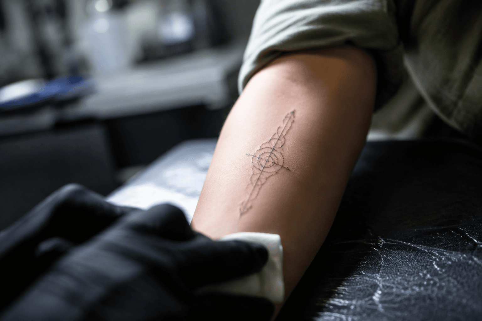
Beginner guide helps readers choose the right geometric tattoo style
Geometric tattoos only work when the concept, placement, and artist all match. A few millimeters off can change symmetry, spacing, and the whole read.

Geometric tattoos look simple until the stencil goes on. One broken line, one spacing error, or a slightly off center axis can turn a clean composition into something that reads tired or lopsided, which is why the style punishes loose planning more than most categories do.
What geometric actually covers
Geometric is not a single look but a family of looks that includes sacred geometry, dotwork patterns, mathematical shapes, symmetrical compositions, mandalas, platonic solids, and geometric animal designs, the same broad range mapped in Tattoodo’s geometric guide. That breadth is exactly why beginners get tripped up. A client may say “geometric” and mean a mandala centerpiece, a cluster of clean shapes, or a black-and-dot composition with no literal geometry at all.
Execution changes with the concept. CoCreate Ink’s June 16, 2024 explainer, “Exploring Geometric Tattoos - History, Inspirations, and Artists,” focused on precise shapes and intricate patterns that had gained widespread popularity, while Fade FX Tattoo’s June 24, 2025 piece on geometric dotwork focused on the style’s mesmerizing intricacy and symbolic weight.
How it sits next to other tattoo styles
Geometric sits closest to fine-line, dotwork, ornamental, blackwork, and illustrative work, but each asks something different of the artist. Fine-line can look delicate and airy, yet it often depends on very thin strokes that age differently from the more structural lines in geometric work. Dotwork overlaps heavily with geometry, but in geometric dotwork the spacing between dots and the rhythm of the pattern become part of the architecture, not just shading.
Blackwork brings contrast and staying power through solid fill, which can make some designs read more boldly over time. Geometric work, by contrast, often leans on negative space, mirrored spacing, and repeated angles, so a small shift in line precision can be more visible. Ornamental and mandala pieces share the obsession with symmetry, but ornamental work usually tolerates more decorative flourish, while geometric designs tend to live or die by their measured structure. Illustrative tattoos can absorb variation more easily because the image can carry the piece, but geometric tattoos have to hold their own on structure alone.
Why precision matters more here than in most styles
In sacred geometry, the entire appeal is often that something intricate still feels calm and ordered. In Inked’s August 12, 2019 video, Dillon Forte walked through the work behind sacred geometry tattoos and how elaborate pieces can still look deceptively simple. That simplicity is earned, not improvised, and it depends on line accuracy, matching angles, and clean repetition.
The failure points are specific. If symmetry drifts, the eye catches it immediately. If micro-details are packed too tightly, those spaces can close as the tattoo settles. If a mandala’s spokes are uneven or a platonic-solid edge is softened by a shaky hand, the whole design loses the sharpness that made geometric appealing in the first place. Artists who specialize in the style obsess over stencil placement and spacing long before the first line goes in.
Placement and scale are part of the design, not afterthoughts
A design can get lost on the wrong body part, and geometric tattoos are especially vulnerable to that problem because they depend on clean read and symmetry. A design that looks crisp on a flat mockup can distort when it is squeezed onto a curved, narrow, or highly mobile area. The smaller the piece, the less room there is for line precision, negative space, and dot spacing to survive the healed result.
That makes sizing part of the brief. If the idea relies on fine spokes, nested shapes, or micro-dot gradients, the tattoo generally needs enough scale to let those details breathe. If the concept is a simple shape cluster or a minimal symbol, it can be smaller, but the artist still has to protect the spacing so the composition does not collapse visually over time.
Aging and fading are not the same risk in every style
Geometric tattoos can age well when the lines are bold enough and the structure is roomy enough, but they are less forgiving than styles that can hide softness inside texture or shading. Fine lines fade first, tiny gaps close up, and overpacked dotwork can blur into a denser field than you planned. That is why many geometric designs work better when the artist builds in a little breathing room rather than chasing the thinnest possible line.
Clients need to understand the symbolism and intention behind the style before choosing it for fashion alone, a caution Business Insider highlighted in its 2015 piece on trendy sacred geometry tattoos. If the concept only works when every microscopic element stays pristine, it deserves more planning than a casual impulse booking.
Artist specialization matters more than a general portfolio
Broader societal acceptance of tattooing and a steady inflow of new talent, especially among freelance practitioners and independent studios, mean there are more artists working in geometric, dotwork, and ornamental styles than there used to be. It also means the burden is on you to sort specialists from generalists.
A strong geometric artist portfolio should show healed work, clean symmetry, controlled line weight, and examples of negative space that still read after healing. It should also show whether the artist works comfortably in sacred geometry, mandala construction, platonic solids, geometric animals, or pure shape-based abstraction.
Pre-booking checklist
Before you commission a geometric design, make sure you can answer these points clearly:
- Is the idea actually geometric, or is it better suited to ornamental, blackwork, dotwork, fine-line, or illustrative treatment?
- Does the concept rely on symmetry, negative space, or tiny gaps that need enough size to survive healing?
- Is the placement giving the design a flat enough, stable enough surface to stay readable?
- Does the artist’s portfolio show healed geometric work, not just fresh stencil photos?
- Have you defined the brief tightly enough that the artist knows whether you want a mandala, sacred geometry, platonic solids, geometric animals, or a minimalist shape system?
This article was produced by Prism’s automated news system from verified source data, official records, and press releases, then run through automated quality and moderation checks before publishing. The system is built and supervised by the people who set the standards it runs under. Read our full AI policy.
Did this article answer your question?