Geometric Tattoos Blur Style Labels as Artists Forge New Visual Languages
Geometric is no longer the safest label. Vialetto’s editorial shows how ornamental, dotwork and hybrid work carry different meanings, structures and body logic.
Geometric is no longer the safest word to use when you are booking a tattoo. Miki Vialetto’s latest editorial treats tattooing as a language that keeps expanding, with artists borrowing from different traditions, building personal signatures, and then trying to name what they make.
Why the label keeps stretching
That shift matters because a style name can now hold very different intentions without being wrong. In Tattoo Life’s framing, ornamental can mean cultural memory and pre-Hispanic roots for Ulises Indo, while for Alexa Tamaska it becomes a floral-and-geometric composition built in dialogue with anatomical form. The point is not that the category is broken. It is that the category is alive, and the same word can describe very different visual grammars.
For geometric readers, that changes the booking conversation. If a design is built from sacred geometry, blackwork, floral structure, or a more decorative ornamental flow, the real question is not whether it looks “geometric” in a quick scroll. The question is what language it belongs to, what it is saying, and how it will read once it has healed on skin.
What to look for in a portfolio
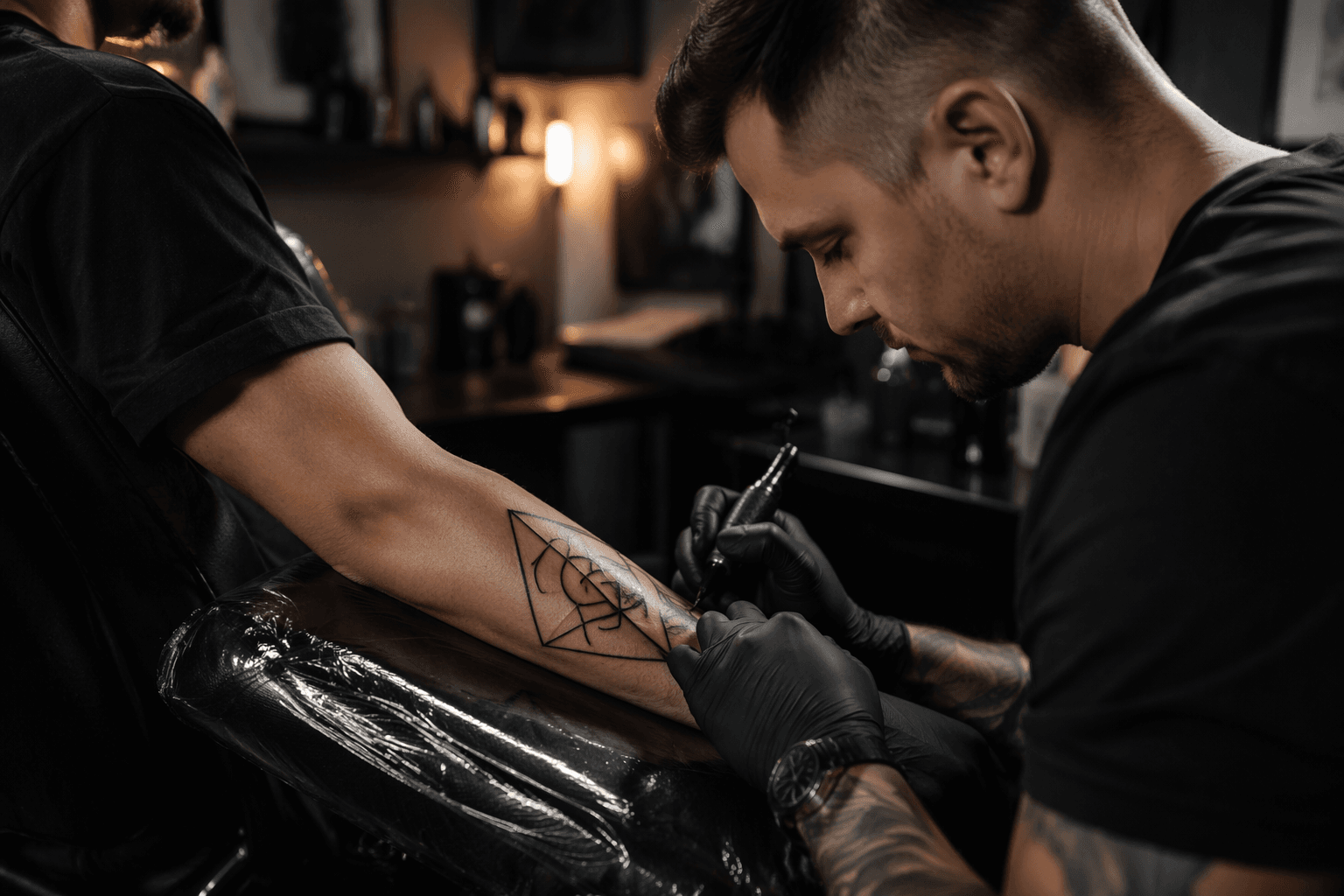
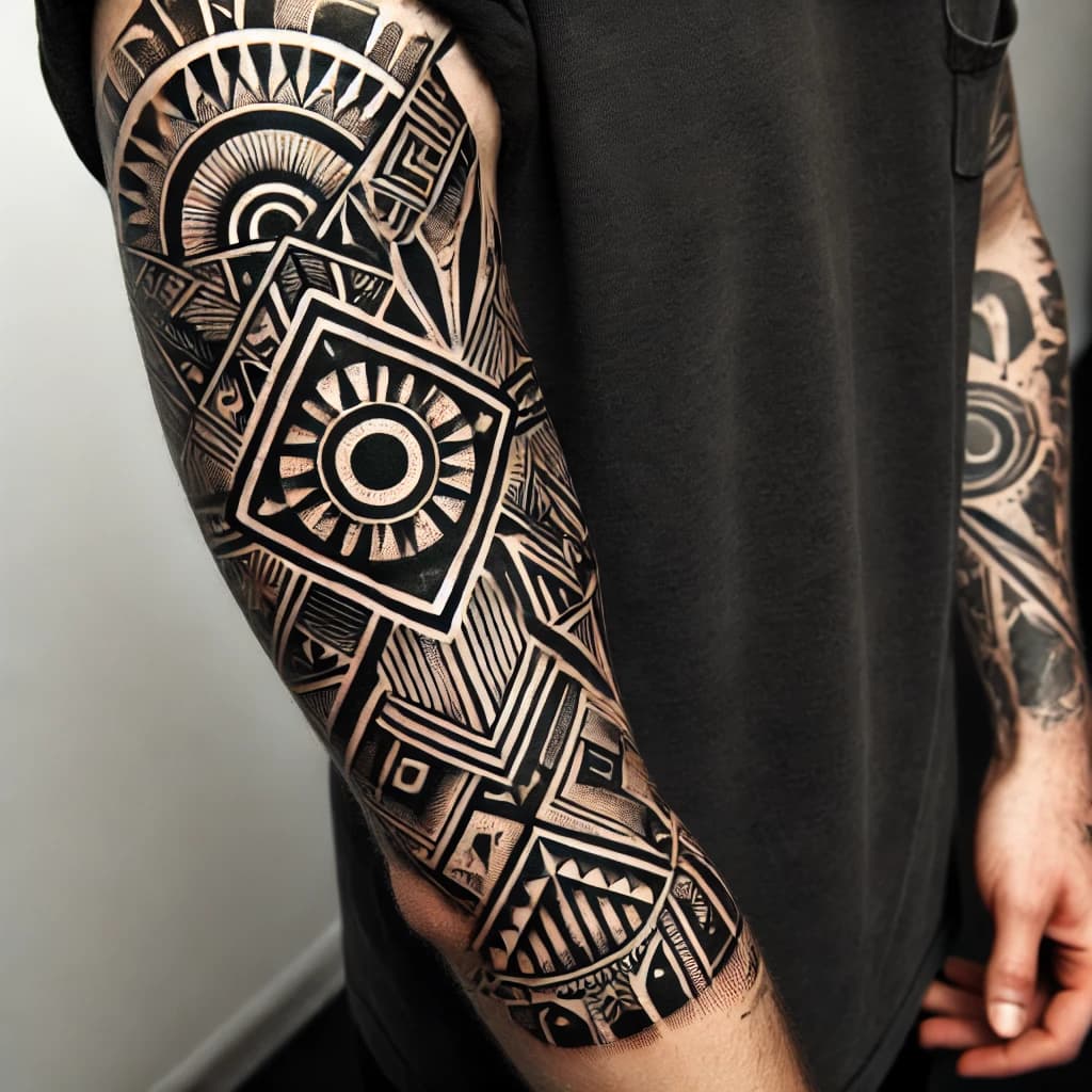
The fastest way to separate geometric from ornamental, dotwork, or a hybrid piece is to look at how the image is constructed, not just what it contains. Geometric work usually leans on structure first: symmetry, repetition, clear line systems, and forms that feel engineered. Ornamental work, especially in Tattoo Life’s recent coverage, often brings in mandalas, flowers, full-black elements, dots, and empty-space composition that shape the body rather than sit flat on top of it.
That distinction is important because ornamental is not just decoration with extra detail. Tattoodo’s ornamental guide places mandalas, mehndi-inspired patterning, sacred geometry, and blackwork inside the style, while also warning that those references can sit close to the line between cultural appreciation and appropriation. In practice, that means a piece can look visually close to geometry while carrying a very different set of references, intentions, and cultural weight.
Dotwork sits in the overlap zone when dots are doing the real structural work. If the dots are only a texture, you may still be in a geometric or ornamental piece. If the dots build the form, soften the transitions, or create the entire sense of rhythm, you are closer to dotwork territory. Hybrid pieces often use that overlap on purpose, mixing geometric order with ornamental flow so the composition feels responsive to the body.
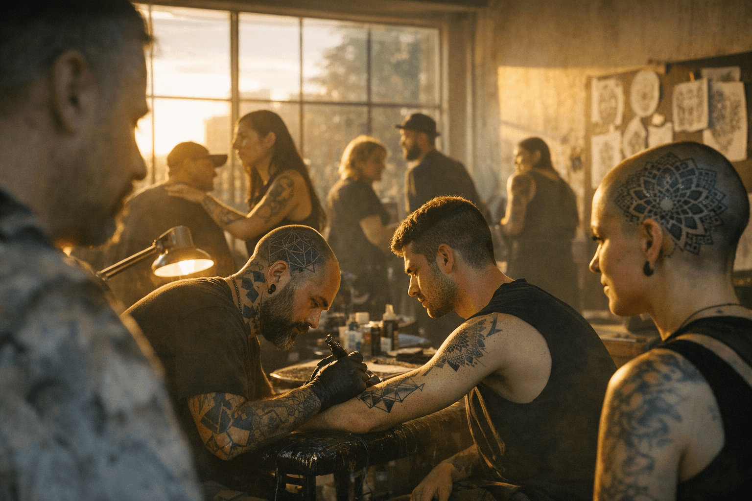
Why anatomy is part of the style
Vialetto’s editorial makes a useful point for anyone booking body art: these styles are not only about image choice, but about how the tattoo moves with the body. Alexa Tamaska’s approach is described as floral and geometric forms arranged in dialogue with anatomy, which is a reminder that the best ornamental and geometric pieces do more than sit in place. They follow curvature, joints, muscle lines, and the visual movement of the body itself.
That is where style confusion can cost you the wrong tattoo. If you want something that reads as sharp, architectural, and tightly ordered, but you commission a design built around decorative flow and anatomical movement, the result may feel too soft, too dense, or too fluid. The reverse can happen too: asking for ornament but getting a rigid geometric layout can flatten the energy you wanted across the skin.
The history behind the modern labels
The current debate makes more sense when you remember how old tattooing is. Britannica says tattooing proper has been practiced in most parts of the world, and Smithsonian Magazine notes that the oldest known human tattoos, found on Ötzi the Iceman, are about 5,200 years old. Smithsonian also points out that Polynesian traditions developed over millennia and often feature highly elaborate geometric designs that can cover the entire body.
That history matters because geometric language did not appear as a trend file on social media. It comes from deep cultural systems, repeated symbolism, and long visual traditions. Tattoo Life has also noted that ornamental-style tattooing has been popular for more than a decade, which explains why the category now contains so many variations that one label can feel too blunt for what artists are actually doing.
The consultation questions that save you from a mismatch
The easiest way to avoid style confusion is to talk in terms of visual language instead of broad labels. A good consultation should get specific about structure, cultural references, and body placement. If you can name what is driving the design, you are much less likely to leave the studio with something that only partially matches your idea.
Use questions like these in the room:
- Is this rooted in geometric structure, ornamental flow, dotwork construction, or a hybrid of all three?
- What matters most in the piece: symmetry, repetition, empty space, black coverage, or anatomical movement?
- Does the design borrow from mandalas, mehndi-inspired patterning, sacred geometry, or another tradition?
- How will the tattoo read on the body after healing, especially on curved or moving areas?
- If there is a cultural reference here, what is the right way to handle it with respect?
Those questions reflect the way the scene is changing. Tattoo Life’s editorial argues that the publication’s role is to explain distinctions rather than flatten them, and that is exactly what collectors now need. The label on the folder matters less than the language the tattoo actually speaks.
Why this conversation is happening now
Tattoo Life’s May/June 2026 issue puts that shift in plain view, with Alexa Tamaska on the cover and artists including Raul Felix Mumia, Aries Rhysing, Janna Antich, Luis El Rostro, Tony Karpinski, Ulises Indo, and UNO Own inside the issue. The magazine is treating style distinction as an active editorial concern, not a static classification.
That is the bigger takeaway for geometric readers: taxonomy is now part of the creative process. The strongest tattoos are not just precise. They are legible. They know what tradition they are speaking from, how they will sit on the body, and why a single label is often not enough to describe them.
This article was produced by Prism’s automated news system from verified source data, official records, and press releases, then run through automated quality and moderation checks before publishing. The system is built and supervised by the people who set the standards it runs under. Read our full AI policy.
Did this article answer your question?