Hamster and Hammer Blends Art Deco Style With Geometric Tattoo Branding
Hamster and Hammer's moth emblem for Midnight Oil Tattoo Society pairs Art Deco symmetry with geometric linework built to work across flash sheets and merch alike.
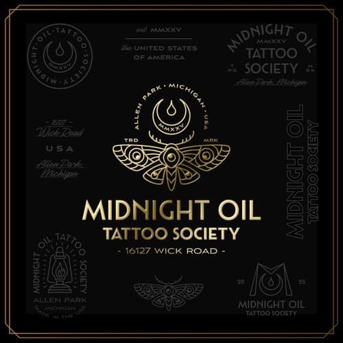
Branding studio Hamster and Hammer published a new visual identity for Midnight Oil Tattoo Society on March 11, 2026, building a system around Art Deco structure and geometric ornamentation that positions the studio as a serious player in the increasingly design-conscious tattoo world.
The project's central ambition was clear from the jump: create "a refined tribute to the timeless aesthetics of classic tattoo culture and the elegance of Art Deco design." That's a tight brief to execute, but the concept holds together by leaning hard on specific Art Deco principles, specifically symmetry, elegant linework, and balanced geometric composition, rather than just borrowing the visual shorthand of the era. The result blends vintage symbolism and modern minimalism into what the project describes as a brand language that "feels both nostalgic and contemporary."
The moth emblem sits at the center of the identity and is the piece most likely to catch the eye of anyone who appreciates precise geometric construction. It's "constructed with ornamental yet controlled lines," which is exactly the kind of technical discipline you want in a mark that has to translate from a 2-inch sticker to a full studio sign. That controlled quality gives it "a sense of sophistication while maintaining a bold, recognizable silhouette," and it's designed to function across studio signage, merchandise, and tattoo flash sheets without losing resolution or intent.
Typography gets serious treatment here too. Rather than defaulting to the stock distressed fonts that saturate the tattoo industry, Hamster and Hammer referenced early 20th-century American signage and traditional shop lettering. The combination of structured display lettering with elegant script accents was chosen deliberately to introduce hierarchy and personality, keeping the heritage feel intact without the system looking like it was pulled from a Halloween supply catalog.
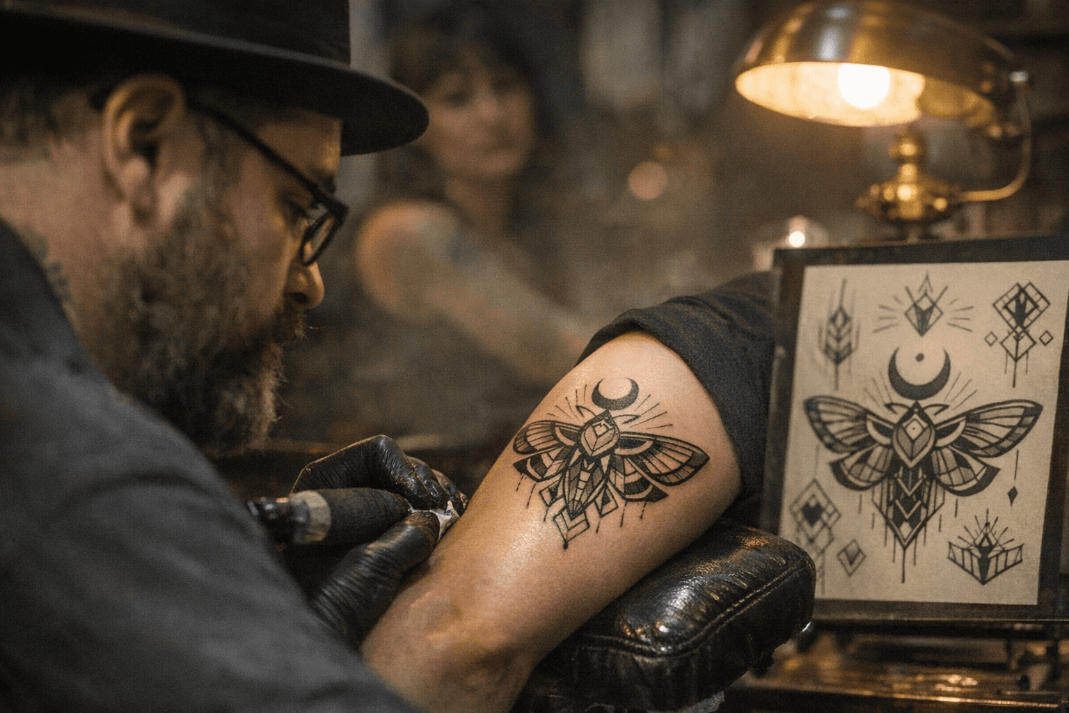
The broader identity system was built with versatility as a non-negotiable requirement. The stated goal was for Midnight Oil Tattoo Society to "stand out as a modern studio rooted in classic craft traditions," which in practical terms means the mark needs to hold up whether it's pressed into a flash sheet border, embroidered on a crew neck, or mounted above a studio entrance. A system that passes all three of those tests is doing real work.
What Hamster and Hammer delivered is a cohesive geometric identity that takes the Art Deco revival seriously rather than using it as aesthetic decoration. The tattoo industry has no shortage of studios leaning on skulls and roses for their branding, so a mark built on symmetry, controlled ornamentation, and typographic discipline carries genuine distinction.
This article was produced by Prism’s automated news system from verified source data, official records, and press releases, then run through automated quality and moderation checks before publishing. The system is built and supervised by the people who set the standards it runs under. Read our full AI policy.
Did this article answer your question?